This is a level 3 statistics activity from the Figure It Out series.
A PDF of the student activity is included.

Click on the image to enlarge it. Click again to close. Download PDF (2354 KB)
evaluate features of graphs, e.g. labels, bar width
construct a graph
compare graphs with others and draw conclusions
This diagram shows the areas of Statistics involved in this activity.
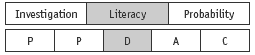
The bottom half of the diagram represents the 5 stages of the PPDAC (Problem, Plan, Data, Analysis, Conclusion) statistics investigation cycle.
FIO, Levels 2-3, Statistics Revised Edition, Where on Earth? pages 16-17
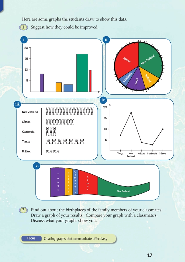
Rather than start with a session on “the rules of graphs”, challenge your students to look critically at the graphs in question 1 and:
• work out what information they do and do not convey;
• suggest changes that would improve their communicative power.
Once the students have read the context on page 16, they can cover or fold this page back and not refer to it again until they have gone through the fi ve graphs one by one and answered (as a series of statements) the question “What does this graph tell me?” Encourage them not to make assumptions (for example, not to assume that the numbers on a vertical scale are people, even though in this case they are).
They can then uncover page 16 and check each of the statements they have written against the actual data. What information got lost in each graph? What information got distorted?
Finally, they can make recommendations on steps that would improve each graph.
This is an appropriate pair or small-group activity. Each of the graphs presents its own issues.
Some of these are discussed in the Answers.
Note that iv presents a particular issue that the students may not have enough experience to recognise; namely, the type of graph chosen is not suitable for the type of data.
Line graphs are used to show increases, decreases, and trends in data of the same kind. In line graphs, the scale on the horizontal axis has a fi xed order (for example, Jan, Feb, Mar, Apr, …) and the line segments that join the various data values (points) have meaning (for example, an upwards slope always means an increase of some kind).
In iv, the data is category data. The categories have no inbuilt order: they could be organised alphabetically, randomly, or according to frequency. (While the latter is usually preferred, this is for reasons of clarity, not mathematics.) In this graph, the lines joining the various data values have no meaning. (Why should Holland be linked to New Zealand and Cambodia, for example?)
Whether the lines go up or down is entirely a result of the order in which the categories are placed.
In summary, line graphs should not be used for category data.
Answers to Activity
1. All the graphs need titles so that it is clear what they show.
You can’t tell what’s what in i. This graph needs labels on each axis and country names under the bars; bars need to be of equal width and equally spaced.
Looking at the areas coloured red and green in ii, it appears that an equal number of those questioned were born in Samoa and New Zealand, but the data shows that this is not true. To get the areas of the different sectors correct, the divisions around the
perimeter of the pie need to be equal.
The icons in iii need to be the same size so that the reader can compare from the lengths of the lines how many people were born in each country.
The line graph in iv is not a suitable choice for category data. A line graph shows increases, decreases, and trends in data of the same kind.
In a strip graph, area matters: twice the area means twice the data. But there is too much going on in the strip graph in v, which gets thinner and curves, to be able to read or compare the areas of the different regions. 41 people were questioned about their country of birth, so a correct strip graph would be of constant width,
41 units long, and divided into lengths according to the number of people in each category.
2. Answers and graphs will vary.
Key Competencies
Where on Earth? can be used to develop these key competencies:
• using language, symbols, and texts
• relating to others.