This unit requires students to use statistics about the top ranked teams in the 2019 Rugby World Cup to predict the winner of the World Cup, justifying their prediction using data. Notes are included for adapting this unit post the 2019 World Cup.
- Recognise variables and measures in an existing data set.
- Establish criteria and use these to sort data.
- Display data using technology.
- Use graphs to make comparisons between groups.
- Justify conclusions based on data.
In this unit students will examine the variables and consider the attribute that each variable measures, within the context of the 2019 Rugby World Cup. They will compare groups (e.g. nations, positions) using technology to graph distributions and calculate measures. Finally, they will use their knowledge to predict the winner of the World Cup, justifying their prediction using data.
Students will carry out a statistical investigation using the PPDAC cycle (Problem, Plan, Data, Analysis, Conclusion). The data set of statistics about players in the 2019 Rugby World Cup is provided. Students will need to work out which variables they will use to make their predictions about a likely winner.
Creating graphs of data also allows for ‘eyeballing’ the data to look for similarities and differences.
The learning opportunities in this unit can be differentiated by providing or removing support to students, and by varying the task requirements. Ways to support students include:
- providing modelling, explicit teaching, and scaffolding in response to students’ demonstrated needs at each stage of the investigation
- strategically organising students into pairs and small groups in order to encourage peer learning, scaffolding, and extension
- working alongside individual students (or groups of students) who require further support with specific areas of knowledge or activities (e.g. creating a graph).
The context for this unit can be adapted to suit the interests and experiences of your students. With careful preparation, this unit could be adapted to focus around data from a Women’s Rugby World Cup, FIFA World Cup, or other team sport tournament.
Te reo Māori kupu such as taurangi (variable), tuari (distribution), kauwhata (graph), tauira (pattern), and mōwaho (outlier) could be introduced in this unit and used throughout other mathematical learning.
At the time this unit of work was updated (Nov 2020) the next rugby world cup event planned was the Women’s Rugby World Cup in 2021 (now delayed to 2022). When the original unit of work was created (September 2019) the upcoming rugby world cup event was the Men’s Rugby World Cup in 2019. Activities throughout the unit of work that use given data relate to either the 2021 women’s tournament or to the 2019 men’s tournament. Feel free to update the information to reflect the current (or next) rugby world cup.
Session One
- Discuss rugby World Cup tournaments, depending on the year there could be a women’s one coming up e.g. 2021, 2025 or a men’s one e.g. 2023, 2027.
Why are the Rugby World Cup tournaments of interest to New Zealanders?
Women’s Rugby World Cup 2021 https://www.rugbyworldcup.com/2021
The teams for the 2021 world cup are seeded based on their world rugby women’s ranking on 1 January 2020 (as this was the last time teams could play before COVID-19 pandemic).
The world women’s rugby rankings (November 2020) for rugby going into the 2021 tournament are/were:- England
- New Zealand
- Canada
- France
- Australia
- USA
- Italy
- Ireland
- Wales
- Spain
- Discuss: How do you think the rankings are decided?
Students will likely suggest that the record of wins and losses is used to set the rankings. In fact, the system is more complicated than it first appears. Teams lose points if they lose, and gain points if they win. How many points they gain or lose depends on the difference in ranking of the teams, which team is playing at home, and if the winning margin is greater than 15 points. If students are interested you can read more at https://www.world.rugby/tournaments/rankings/mru.
Does this mean England will win the Women’s Rugby World Cup in 2021?
Does it mean the top ranked team will win the World Cup in any given year? - For the 2019 men’s rugby world cup the rankings (9-9-2019) going into the tournament were:
- Ireland
- New Zealand
- England
- Wales
- South Africa
- Australia
- Scotland
- France
- Fiji
- Japan
- An investigative question that arises from this data is: I wonder if the women’s rankings and/or points are related to the men’s rankings for different countries? If you want to explore this investigative question some ideas are below.
To answer this investigative question, data was collected from the World Rugby website https://www.world.rugby/ and the provided file contains the all the World Rugby Women’s Rankings and their Men’s World Rugby Rankings. The data set contains 56 countries, these are the countries for which there is both women and men’s ranking available. The file is a CODAP document. The data set can be found here. To answer the investigative question students will need to make a plot of the women and men’s rankings and for the women and men’s points.
- Open the CODAP document. This unit assumes previous knowledge of using CODAP. Use the Level 4 unit Travel to School for an introduction to using CODAP.
- Get students to make a graph with the WRU ranking on the x axis and the MRU ranking on the y axis. Ask the students what they think WRU and MRU stand for (Women’s Rugby Union and Men’s Rugby Union). Ask them also if a low number or a high number for the ranking is best?
They will get a scatterplot. Show them how to adjust the x axis so that both axes have the same scale (put the cursor near 60 on the x axis, a little hand pointing to the right shows up, drag the scale to extend to 100). This allows us to observe like with like.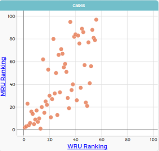
- Ask them what this type of graph is called (a scatter plot - we use it to look at relationships between numerical variables such as the rankings).
- Ask them what they notice about the data.
- Women’s ranking go up to 56, why? (only 56 countries for women)
- Men’s rankings go up to 100, why? (more countries have men playing rugby and have a ranking, can confirm 105 from the ranking list on the website)
- Ask them what they would expect if the rankings for women and men were the same? All the dots would be on the same line (the WRU ranking = MRU ranking).
- We can put that line onto our graph.
Click on the ruler and select plotted function. f()= appears in the top left hand side of the graph. Click on the grey box and type start typing WRU in the pop-up window, WRU ranking pops up, select (‘WRU ranking’ in pink appears in the box), then apply. The resulting graph has a red line where WRU ranking is equal to MRU ranking.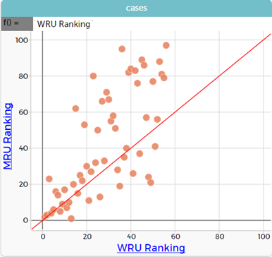
- Discuss what this tells us…
The dots that are above the line are the countries where the WRU ranking is a smaller number than the MRU ranking, in other words the women have a better ranking than the men. Therefore, the dots below the line are where the men have a better ranking. The dots on the line are where the ranking is the same. Click on the dots on the line to see this. For example, WRU 9, MRU 9, country Wales. Dots that are close to the line are countries where the rankings are similar. The dots close to the origin are the countries with the best rankings.
- Repeat for the W points and M points. What does W points mean? M points mean? In this graph the higher points are better.
Make the graph and put in the W points = M points line. Describe the data.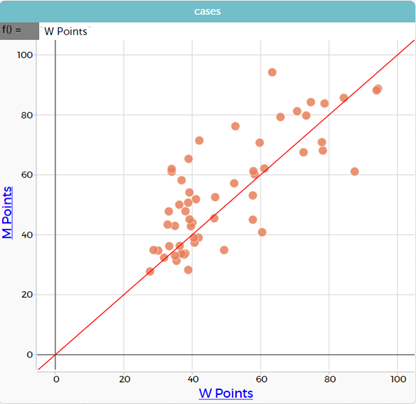
The countries below the line have higher women’s rugby ranking points than men. The countries above the line have higher men’s rugby ranking points than women.
- More on rankings
Discuss the idea that the rankings are based on form, but the result of an individual game can be unpredictable. Demonstrate how luck can play a significant part even when one team has a higher rank than the other.
New Zealand and Australia played in the 2015 cup final. Between 2015 and 2019 the sides played ten test matches and New Zealand won eight of those games. Let’s put ten cards, Ace, one, two … ten, into a box. Australia won games six and nine. If a six or nine comes out, then Australia win, and any other card is an All Black win.
Imagine that New Zealand and Australia are in the final of a World Cup. Based on the statistics from 2015 -2019 can Australia win? [Teachers can update the wins and losses by looking at the last ten games between the All Blacks and Australia].
- Let your students discuss the chances of Australia winning. Look for ideas like:
- They probably won’t win.
- It’s possible they can win in a ‘one -off’ game.
- Their chances are 1 in 5 or one fifth.
- Discuss the uncertainty of predicting the result even though the odds favour New Zealand. They are ranked second, and Australia are ranked sixth (2019 world rankings). You might simulate a single game of drawing a card. Surprises do happen.
Actually, Australia won two of the last six test matches. Let’s change the cards to match that. (Six cards, Australia win on 2 and 5)
- Discuss how the chances of an upset change. Simulate taking out a single card again.
- 2019 Men’s Rugby World Cup draw
Slide Two of PowerPoint One shows how the draw for the 2019 Men’s Rugby World Cup tournament worked. Discuss what is meant by pool play and how the winners play runners-up in the Quarter Finals.
Suppose you are organising the tournament. You have a table of the top eight ranked teams.
How would you allocate the 2019 top ten teams to the pools?
You want (if the team win as expected):
Teams ranked 1-8 to probably be in the Quarter Finals
Teams ranked 1-4 to probably be in the Semi Finals
Teams ranked 1 and 2 to probably be in the Final
Copymaster One gives an organised space for students to work in. Let students work together in pairs to allocate the teams to pools. Do they:- Work backwards from the outcome of Ireland and New Zealand in the final Ireland, New Zealand, England and Wales in the semi-finals?
- Look to the rankings to give the winner of each game?
After an appropriate time bring the class together to share the draws they have created.
- 2021 Women’s Rugby World Cup draw
Slide Four of PowerPoint One shows how the draw for the 2021 Women’s Rugby World Cup tournament worked. Discuss what is different in this draw compared to the Men’s draw. It doesn’t show how the four quarter finals are decided from the three pools. The top two teams from each pool are automatically included in the quarter finals, as are the next two teams with the most points from pool play.
Suppose you are organising the tournament. You have a table of the top eight ranked teams.
How would you allocate the 2020 top ten teams to the pools (23-11-2020 rankings)?
You want (if the team win as expected):
Teams ranked 1-8 to probably be in the Quarter Finals
Teams ranked 1-4 to probably be in the Semi Finals
Teams ranked 1 and 2 to probably be in the Final
- Finish the lesson with this question:
What data about the players might be useful to predict the winner of any Rugby World Cup?
- Let students brainstorm in small groups about the data they might want to know. Accept attributes (characteristics) they suggest at this stage but do ask how that attribute might be measured. For example:
I want to know how fast players can run. How would that be measured?
- Make a list of attributes as a class. Ask students for justification about why that attribute might be important, and how they think the attribute might be measured, e.g. Rugby players frequently measure a time to sprint 40 metres from a standing start (why is that more useful than 100 metres?).
Session Two
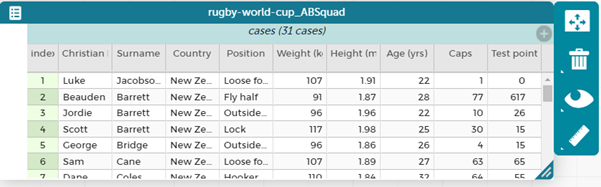
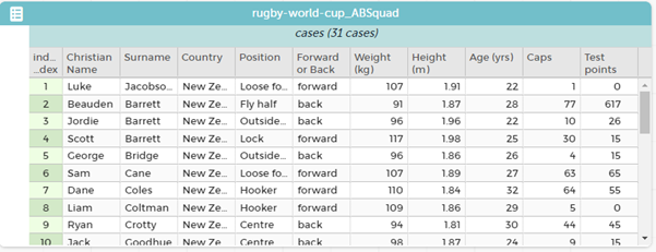
In this lesson students explore tools that will be important to justifying their prediction about which team they think will win the World Cup. Use Spreadsheet One. This lesson, and those following, use the 2019 Rugby World Cup data. Feel free to adapt these to reflect more current data.
- Display the spreadsheet for the class (e.g. on a large screen).
What data have we got about each player in the New Zealand squad? - Spend time ensuring that students know what each variable is referring to and have a sense of the measurements. Spend time comparing appropriate measurements (i.e. height) of players to those of your students, and on making reference to students' personal measurement benchmarks. to For example:
- How tall is a player who is 2.04 metres tall? What about 1.80 metres?
(You might measure those heights and mark them on a door frame. Students might measure their own heights in metres.) - How heavy is a player who is 126?
(That means 126 kilograms. While being sensitive to students’ personal feelings you might find two or three students whose combined weights equal that of the player.) - A full two litre bottle of milk weighs about 2 kilograms.
How many full bottles does this player weigh? 63 bottles are a reasonable approximation of the player’s volume as well. - What is meant by ‘caps’? (Appearances for New Zealand)
- How tall is a player who is 2.04 metres tall? What about 1.80 metres?
- In the next three parts of the lesson, which may span two sessions, students look at answering three types of investigative questions:
- Summary investigative questions about one group, such as:
What is the distribution of player positions? (category data)
What are the weights of the All Black players? (numeric data) - Comparison investigative questions about two or more groups, such as:
Do forwards tend to be taller than backs? - Relationship investigative questions about the association of one variable with another, such as:
How are players’ weights related to their heights?
How are players’ total points related to their number of caps?
- Summary investigative questions about one group, such as:
For all the following investigative questions:
- If you can, update the data set to include the latest All Blacks squad as the players in the given spreadsheets may no longer be relevant to your students e.g. Sonny Bill who?
- If you do update the data set you will need to save it as a .csv and then import into CODAP.
- Support the students to make the graphs, copy and paste them into a digital document, and then write what they notice under the graph or use the text boxes in CODAP.
- There are hints on how to explore the data more deeply by using a third or another variable.
- Students can learn to dig deeper into a particular data point by clicking on it and noticing that “oh yeah, the number 10 scores the most points!” The data then makes sense to them.
- Allow some flexibility with what students do with the software, it is about learning the possibilities rather than sticking to strict rules.
- Details on using CODAP are covered in the Travel to school and Measuring Up units of work.
Investigative Question One: What is the distribution of player positions?
- Use the data from the spreadsheet available in CODAP. Share the link with them (e.g. through email, Google Classrooms etc.).
You may need to explain the positions to some students, e.g. fly half is often referred to as ‘number ten’ or ‘first five eighth’ in New Zealand. There might be some students in your class who are motivated to explain these terms to their peers.
- Direct students to use CODAP to create two different graphs to show this data. Provide appropriate scaffolds to draw on students' prior experiences of graphing, whilst encouraging them to independently create the graphs. You might need to model the graph-creating process for the whole class, support a small group of students, group students to encourage tuakana teina (peer learning), or roam and support individuals.
Students are likely to make a dot plot and a bar graph. With the dot plot they can also include the count, see the dot plot in PowerPoint Two Slide 2. In CODAP the default organisation of categorical data is alphabetically. Students should be encouraged to rearrange the order to make more sense of the positions in rugby i.e. roughly ordering by jersey number, see the bar graph in PowerPoint Two Slide 2. This might make more sense when describing what the data shows.
Once students have created their graphs, they can make a text box in CODAP (or in word or google docs) and write 2-3 statements about what they notice about their graphs. Remind them to include the variable, the group (2019 RWC All Blacks) and if talking about numeric data (not this specific investigative question) to include values and units also.
- After a suitable time gather the class to share the students’ graphs.
Which type of graph best answers the question, "what is the distribution of player positions?”
Both graphs provide answers to the question, but the ordered by position bar graph highlights differences in frequency better related to the position. For example, hookers and scrum half and fly half have the least, within the team these positions are single positions, whereas many of the other positions have two players e.g. lock, prop etc.
They also might note that there are more forwards altogether than backs (17 versus 14) and that there are more forward positions than back positions (8 versus 7).
Which type of graph best answers the analysis question, “what fraction of the players are forwards and what fraction are backs?”
Investigative Question Two: What are the weights of the All Black players?
- Direct students to use CODAP display these data.
The default graph view of the data is shown in PowerPoint Two Slide 3.
Students can explore the data further by extending the x axis out (PPT 2 Slide 4) and/or by putting the data into bins and then fusing to make a histogram (PPT, Slide 5). See Measuring Up for more on this.
What statements can you make about the weights from these two displays?
What would the middle weight be? How could you find that out?
- Show students how to find the middle using CODAP – see Measuring Up for a full discussion on how to do this. In CODAP you can add a movable value and add in count. Move the value until about half of the count is on each side of the value. This is the middle.
Formalise to showing the median. The median is an option in the ruler.
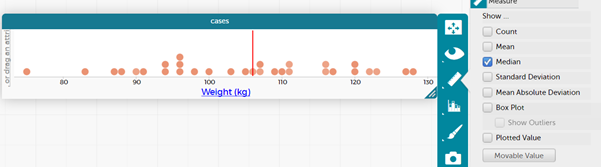
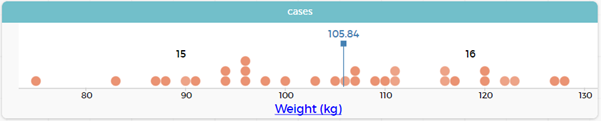
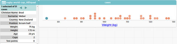
Are there any outliers? (Brad Weber, at 75 kg is light compared to the others)
Who do you think might be the heaviest player?
What is the range between the lightest and heaviest players?
In CODAP information about specific points can be found by clicking on the point.
In case card view when one dot is highlighted the specific “case” comes up. In the picture below you can see that the lightest player is highlighted and in the case card it says 1 selected of 31 cases and tells us that it is Brad Weber and gives all the data we have on Brad.
- Explore the idea of finding the middle 50% as well using ideas from Measuring Up.
Investigative Question Three: Do forwards tend to be taller than backs?
Students will have their own ideas about the answer to this question. Locks and loose forwards are the ball winners in the line-out, so tend to be taller than players in other positions, which would support a hypothesis of forwards being taller than backs. With our data at the moment we cannot answer this question directly, we need to add in a new variable which tells if a position is forward or back.
- Direct students to use CODAP and add a new variable. To do this we switch to table view and then click on the grey + on the right to insert a new attribute.
We name the attribute e.g. forward or back.
Instead of going through all 31 players, we can do a quick rearrange of the table and just rename for the eight positions. Drag the position attribute to the left and then the forward or back attribute so that they are hierarchal to the left in their own part of the table, see below.
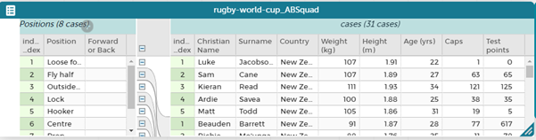
Name each of the positions as forward or back. Then drag the attributes back into the main part of the table.
You can position the attributes where you like in the table by dragging the label.
Slide Six shows a dot plot with the data split by whether the position is a forward or a back. The median for each group has also been put in.
- Discuss the following questions:
Do forwards tend to be taller than backs? Students might notice that the data for the forwards is to the right of the data for the backs, i.e. the forwards tend to be taller.
What is the median height for forwards? (Read off graph – 1.89m)
What is the median height for backs? (Read off graph – 1.855m)
If we add a legend to our graph (PPT S7), and do a bit of tidying up of the legend (by dragging the positions about so they align with the colour position on the graph), we can explore the individual positions within the forwards and the backs and extend our response by asking the following analysis questions.
What positions have the tallest players? (As expected, the locks are the tallest, but loose forwards, and props are similar)
What positions have the shortest players? (As expected, the scrum halves followed by the fly halves are the shortest groups).
Students might notice that one of the scrum halves is quite a bit taller and wonder who that is. Click on the data point and they find out that it is TJ Perenara.
Investigative Question Four: How are players’ weights related to their heights?
Relationship questions require looking for an association between two or more variables, in this case height and weight.
- Pose the question: How could we display these data to look for a pattern?
Students may not be aware of scatterplots as a representation, but we can use CODAP to explore possible options.
- Ask students to make a graph with weight on one axis and height on the other, not dissimilar to what they have just done for height and forward or back. Suggest everyone puts the weight on the x axis and height on the y axis (so they are looking at the same graph).
- Show them slide eight – Ask the students if they know what this type of graph is called?
If they do not know tell them it is called a scatter plot and it lets us see if there is an association between two numerical variables, in this case weight and height.
- Pose the question: Is there any pattern in this graph?
We can look at the pattern in a scatterplot using the draw tool in CODAP. Click on the graph and then click on the camera icon and select open in draw tool. You then get an image of the graph that you can draw on. Select the line tool and draw in two lines, one that goes just above nearly all of the data and one that goes just below nearly all of the data. You might notice in the picture below that one data point is outside the lines. This shows the general pattern of the data, which in this case is showing that heavier All Blacks also tend to be taller and lighter All Blacks tend to be shorter. This is called a positive association and is all that students need to be looking for at this level.
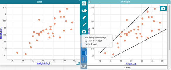
By clicking on the outlying point we can see that Jordie Barrett is the person who appears to be quite a bit lighter than would be expected for his height. Students can also reflect on his position as an outside back and why this might be the case.
Students might also be interested in if the position they play is important so could drop the attribute forward or back into the middle of the graph. The following happens… PPT S10.
Students might note that forwards are generally heavier and taller than backs. They could guess as to who the back is that weighs over 110 kg and is over 1.95 m and click on the point to find that it is Sonny Bill Williams.
Investigative Question Five: How are players’ total points related to their number of caps?
The point of this investigative question is to illustrate that there is often no clear association between variables. It makes intuitive sense to think that the more tests a rugby player participates in, the more points they are likely to score.
- Display slide 11. This shows a scatterplot of the association between number of caps and number of points.
- Pose the question: Is there a pattern in the points for this graph?
Students should notice that generally the number of points is between 0 and 100 and the length of time playing does not necessarily mean more points.
- Ask:
Who do you think is the player who has over 600 points and about 75 tests?
What position do you think this player is? What might be one of their key roles in the game?
- Click on the point to find that this outlier is Beauden Barrett who scored 617 points in 77 tests.
Why does playing more tests not necessarily lead to more points?
Students who are familiar with rugby will know that most points are scored by the fly halves, who tend to be the goal kickers.
Again, we can add in another variable, e.g. position into the graph to see if it gives us anything else we can discuss about the data. This is the flexibility that using technology and software such as CODAP allows us. See PPT2 S12.
Session Three
In this lesson students are encouraged to come up with a prediction about which team will win the World Cup. It is important that they use evidence, related to the variables in the data set. Note: the 2019 Rugby World Cup has gone, the data provided is for teams that were in the 2019 Rugby World Cup. You can use this data but base it on the six teams going into a tournament that we are yet to know the outcome of. Alternatively, you can switch the data given for the latest data from the six countries.
- Begin with a discussion.
How might we use these data to predict a winning team?
You may need to discuss that the prediction will always be a ‘best guess’ based on form, as chance and form will play a big part in the outcome.
- Show the students Spreadsheet Two which has statistics on the squads of the six highest ranked team. Historically, the winner usually comes from one of those teams. Discuss the meaning of each variable, and how it is measured.
- Display PowerPoint Three. This shows some considerations about making a prediction. Take care to present the ideas as opinions, to open students’ minds to possible ways to predict the outcome.
Take some time now to think about what measures you will use to decide which team/s have the best chance of winning. Write some ideas down.
When you present your ideas in the next lesson you will need to justify your prediction.
Data displays will be important to convincing others that your method was sound.
- Provide students with access to Spreadsheet Two. This link is to a CODAP document with the data imported and ready to use.
- Let pairs of students work with the graphing tools, e.g. CODAP, to create a way to predict the winning team. You might provide Copymaster Two as template to help students structure their responses. Watch as students work:
- Can they justify their choice of variables and measures?
- Do they use appropriate displays to represent the data, that allow them to compare teams?
- Do they ‘eyeball’ the distributions to get a sense of possible differences.
- Do they use software to calculate statistics, such finding the middle, the middle 50% or the band of data in scatterplots?
- Do they use additional variables to look deeper into the data?
- Provide students appropriate time to investigate the data and create their report. If Copymaster Two is provided as a digital document students can type within it and insert graphs and tables from the online tools. Snipping graphs is useful way to do this, though encourage students to insert the graphs/tables in text boxes for ease of formatting.
Session Four
In this lesson students are the consumers of others’ reports and are expected to use statistical literacy to evaluate the validity of findings. From the outset it is important for students to understand that there is ‘no one correct answer’ and that different choices and combinations of variables may lead to different predictions.
- Display PowerPoint Four as an example of a report. Discuss, focusing on the questions for discussion in the speech bubbles. Pay attention to justification, and sensible use of technology to present the data.
- Put three groups of two students together to present their reports in an appropriate and relevant format. Have each pair of students present their findings to two other pairs. Watch to see:
- Do students focus on justification, especially where another team chooses measures that are different to their own?
- Are they critical (in a positive way) about the use of graphs and statistics?
- Do they provide quality feedback about the work of the other teams, including other points of view?
- After a suitable amount of time bring the class together to discuss what they learned from the feedback.
What did you learn that might improve your report?
You might give students a chance to make alterations to their reports prior to submitting them. As a final exercise collate the predictions for winning team in a tally chart.
Do you think this table is a better predictor of the winning team than each individual prediction? Explain.
- Display the reports from each pair of students on the wall.
Family and whānau,
This week we have been predicting which team will win the rugby World Cup. We used data about the players in each squad to make our prediction, including ages, weights, heights, number of caps, and total points scored.
By sorting and displaying the data we were able to predict a likely winner. However, we do know that ‘one-off’ games can produce surprising results. Ask us how we made our predictions. Will the All Blacks win again?