This is a level (3+ to 4+) mathematics in science contexts activity from the Figure It Out series.
A PDF of the student activity is included.
Click on the image to enlarge it. Click again to close. Download PDF (887 KB)
Students will:
- convert metric units for speed (metres per second [m/s] to kilometres per hour [km/h])
- interpret line graphs and scatter plots
- use location, wind speed, and gale frequency data to recommend a location for a wind farm adjust their conclusion for additional variables.
Students should discover that:
- good decisions may involve multiple variables, but data displays can only show a few of these.
FIO, Energy, Levels 3+-4+, Wind Power, pages 18 - 19
Points of entry: Mathematics
This activity requires students to make decisions based on different variables* and data representations. They need to combine information from the line graph, the scatter plot, the table, and their own ideas and research to come up with their recommendation.
Tables and graphs are important tools for representing information and ideas and, as such, both use and develop the key competency using language, symbols, and texts.
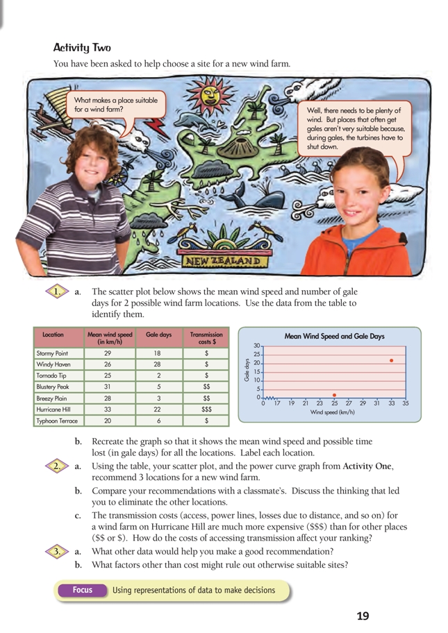
To ensure that all students can interpret the table with a minimum of teacher direction, have them study it in small groups and write down at least 5 statements that are true according to the data. For example, “Hurricane Hill is the windiest”, “Windy Haven is the most stormy”, “Tornado Tip is the least windy”, “Hurricane Hill is the most expensive”, “Windy Haven, Hurricane Hill, and Stormy Point all have quite a few gale days”.
The students will realise that the difference between winds and gales is one of degree, but they are unlikely to know the technical difference, so you could challenge them to find out. (Gale-force winds are usually defined as greater than 60 km/h [17 m/s].)
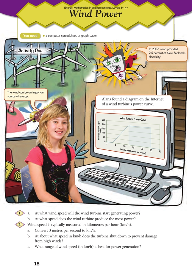
The students need to understand what the line graph tells them about wind turbines. Ask: What are the axes? What do the terms “Watts” and “metres per second” mean? (1 watt is 1 joule per second [J/s].) Discuss the fact that the output profile of a wind turbine is not a simple straight line; it takes a certain amount of wind before the turbine will turn at all, then power increases smoothly until the limit of the generator is reached; once this limit is reached, full output is maintained until the wind drops below the optimum range or reaches gale shutdown speed (at which point, the turbine is shut off and the power output drops to zero).
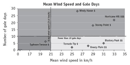
Once the students have re-created and completed the scatter plot (Activity Two, question 1b), they can use it to rule out locations. They can decide how many gale days are the most they can accept, draw a horizontal line through that point, and eliminate all locations above the line. Similarly, they can eliminate locations where the wind speed falls below a selected threshold. Although it is arguable whether a graph is really necessary for a small data set like this, the students should be able to see that, as a general principle, it is much easier to analyse data presented on a scatter plot than in an unsorted table.
Challenge the students to incorporate all the data in a single representation. The following scatter plot
incorporates information from the power curve graph in the students’ book. Based on the power curve, a reasonable power output can be obtained at 6 m/s or more (21.6 km/h), which is represented by a vertical line. (The 13 m/s [46.8 km/h] full output threshold is off the scale.) The graph also shows a selected gale-days threshold of fewer than 10 days. The graph clearly identifies 3 locations that meet the selected criteria.
This activity offers a very suitable context for exploring the notion of mean (average). The students need to realise that the mean wind speed is not the minimum wind speed on any given day: there will be days where the wind speed is greater (sometimes much greater) and days when it is less (sometimes much less). Based on the data provided, Typhoon Terrace, with a mean wind speed of 20 km/h, is likely to be a bad choice for a wind farm because the mean wind speed is very low relative to the power curve. This means that there will be many days when there won’t be enough wind to generate much electricity at all. The statistics for Windy Haven and Tornado Tip are also interesting. Both have similar mean wind speeds (25–26 km/h), but Windy Haven has far more gale days. This means that, in Windy Haven, when gales are not shutting the turbines down, the winds will frequently be too light to generate much electricity.
In this activity, there are 3 independent variables (mean wind speed, gale days, and cost). To meet the statistics achievement objective of “gathering, sorting, and displaying multivariate category … data to answer questions”, the students should factor in all 3 variables when making their recommendations for location. Scientists and mathematicians use data to make decisions. It is important that the students learn to differentiate between beliefs and evidence-based recommendations so that they select and support their proposed locations using facts. For example, Tornado Tip is a good choice in terms of cost, mean wind speed, and low number of gale days, and Blustery Peak has a considerably higher mean wind speed, although the cost is higher.
The debate could be extended to include other variables, for example, proximity to major energy users. (For example, in a New Zealand context, electricity generated in Kaitaia would have to travel some distance to reach users in Auckland.)
Points of entry: Science
Find out what your students know about wind power and how wind turbines work. Some may already have considerable relevant knowledge. Encourage them to present or explain their ideas to other students as an introduction before you introduce the graph showing wind speed and output.
Transfer the students’ thinking about the selected locations to other places: Would our area be a good location for wind generation? Are there any wind turbines nearby? What are the characteristics of areas where wind turbines are located?
Wind turbines work by converting the kinetic energy of the wind into electrical energy. The energy is transferred from the moving wind to the turbine blades, which then drive the turbine (inverter), generating electricity. Electricity can be stored as potential energy in a battery or flow directly as current (kinetic electrical energy) to another electrical device. This simple flow chart may help:

As the power curve graph shows, not all of the energy of the wind is converted into electricity (for example, a 20 m/s wind yields the same amount of energy as a 15 m/s wind). Ask: Is the process 100% efficient? Why not? Where is energy being wasted or lost? (The blades are not 100% aerodynamically efficient. There are losses due to friction around the turning shaft.)
With fossil fuel resources becoming depleted and increasing emphasis on reducing our carbon footprint, wind power is a growth area in New Zealand. But, because of its inconsistency, wind will never be able to provide 100% of our power needs. Energy needs to be stored so that it can be drawn on as needed, not just when it happens to be available. The lakes that supply our hydroelectric systems serve this function. Unfortunately, wind energy can’t be stored, so when a wind farm is idle, the electricity it would generate has to come from another energy source. In New Zealand, that other source is either water or fossil fuels.
Encourage your students to make use of the Internet and to debate the issues regarding the advantages and disadvantages of wind turbines and wind farms. Possible lines of inquiry include: Why do we need to look at alternative sources of energy, such as wind power? How do wind turbines work? What are their limitations? What aesthetic, cultural, ecological, technological, or economic factors prevent us using otherwise suitable sites for wind farms? Which countries in the world are leaders in the use of wind generation? How does the cost of wind generation compare with other energy sources?
Answers
Activity One
1. a. 3 metres per second (m/s)
b. 12.5–25 m/s
2. a. 10.8 km/h. (There are 60 seconds in a minute, so 3 m/s is the same as 180 m/min [3 x 60 = 180]. 180 m/min is the same as 10 800 m/h [180 x 60 because there are 60 minutes in an hour]. There are 1 000 m in 1 km, so 10 800 m/h = 10.8 km/h.)
b. 90 km/h. (Convert from seconds to hours again. 25 m/s x 60 = 1 500 m/min. 1 500 m/min x 60 = 90 000 m/h, which is 90 km/h. Alternatively, you could use the fact that there are 3 600 seconds in an hour, and multiply directly. 25 m/s x 3 600 = 90 000 m/h)
c. 45–90 km/h. (The graph shows that full output is reached at 12.5 m/s and shutdown at 25 m/s. Convert 12.5 m/s to 45 km/h using the method you used for 2a and 2b because there are 1 000 m in 1 km and 3 600 seconds in an hour. You may have noticed that 12.5 is half of 25; you have already calculated that 25 m/s is 90 km/h, so you can also halve 90 km/h to get 45 km/h.)
Activity Two
1. a. Tornado Tip (left) and Hurricane Hill (right)
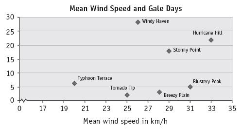
b. Your graph should be similar to this:
2. a.–b. Answers will vary but should be backed up by evidence. Blustery Peak, Breezy Plain, Hurricane Hill, and Stormy Point all have high mean wind speeds. Hurricane Hill and Stormy Point both also have a high number of gale days, which may count against them.
c. Answers will vary. Stormy Point has the most wind for an inexpensive location, but the combination of high wind speed and few gale days may make Blustery Peak worth the extra cost.
3. a. Answers will vary. Mean wind speed is just one statistic; it would be essential to analyse wind patterns for an extended period of time before committing to a particular location. Relevant non-weather data might include environmental impact or site access.
b. Answers will vary. You might have to rule out otherwise suitable sites because construction equipment can’t access them, they are in national parks or other areas of particular cultural or ecological value, they lie in bird migration paths, or they are too close to populated centres.