This is a level 3 statistics activity from the Figure It Out series.
A PDF of the student activity is included.
Click on the image to enlarge it. Click again to close. Download PDF (1565 KB)
answer questions from graphs
make a graph
make conclusions from the data
pose questions for further investigations
This diagram shows the areas of Statistics involved in this activity.
The bottom half of the diagram represents the 5 stages of the PPDAC (Problem, Plan, Data, Analysis, Conclusion) statistics investigation cycle.
FIO, Level 3, Statistics Revised Edition, Well Weathered, pages 10-11
A classmate
In this activity, the students analyse and interpret information found in graphs and tables. They also carry out their own investigation, comparing the weather in their area with that of another location of their choosing.
Before beginning, you will need to explain (or get the students to fi nd out) that NIWA is an abbreviation for the National Institute of Water & Atmospheric Research Limited, the Crown Research Institute that studies the scientifi c basis for the sustainable management and development of New Zealand’s atmospheric, marine, and freshwater systems and associated resources.
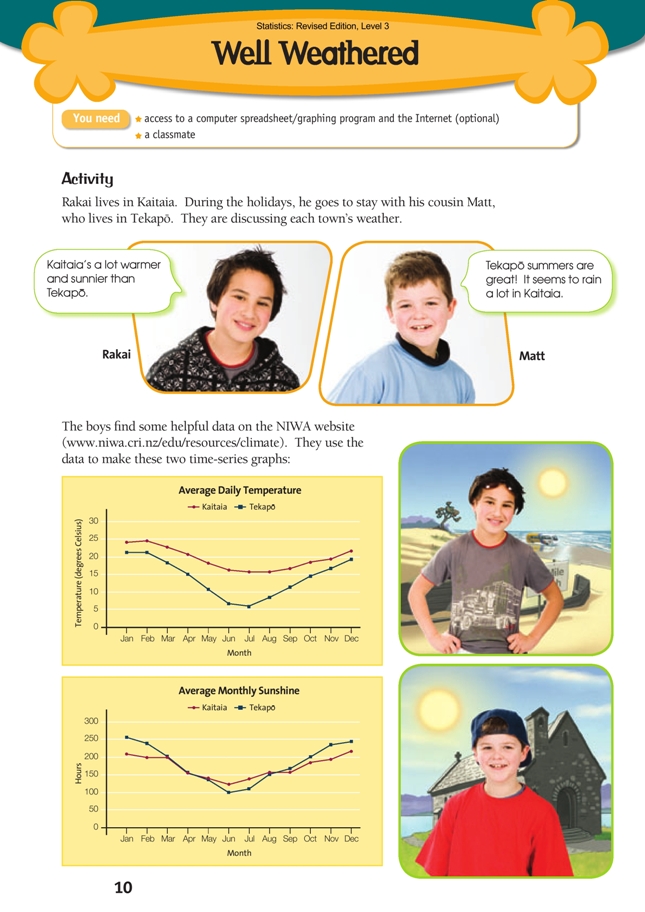
The two graphs on which the fi rst part of the activity is based are time-series graphs. They show the average daily temperature and average monthly sunshine hours per year. It is very important that the students think about exactly what this means in each case, and how the data in these graphs would have been gathered and collated. Students could do this thinking in pairs or small groups and then present their thoughts to the class.
The data-gathering and analysis process for the first graph would involve:
• Taking the temperature at regular intervals throughout each 24-hour period. (Yes, it’s daily, not daytime!)
• For each month, fi nding the average (mean) of all these observations.
• Doing the above for a number of years and averaging the results for each month (so that the data doesn’t just reflect one year).
Depending on where your students are at, you may need to explain or clarify the meaning of “average” and “mean”. While they need to have some understanding of the notion, they do not need to know how to calculate a mean to do this activity or the investigation that follows.
The data-gathering and analysis process for the second graph would involve:
• using an electronic device to detect sunshine and keep a running total of the hours for each month
• doing this for a number of years and averaging the results for each month.
Note that, although based on continuous variables (time and temperature), the data in the two graphs is actually discrete because, in each case, it is summarised as a series of 12 data values. The lines that join each pair of points are there to show the trend or pattern.
As the students do the different parts of the activity, encourage them to look at the detail as well as the overall picture:
• In what part of the year are the average daily temperatures closest together? How do the graphs show this?
• In what months of the year are the temperatures the most different? Why might this be?
• In what months are the average sunshine hours almost exactly the same for the two places?
How do the graphs tell us this?
When it comes to reasons for the differences between Kaitaia and Tekapo, the students need to go beyond what they can fi nd in the graphs and look for geophysical explanations. There is excellent scope here for investigating mathematics in a context that relates to another learning area.
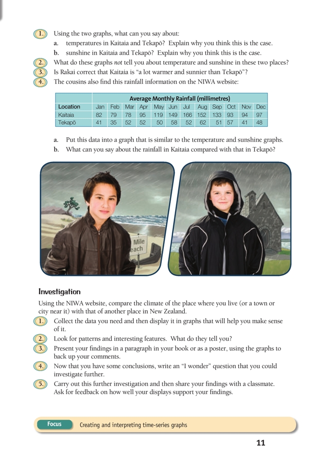
Investigation
This investigation involves the students creating their own time-series graphs. Such graphs can be conveniently created in most graphing programs. However, it may not be obvious how to get the horizontal (time) axis labelled correctly, so if you are not sure how to do this, it would be best to go through the process yourself fi rst. A likely process is:
• Select the number data only (not the names of the months) and create a line graph using the Line chart option.
• From the Chart menu (which appears on menu bar when you click on a graph), select Source data and then the Series tab. Click the cursor in the box that says Category (X) axis labels and then select the cells in your spreadsheet that contain the names of the months.
(Alternatively, type the names of the months into this box, separated by commas.)
• To get the labels on the horizontal axis aligned with the “tick marks”, right-click on the horizontal axis to obtain the Format axis options. Select the Scale tab and then remove the tick from the check box beside Value (Y) axis crosses between categories.
Data on the NIWA website is given to one decimal place. Students will need to be at stage 6 on the Number Framework if they are to understand how to round decimals to the nearest whole number. To round data to the nearest whole number in a typical spreadsheet, go to the Format menu, select Cells, then the Number tab. From the category list, select Number. A box labelled Decimal places appears to the right. Make this number zero and click OK.
During the course of the investigation, encourage the students to write full sentences in paragraph form when describing their fi ndings. They should also use information from their graphs to support any comments they make.
Answers to Activity
1. a. The average daily temperature is higher in Kaitaia than in Tekapo. This is true for all months of the year. The difference is least in summer (about 3–4 degrees in December and January) and greatest in winter (about 10 degrees in July). The main reason for the difference is that Kaitaia is much further north (and therefore closer to the equator) than Tekapo.
b. In spring and summer (from September to February), Tekapò has markedly more
sunshine than Kaitaia (as much as another 50 hours per month). The simple reason
for this is that when rain-bearing clouds from the west (the prevailing wind for that
season) meet the Southern Alps, they drop their rain, leaving the skies clear over
Tekapò. In the depths of winter (June and July), it has markedly less (see explanation
in 1a). In autumn (March to May) and early spring (August), the hours are very nearly the same. See question 4 for related data.
2. The graphs do not show how much the temperature varies within a day. The range
may be much greater in Tekapo than in Kaitaia. The graphs also do not show how consistent (predictable) temperature is throughout a month.
3. On average, Kaitaia is much warmer than Tekapò, but for all but 2 months, Tekapò has about the same or more sunshine hours than Kaitaia.
4. a. If you use a graphing program, your graph will look something like this. (You may have drawn a similar graph by hand.)
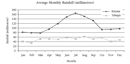
b. Kaitaia has a lot more rain than Tekapo. March, April, and October are the only
months when Kaitaia’s average rainfall is not at least twice that of Tekapò. In July,
the average rainfall in Kaitaia is over three times that of Tekapò.
Investigation
Investigations will vary. Your paragraph for question 3 should refer closely to your graphs. For question 5, if you agree with any suggestions from your classmate for improving your graphs, revise your displays accordingly.
Key Competencies
Well Weathered can be used to develop these key competencies:
• using language, symbols, and texts
• managing self
• relating to others.