This is a level 3 statistics activity from the Figure It Out series.
A PDF of the student activity is included.
Click on the image to enlarge it. Click again to close. Download PDF (1656 KB)
answer questions from histograms
compare graphs
construct a histogram
make a conclusion from graphs
This diagram shows the areas of Statistics involved in this activity.
The bottom half of the diagram represents the 5 stages of the PPDAC (Problem, Plan, Data, Analysis, Conclusion) statistics investigation cycle.
A piece of string or some thin card
A computer spreadsheet/graphing program (optional)
FIO, Level 3, Statistics Revised Edition, Way to Go, pages 16-17
Classmates
These activities give you an opportunity to introduce the students to histograms, which they will meet more fully in level 4 of the curriculum.
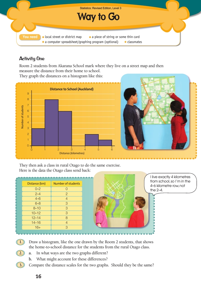
Activity One
This activity involves continuous data. You may need to remind the students what this is. They need to know that all non-rounded measurement data is continuous and that a continuous variable can take on any value within an interval. The graph that best displays grouped continuous data is the histogram. A stem-and-leaf graph could have been used to display this information, but a histogram is more visually informative.
Room 2’s histogram comes from the following table: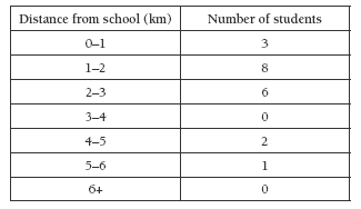
The speech bubble in the students’ book raises the issue of the boundaries between intervals: if a distance is measured to be 4 kilometres, should it be included in the 3–4 or the 4–5 interval? While there is no mathematical reason for it being one or the other, the usual practice is to include the boundary case in the next interval. We say, for example, that an interval includes “all distances that are equal to or greater than 3 kilometres but less than 4 kilometres”. This is too wordy to fi t in a column in a table. (Students will learn numeric short cuts at a later stage.)
By comparing the two histograms, the students should see that the data for Room 2 is very tightly clustered around the shorter distances, while the data for the Otago school is clustered around the further distances. In short, the Auckland students all live within a few kilometres (walking distance?) of school; the great majority of the Otago students live well beyond walking distance. (How do they get to school?)
Question 3 is there to make a simple point: the scale on the horizontal axis begins and ends wherever the data requires. It will vary with every graph. In this case, if the same scale were used, the fi rst histogram would have to be very narrow and the second very wide.
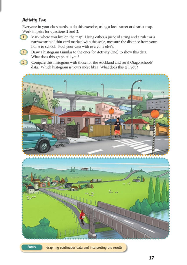
Activity Two
Before assigning this task, you will need to obtain a local street or district map and photocopy it for the students to use. You will also need lengths of string or narrow strips of thin card that can be marked out with units that match the scale of the map to be used.
If an appropriate map does not exist, then make it a homework task to fi nd the distance between home and school. A car odometer will do a good job! Encourage the students to predict the results before starting the exercise.
The measuring exercise in question 1 is valuable in its own right, not just as a means of creating data for a statistics task. The students should bend the string or strip of card to conform to the route they take from home to school. If using a strip of marked card, they can then simply read the distance in kilometres off the strip. If using string, they will need to measure the length against a ruler and then translate centimetres into kilometres. Students who are new to the notion of scale
will need an introduction. If you think it appropriate, you can simplify the measurement task by pre-preparing measuring strips and photocopying them for student use. In any case, you will need to discuss with your students what level of accuracy is to be aimed for. For most maps, 0.1 kilometre should be suitable. Given that whole kilometres (for example, 5 kilometres) are included in the 5–6 kilometre interval, a distance of (say) 4.95 kilometres should be rounded down to 4.9 (rather than up to 5) to ensure that it is included in the correct interval.
The aim in questions 2 and 3 is to have your students thinking about the realities behind the data portrayed in the graphs. Ask students to replace context-empty statements such as “the 5 to 6 bar is tallest” or “17 to 18 kilometres is an outlier” with interpretive statements such as “more students travel between 5 and 6 kilometres than any other distance” and “one student has to travel between 17 and 18 kilometres – that’s 4 kilometres further than anyone else in the class”.
In answering question 3, the students should compare these features and interpret them in terms of the context:
• symmetry (or lack of it)
• clusters (are there obvious clusters, and if so, where are they and how big are they?)
• range (the difference between the largest and smallest values in a data set)
• outliers
• median
• central tendency (the extent to which data is clustered around some central point)
and spread.
Once they have completed questions 2 and 3, encourage the students to:
• explain their answers to the class
• develop “I wonder” questions from their conclusions.
Answers to Activities
Activity One
1. Practical activity. Your graph should be similar to this: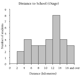
2. a. All the Auckland students live less than 6 kilometres from school, whereas most
of the Otago students live further than 6 kilometres from school.
b. Answers will vary, but city students tend to go to schools that are near their
homes, while many students at rural schools live on farms, which can be a
long way from school.
3. Because the distance range for the rural school is much greater than that for the city school, you would end up with a very long histogram for the rural school if the same scale were used.
The differences still show up very clearly when the scales are different.
Activity Two
Practical activity. Results and comparisons will vary.
Key Competencies
Way to Go can be used to develop these key competencies:
• using language, symbols, and texts
• relating to others.