This is a level 4 activity from the Figure It Out series.
A PDF of the student activity is included.
Click on the image to enlarge it. Click again to close. Download PDF (1174 KB)
Statistical thinking involves the exploration and use of patterns and relationships in data. There are four key processes:
- describing data – connecting the information in a table or graph with a real-life context
- organising and reducing data – ordering, grouping, and summarising data
- representing data – creating visual representations
- analysing and interpreting data – recognising patterns and trends and using them to make inferences and predictions.
In these activities, the students explore statistics relating to the use of cellphones, particularly their use in developing countries.
a calculator
classmates
Statistical literacy is the ability to read and interpret data. Statistics provides the means to organise large amounts of data in such a way that it communicates meaning. However, by presenting statistical information in a simplified form, it is also possible to manipulate or misinterpret it.
Statistical information is seen as adding weight to a discussion because it is thought to be scientific. People often accept statistics without asking how data has been gathered or whether crucial information has been left out. Students need to be able to intelligently evaluate and interpret the statistical information they will encounter in everyday life.
In these activities, students encounter three types of data display: a line graph, pie graphs, and a bar graph. Discuss with your students how each type of graph relates to the data it represents. Line graphs are often used to show changes over time, pie graphs are useful for showing proportions, and bar graphs are used to make comparisons between categories.
Students use the graphs to explore statistics related to global ICT trends and, in particular, the rapid growth of cellphone and Internet use. Some of the stories behind the statistics relate to changes taking place in developing countries. Hans Rosling’s dynamic use of statistical tools to communicate trends in developing countries (available on TED talks at www.ted.com) shows how exciting statistics can be.
Activity One
Analysing and interpreting data involves recognising patterns and trends and using these to make inferences or predictions.
You may need to support your students as they work with large numbers (billions).
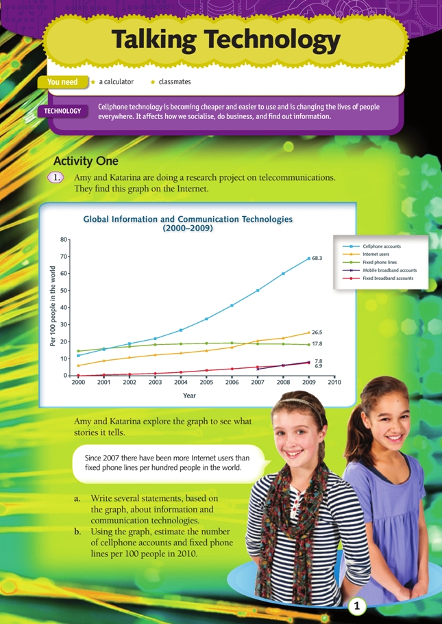
The graph on page 1 of the student book shows the number of ICT users per 100 people in the world. This is different from a percentage because some people have more than one cellphone. For example, in 2010, in Taiwan, the number of cellphones per 100 people in the population was 106.
Students may assume that population growth is responsible for the increased number of cellphone accounts – if there are more people on the planet, there are likely to be more cellphone users. However, this not the primary reason for the increase. The graph shows the number of cellphone accounts relative to the world population. Imagine that the world population is 100 and that 40 of these people have cellphone accounts. If the world population doubles (200) but the proportion of people with cellphone accounts stays the same (80 out of 200), the graph line would be fl at. Instead, the graph shows a much greater proportion of the world’s population now use cellphones.
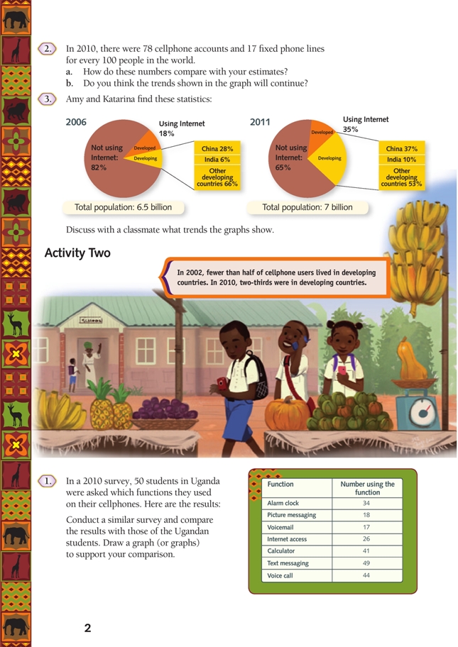
The pie graphs in the student book are based on information from the ITU World Telecommunication ICT indicators database (see www.itu.int/ITU-D/ict/facts/2011/material/ICTFactsFigures2011.pdf) Students may be surprised to learn that in 2011, an estimated 65 percent of the world’s population were not Internet users. Discuss what proportion of the “Not using Internet” sector is likely to be people living in developing countries. (In 2011, approximately 80 percent of the world’s population lived in developing countries. This means that about nine-tenths of the “Not using Internet” sector represents people in developing countries.)
Interpreting visual representations such as graphs develops the key competency using language, symbols, and texts.
Activity Two
The purpose of the survey is to gather data that can be used to compare New Zealand student cellphone use with Ugandan student use.
Converting fractions to percentages makes it easy to compare them. This is particularly true of fractions with different denominators. For example, it is easier to compare 56% with 67% than to compare 14/25 with 2/3.
There were 50 students in the Ugandan survey, so each fraction has a denominator of 50. Students can work out the percentages by doubling. For example, 34/50 = 68/100 = 68%. Remind the students that a fraction and its percentage are in fact equivalent fractions; the percentage sign is simply a notation for hundredths.
Students who struggle with the concept of equivalent fractions can make a visual representation of each fraction. For example, ask the students to draw a 5 x 10 rectangle on squared paper and to colour in 34 squares. Splitting each square in two will show that 34/50 is equivalent to 68/100 (68%).
Students could use a bar graph or a pictogram to display the data. A pie graph is not suitable. Pie graphs are often associated with percentages because they display proportions within a whole. However, in this case, different functions are not mutually exclusive; many of the survey participants used their cellphones for more than one function. This explains why the percentages do not add up to 100.
Support for English Language Learners
Supporting students with the language needed to describe data
Some students may need support with understanding and using language to describe statistical data.
Describing data can involve a number of language areas. For example:
- verbs describing trends (increase, decline, fluctuate, level off)
- tenses that signal time relationships (increased, is increasing, has been declining)
- prepositional phrases that signal time relationships (over the 10 years from, since 2005)
- prepositions and adverbs that modify numbers (from about … to …, approximately)
- language for making comparisons (much faster than, more … than, far greater than)
- long and complex noun phrases (the number of cellphone accounts, the cost of catching a bus from a rural area to a hospital, using cellphones to provide health services and information).
Note that discussing trends shown in a line graph often involves describing movement and time relationships. Verbs describing movement are often modified by adverbs (rose sharply, declined rapidly, fell slightly), and nouns and adjectives are also often used (a sharp rise, a rapid decline, a slight fall).
If your students need support with some of these language areas, focus on one at a time. Then revisit and build on the language each time you work with data, across time and in a variety of contexts.
Below is an example of a process to support students with understanding and using verbs to describe trends.
Language focus: Introducing verbs describing data movements
Before beginning Activity One, display an enlarged version of the graph on page 1 and tell the students that you will be talking about statistics displayed in graphs and tables. Explain that first you will explore graphs – their purposes and how they are made.
Discuss components of the graph. Prompt the students to identify the type of graph, the title, the x- and y-axes, and the key. Label each component. Discuss that line graphs often show changes over time.
Give small groups a set of eight simple line graphs. Each graph should show a different trend. Read out sentences that relate to each graph and ask students to identify the matching graph. Provide time between sentences for group discussion.
Ask the students what verbs they heard and then list them on the whiteboard. You could also include adverbs that modify the verbs and/or prepositional phrases modifying the numbers, according to your students’ strengths and needs.
Hand out cut-up sets of the sentences to each group and ask them to match them with the graphs. Display the correct answers and discuss the meanings of the verbs.
Create charts of language for describing trends, including categories like those in the example below, and display them in the classroom.
| Movement of Data | |||
| verbs | adverbs | nouns | adjectives |
| increase, rise decrease, fall, decline fluctuate remain steady level off | sharply steeply rapidly slowly slightly steadily | increase, rise decrease, fall, decline | sharp steep rapid slow slight steady |
Use the information in the graph on page 1 of the student book to make sets of five graphs, with a separate graph for each of the information and communication technologies. Working in groups of five, students describe the information shown in their graph, without letting their classmates see it. The other students transfer the information to their own copies of the graph. If necessary, provide speaking frames to help students participate more easily. For example:
From 2000 to 2006, fixed phone lines __________ from about __________ to approximately __________.
From 2006 to 2009, they __________ from __________ to __________.
Ask the students to compare their combined results with the graph on page 1.
For students who need support with constructing and describing bar charts, use a similar process to that described for line graphs.
Work through an example of Activity Two, question 1, co-constructing an example bar chart and comparisons. Then have students each conduct a survey, displaying their results in a bar chart. Have students sit back-to-back in pairs, describing their bar charts to each other and adding the other person’s information to their chart. This task is likely to involve the use of noun phrases and language to modify numbers. Encourage the students to make comparisons by asking them to construct sentences from their graphs, sharing their sentences with other pairs. They could then make charts and write sentences that compare their results with those of the Ugandan students.
Technology-related student activities
- Discuss information and communication technologies used in your home and at school. How would life be different if these technologies were not available?
- Early versions of cellphones could only be used for making calls. Now cellphones are multifunctional. Choose a simple, everyday technological product and brainstorm ways to increase the number of functions it performs.
- Use information and communication technologies to collaborate on a project with students at other schools (nationally and internationally).
Exploring the technology-related context
mHealth is the provision of health-related services via mobile communications. In developing countries, mHealth initiatives seek to address obstacles related to large populations, high incidences of disease, shortages of health workers, limited money for healthcare services, and a lack of infrastructure for remote patients.
Some benefits of mHealth initiatives include:
- increased access to healthcare information, especially for remote communities
- improved ability to diagnose and track diseases
- more effective communication of public health information
- access to education and training for health workers.
Answers
Activity One
1. a. Answers will vary. Examples include:
- The proportion of people with cellphone accounts has increased from about 12 per 100 people to 68 per 100 (5 times) over the 10 years from 2000–2009.
- Cellphone use is increasing much faster than the other information and communication technologies shown on the graph.
- The proportion of people with fixed line accounts has been declining since 2005. (This could be because people don’t need a fixed phone line if they have a cellphone.)
b. Answers will vary. If the trends continued, there would be about 78 cellphone accounts and 17 fixed phone lines for every 100 people.
2. a. The number of cellphones is similar to what the line on the graph would suggest.
b. The trend may continue for a while but it is unlikely that there will be more cellphone accounts than people in the world. It is likely that the number of fixed line accounts will continue to decline slowly.
3. Discussion will vary. Globally, Internet usage nearly doubled between 2006 and 2011. The biggest increase has been in developing countries, particularly China and India. In 2006, less than half of the world’s Internet users lived in developing countries. In 2011, nearly two-thirds of Internet users lived in developing countries.
Activity Two
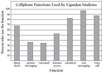
1. Results will vary. The easiest way to compare survey results from two different groups is to convert the values to percentages. Here are the Ugandan survey results in percentages:
| Alarm clock | 68% |
| Picture messaging | 36% |
| Voicemail | 34% |
| Internet access | 52% |
| Calculator | 82% |
| Text messaging | 98% |
| Voice call | 88% |
Here is a graph of data from the Ugandan survey. Your data may be quite different.
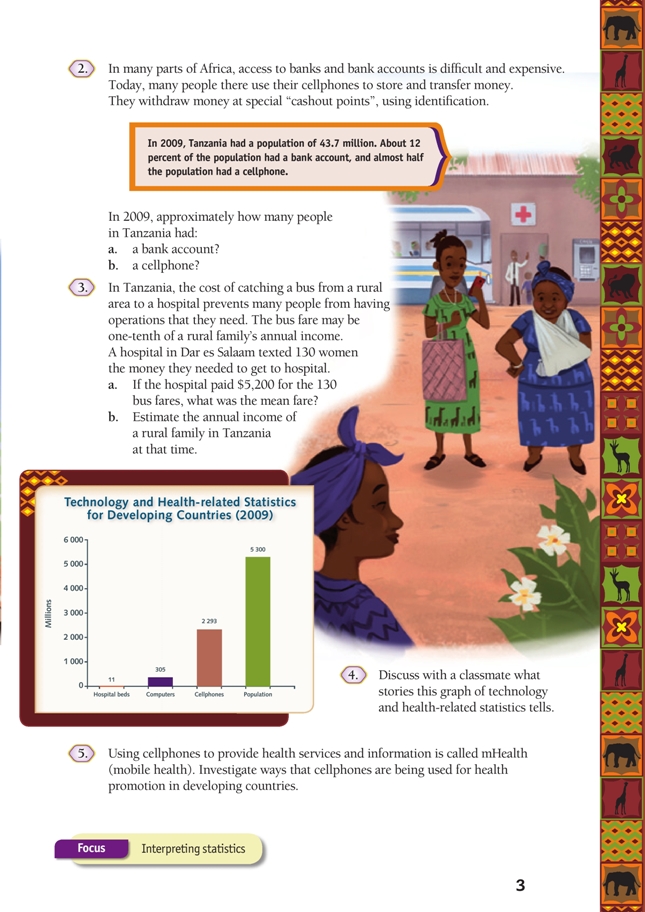
2. a. About 5.2 million (43.7 x 0.12 = 5.244)
b. About 22 million (43.7 ÷ 2 = 21.85)
3. a. $40 ($5 200 ÷ 130)
b. $400 ($40 is one-tenth, $40 x 10 = $400)
4. Discussion will vary. People in developing countries have much greater access to cellphones than to computers or health-related resources, such as hospital beds.
5. Investigation