The purpose of this unit is for students to investigate data related to a science context: predator control. Within this unit, students develop their skills and knowledge for finding patterns and relationships in data.
- Develop questions that can be answered by interrogating data.
- Use tables and graphs to display and analyse data.
- Discuss features of data displays.
- Find patterns, differences, and relationships in data.
- Draw conclusion from data, related to a question in context.
The statistical investigation cycle begins with a problem that arises in a realistic situation and is usually framed as a question. In this unit the situation is the protection of native animal species by predator control. Sometime the data needed to answer an enquiry question must be collected, sometimes the data already exist.
To answer a statistical question, an investigator must decide on the appropriate variables needed to answer the question. A variable consists of an attribute, a characteristic, and a measure, a way to quantify the attribute. For example, a question might be “Does predator control improve the survival of native species?” A variable that measures predator control is needed, as is at least one variable related to populations of native species. Predator control might be measured by numbers of predators trapped. Native species population might be measured by sightings within a day.
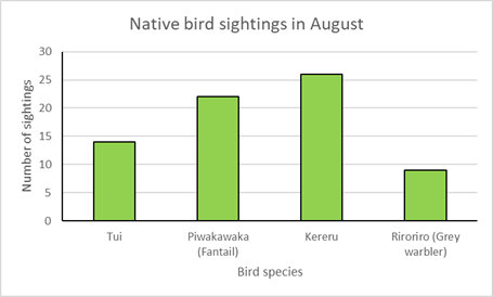
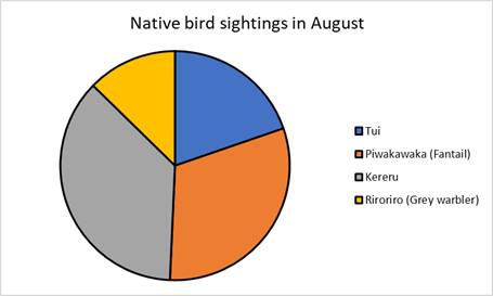
Once appropriate data has been collected, it needed to be interrogated to find patterns, differences, and trends. Displays, such as tables and graphs, are used by statisticians for two main purposes; to discover patterns and relationships, and to communicate what they have found to an audience. This unit deals mainly with categorical and time series data. Categorical data is grouped into categories that have a similar characteristic. For example, data about native bird sightings might be presented in a table, like this:
| Bird species | Sightings in August |
| Tūī | 14 |
| Piwakawaka | 22 |
| Kereru | 26 |
| Riroriro | 9 |
These data might be displayed as a bar graph to highlight relative frequencies (numbers) or as a pie chart to highlight proportions.
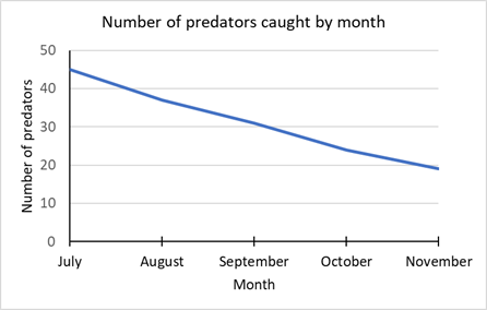
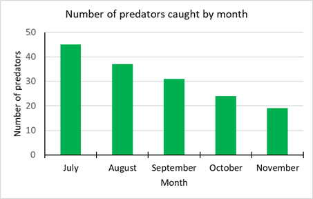
Time series data is data gathered over time. Since time is continuous, time series data can be displayed using a line graph, or a bar graph to highlight discrete time periods such as months or years. For example, the number of predators trapped in each month might be displayed in these ways.
The learning opportunities in this unit can be differentiated by providing or removing support to students, and by varying the task requirements. Ways to support students include:
- modelling the construction of tables, graphs, the analysis of data, and the making of summary statements
- providing extended opportunities for students to explore the graph types featured in this unit
- providing prompts for writing descriptive statements
- extending students by having them apply their percentage calculations to the analysis of graphs and tables
- strategically organising students into pairs and small groups in order to encourage peer learning, scaffolding, and extension
- working alongside individual students (or groups of students) who require further support with specific areas of knowledge or activities (e.g. identifying types of words, creating a graph).
The relevance of this unit can be enhanced with the establishment of links to your local area. Consider how learning around local predator-free spaces, eco-sanctuaries, predator eradication measures, and environmental advocacy groups might be used alongside this unit, in order to form these local connections.
Te reo Māori kupu such as taurangi (variable), tūtohi (table, chart of data), ōrau (percent), kauwhata pou (bar graph), kauwhata pouhere (histogram), whakakapi (conclusion), kohikohi raraunga (data collection), kauwhata rārangi (line graph), and ia (trend) could be introduced in this unit and used throughout other mathematical learning.
- Access to the internet and appropriate graphing software.
- PowerPoint
Session 1
- Explain to the class that the Department of Conservation (DoC) and many other organisations are working to make New Zealand ‘predator free’ by 2050 (see the Predator Free NZ website for more information). Discuss the reasons for a predator-free Aotearoa New Zealand.
- What is meant by ‘predator free’?
- Why does DoC want to reduce the numbers of some animals?
- What data might the decision be based on?
- How can DoC measure their effectiveness?
- How can we (at school, at home, around the community) assist in achieving this goal?
- What variables might have been measured to suggest the need for the ‘predator free by 2050’ pledge?
- What are the variables should be measured to recognise the success of the goal to be predator free?
- What data collection methods can the Department of Conservation use to count wildlife and predator populations over the next 30 years?
- Record the key points from discussion in an appropriate format (e.g., shared digital document, mind map, on sticky notes). You might need to address specific statistical concepts (e.g.,What is a variable?) or provide time for students to research the information needed to answer these questions.
- Use slide 1 of the PowerPoint to discuss kiwi numbers over time. Ask students to discuss:
What does the graph tell you about the need for a predator-free New Zealand?
Can students read from the graph?
For example, What was the estimated number of kiwi before people came to Aotearoa?
Can students tell about the graph?
For example, What does the graph tell you about numbers of kiwi?
What might have caused kiwi number to decline?
Can students reason from the graph?
For example, What is likely to happen if the trend continues? - Ask students to look at https://savethekiwi.nz/about-kiwi/threats-to-kiwi/.
What are kiwi numbers today? (Estimated at 70,000 kiwi)
What is happening to kiwi populations in the wild? (2% decline per year)
What is meant by managed areas? (Dedicated areas that are ‘pest free’)
Session 2
This session focuses on comparing the distribution of predators over time from a graph display.
- Explain to students using slide 2 of the PowerPoint:
A local bird sanctuary is protected from predators by good fencing and a trapping project run by volunteers. A record is kept of all the predators caught in the traps and when the traps are sprung (by a predator that ‘got away’). - Display the graph of the data for the first five years of the trapping programme (shown below and slide 3) and discuss, using the following points:
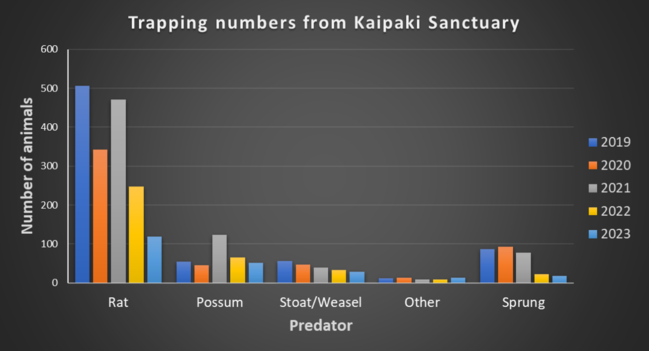
- Describe the overall trend in trapping success shown in this graph.
- Which type of predator is the most prevalent in the traps?
- What animals might be included in ‘other’?
- In early 2022, the bird sanctuary changed to using New Zealand made automatic resetting traps. That means the traps automatically reset without a human being there. Use the data below to comment on the effectiveness of the new traps.
- Does the data tell you how many predators are present in the bird sanctuary?
- How could the number of predators be estimated?
- The graph shown above has the data grouped by predator. Why is this a useful choice of grouping?
- If the data was grouped by year, what trends/patterns would be more obvious to see?
Show students the following table. This presents the raw data (number of animals caught per calendar year) from a local bird sanctuary’s predator trap programme.
Year/predator Rat Possum Stoat/weasel Other Sprung 2019 506 54 56 12 87 2020 342 46 47 14 93 2021 471 123 39 9 78 2022 248 65 33 8 22 2023 119 52 28 13 18 - Discuss and explore, using the following prompts:
- If a trap has been sprung, we can assume that a predator was present but cannot count it as caught. Why not?
- Find the total number of predators caught in traps each year.
- Graph the total number of predators caught in traps each year.
- Comment on the overall trend of the total number of predator’s caught in in traps each year.
- Model analysis of the data and creation of a graph, as necessary in response to the needs of your class. Examples of graphs are provided on slides 5 and 6.
- Explain to students (see slide 7):
In 2024, the bird sanctuary manager decided to further reduce the rat and possum population with better management of visitor behaviour. They did this by banning food consumption within the predator-controlled area and removing the rubbish bins (as they were no longer needed). Show students the data below (slide 8). Ask them to comment on the effectiveness of the management of visitor food and rubbish.
Year/predator Rat Possum Stoat/weasel Other Sprung Total 2019 506 54 56 12 87 628 2020 342 46 47 14 93 449 2021 471 123 39 9 78 642 2022 248 65 33 8 22 354 2023 119 52 28 13 18 212 Students should notice a differential effect on rats and possums.
Why were rats more affected by the ban on rubbish?- Animate slide 8 to show students the graph below. This displays the total number of predators trapped by year.
When will the sanctuary become predator free?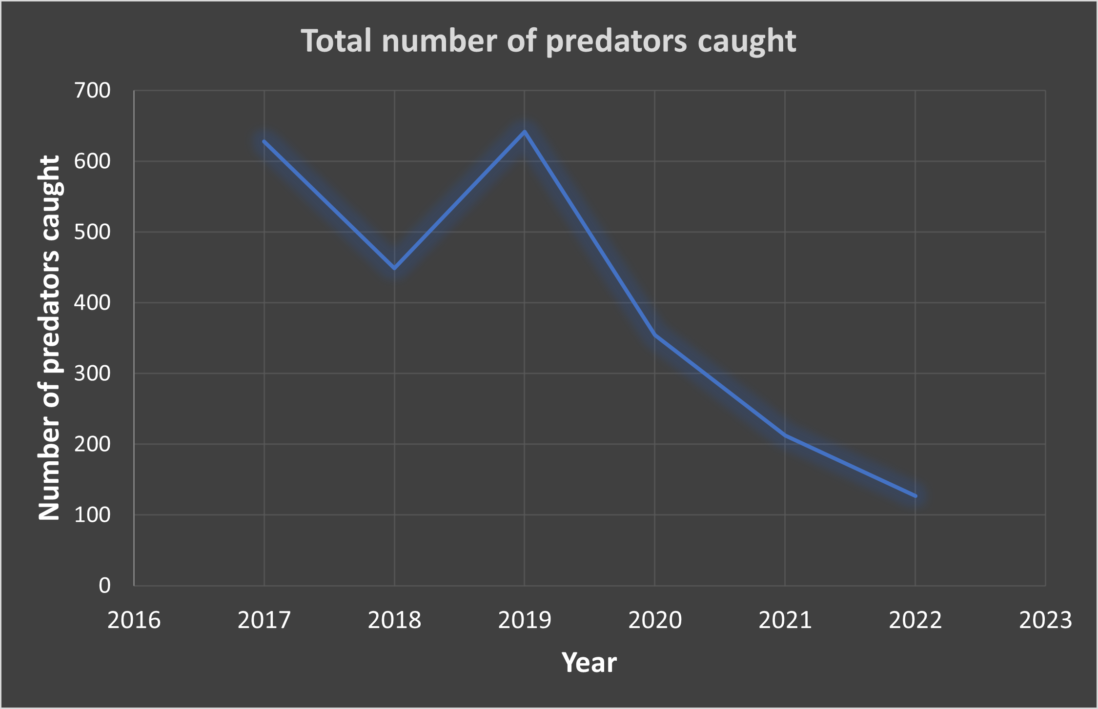
Let students discuss the trend in small group and extrapolate (predict ahead) when there will be no predators.
Session 3
This session focuses on communicating findings from a statistical investigation, using appropriate displays.
- Explain to students:
Imagine you want to trap pests around your backyard.
Why will you need to be careful about how you trap animals?
There are many reasons to take care. Using poison runs the risk of inadvertently hurting pets. The safest way is to use pest traps with bait and spring traps. There are many excellent videos online about trapping pests, including this one from Auckland Council:
https://www.youtube.com/watch?v=YCVnb5cZwH0 Explain to students (use slide 9):
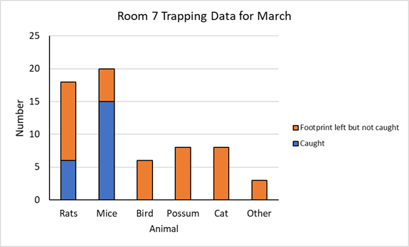
Room 7 begin a programme of pest control using proper wooden traps. There is a reserve next to the school with some bird life.
They hire 15 traps from the local council and locate the traps between the reserve and possible food sources, such as the school compost bin and rubbish skip. They also place traps beside the old hall.
Here is the data from their first week of trapping:Monday Tuesday Wednesday Thursday Friday Rats 2 1 3 2 0 Mice 3 2 4 2 2 Other 0 0 2 1 0 Sprung 2 4 4 6 4 Nothing 8 7 6 3 9 - Discuss: What conclusions can you draw about the predators around the school grounds from these data (slide 10)?
- How many traps are accounted for each day? Is that all the traps?
- What might be in the ‘other’ category? Would it be useful to list these by name?
- Predict what the data for the second week might look like?
- How often might Room 7 need to run a trapping programme?
- Have students look at the data collected by Room 7 over the week of predator trapping. The data in this table are grouped by trap results, including predator type, over time.
- Tell students that a line graph, with a differently coloured line for each row in the table is a suitable method of graphing. You might explore some different line graphs to come up with a conclusion as to why this is.
- Have students construct a line graph using the data recorded in the table. Consider what grouping is appropriate and the level of modelling and structured guidance needed. Provide time for students to share their graphs with their peers, compare any differences, and revise their graphs in reflection of these differences.
- Describe the trends shown by the lines in the graphs (slide 11). You may use terms such as: increasing, decreasing, constant, fluctuating/varying, no clear trend.
- Do the table and graph show the trend in effectiveness of Room 7’s traps.
How could we improve our displays, so the trends are more obvious? - Tell students:
To show the total count for each day, with the trapped predator, missed predator (sprung) and inactive traps separated, a stacked column graph could be used.
Ask students to graph the data in this way and then describe the trends shown in their tables. Terms such as increasing, decreasing, constant, fluctuating, no clear trend might be used. Look at slide 12 for an example of the graph.
Session 4
In this session students gather a range of data to support a more informed predator survey. That includes species that may not be trapped, other forms of predator, and predicting the predator population of the area.
- Explain to the class (slide 13):
Room 7 students want to know if they are effective in reducing the number of wildlife predators around the school. They collected data on the activity in their 15 predator traps.
However, the students want to find out more about any predators that had not been caught in the traps. They have prepared ink pads and plain cards for the entrance to each of the trap tunnels. The predators going near the tunnels will get ink on their paws/feet and will leave a footprint record of their visit.
Before they collect their data, the students need practice in identifying footprints. - Use slide 14 to have a quiz about identifying footprints. Show students the slide then animate it with mouse clicks to check answers.
Name each print by the creature that created it. - Have students consider the footprint cards in front of the traps, and decide which of the following are valid statements, with appropriate justification.
- The footprint record can be used to count how many wildlife predators visit the traps.
- The footprint record will show how many wildlife predators are in the area.
- The footprint cards could be used to identify the predators that are springing the traps and escaping.
- Different species will leave a different coloured footprint.
- The footprint cards will help the class work out which are the most prevalent species of predator.
Tell students: After a week of using the footprint cards, the class recorded the following data:
Caught Footprint left Escaped Rats 6 13 7 Mice 5 11 Bird 0 2 Possum 0 5 Cat 0 1 Other 0 3 - Present students with the following task:
- Can you complete the section ‘escaped’? Note that cats and possums are too large to fit through the tunnel.
- What percentage of each type of wildlife predator has been successfully caught in the trap it enters?
- Can the class use this information to estimate the wildlife predator population in the area? How?
- How can the class use this information to improve their traps?
- How can the class use this information to evaluate the effectiveness of their 15 traps over time?
- Explain to the class: After a month of using the footprint cards, the class recorded the following data in a stacked bar graph (slide 15):
- Pose the following tasks:
- Estimate the total number of predators that visited traps but were not caught.
- Why can you not be certain of the total number of predators that visited traps but were not caught?
- Find the ratio of the total number of caught to visiting (but not caught) rats and mice.
- Looking at the data for one month, can you make the call that the traps work better for any one species of predator? Explain your answer.
Session 5
This session focuses on predicting the number of rodents that are still alive and frequent the school grounds.
- Tell the students:
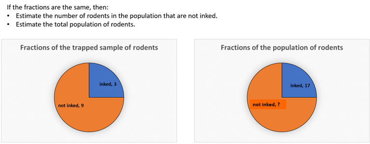
Using the ink pad to leave footprints is also useful in another way. Predators caught during the week after they escaped the traps have ‘tell-tail’ ink on their feet.
How might the number of trapped predators with inked feet be used to estimate the total population of predators? - Return to slide 15.
How many mice and rats have escaped and have inked feet? (17 rodents)
How might these 17 rodents be used to estimate the total rodent population? - Use a bag of counters to simulate what happens with a population of 34 rodents, 17 of which had inked feet. 17 rodents have clean feet. Put 17 black counters and 17 white counters into a paper bag.
Imagine that 10 rodents come out of hiding and enter the traps.
How many rodents do you expect to have inked feet?
Students might speculate that 5 of the rodents in the traps will have inked feet.
Why do you predict 5 rodents with inked feet?
Students might comment that 5/10 is the same fraction as 17/34. - Ask students to carry out their own simulation with counters (17 black and 17 white) in which 10 rats are drawn from the population.
Let’s explore what happens as the fraction of the rodent population that has inked feet changes. There are still 17 rodents with ink on their feet, but they are only one third of the population.
Collate the results of the simulations using a dot plot. The distribution should look something like this (slide 16):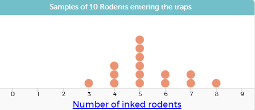
- Discuss the variation in the number of inked rodents caught in the traps. Note that 5 is at the centre of the distribution and talk about it being both mode and median.
If that is true, how many rodents do not have ink on their feet? (34)
How many rodents are there in total, in the population? (51) - Students might use counters in a bag or technology to create a distribution of samples of 10 rodents entering the traps. Slide 17 shows a video with instructions about how to set up a simulation and display the results as a dot plot.
- Let students use CODAP to simulate the 17:34 ratio in the population and what that means for samples of 10 rodents entering the traps. Students might experiment with changing the sample size to 15 rodents entering the traps.
What changes and what stays the same as sample size increases?
Look for students to notice that the central value of the distribution changes but the mode or median stays at one third of the sample size, i.e., 17/51 = 1/3 = 5/15. - Give students this scenario (slide 18).
17 of the rodents in the population have inked feet. During the next week 12 rodents are caught in the traps. 3 of the trapped rodents have inked feet.
Use these data to estimate the population of rodents that frequent the school grounds.
Carry out a simulation to check the accuracy of your estimate. - Slide 19 might be used to guide students towards a proportional estimate. If 4/12 or ¼ of the trapped rats have inked feet, then it is reasonable to assume that 17 is ¼ of the total population. 4 x 17 = 68 so the best estimate of the population is 68 rodents.
- Slide 20 has a video that shows how the estimate of 68 rats might be tested by taking samples of 12 rodents, to simulate 12 rodents getting trapped. Use that video if needed to support students to create their own simulation.
- Discuss the reliability of estimating a population from a sample.
What factors might affect the reliability of the estimate? - Present this scenario for students to apply their understanding.
At another Waimiha School, Room 3 is also trapping possums using humane cage traps. Beside the school is a large glade of native trees and birds are beginning to return, especially kereru and tui.
Using ink pads, the students know that 9 possums escaped the traps on the first night. Those possums got ink on their feet.
On the second night 16 possums were trapped. Six of those possums had ink on their feet.
Use those data to estimate the possum population in the glade and test the reliability of your estimate with a simulation. - Since 6/16 = 3/8 or 37.5% students might predict that the 9 possums with inked feet are 3/8 of the total population. So, 1/8 of the population is 3 possums and the total population is estimated at 3 x 8 = 24 possums.
- With an estimated population of 9:15 inked to non-inked possums a simulation produces a lot of variation from the 6/16 which is the original sample.
Slide 21 shows the results of six simulations.
What do the displays tell you about the accuracy of the population estimate?
Session 6
- Before the year 8 class implemented a ‘predator free’ programme, it took part in Landcare New Zealand’s garden bird survey. The class were interested to learn that over the past ten years in their area, there has been an 20% increase in the tui count but a 10% decline in the fantail count and a 25% decline in the kererū count.
Together, show this information using the line graph on slide 23. Discuss features, such as:- Specific points, e.g., How many kererū were sighted in 2020?
- Trends, e.g., What pattern can you see in the number of tui sightings over the 10 years?
- Reading beyond the data, e.g., What might the number of piwakawaka (fantail) sighting be in 2024, 2030,…?
- Discuss, using the following prompts:
- How have the birds been counted in the ‘garden bird survey’?
- The ‘garden bird survey’ is carried out on the same date each year. Why is this important?
- How reliable are the trends shown from the results of the ‘garden bird survey’?
- What other methods of tracking bird populations are there in New Zealand?
- Tell students: In the same region, some species of bird have shown an increase in population while others have shown a decrease.
- Have them suggest how this might affect the population for each of the following factors. They should explain their suggestions where possible.
- Reducing predator numbers.
- Reducing food supply.
- Reducing predator numbers and reducing food supply.
- An increase in the populations of other species of birds.
- Decreasing available habitat (e.g. clearing bush and building more houses)
- Provide time for students to find out about the trends in population of the birds in their region as measured in the Landcare Research New Zealand garden bird survey. They should consider how the native bird counts trending compare with the introduced species, and should show the information on a suitable chart.
- Tell students: Predators such as rats and mice, possum and cats are not the only threats to native bird populations.
- Pose the following tasks:
- Find out about other possible threats.
- Which of the threats to native birds are of particular relevance to your community?
- Which of threats can be mitigated – and how?
- Create an infographic to display what you have found.
Session 7
This session focuses on communicating findings using suitable displays.
You might investigate how predators, like rats, stoats, and possums, impact on native bird populations. Tell students (use slide 24):
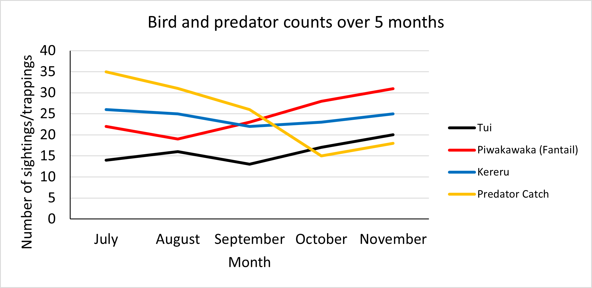
To measure the effectiveness of their predator traps on the bird population at their school, the Room 3 class have taken a bird count for one day each month, over a period of five months. The results are as follows:Month July August September October November Tūī 14 16 13 17 20 Piwakawaka (Fantail) 22 19 23 28 31 Kereru 26 25 22 23 25 - As a class, construct a suitable graph so that:
- a sense of a time series trend is shown,
- the total number of these three types of bird sighted at each survey is shown,
- the count for each species is also shown*.
*Note that this total is of the three species counted and not of all birds present that day.
- Discuss, using slide 25 and the following prompts:
- How might the seasons affect the trend shown in these data?
- What other possible factors might affect the reliability of these data?
- From these data, can you say that one type of bird is more prevalent than another?
- From these data, can you comment on any trends in the population of the tui, piwakawaka/fantails or kererū?
Tell the students: the class wanted to compare the one-day bird surveys with the monthly total predator catch numbers from their trapping programme. The results are shown below (slide 26):
Month July August September October November Tūī 14 16 13 17 20 Piwakawaka (Fantail) 22 19 23 28 31 Kereru 26 25 22 23 25 Predator catch 35 31 26 15 18 - Have students complete the following tasks:
- Construct a single line graph to show the monthly predator catch count from July to November and the bird counts for the same month.
- Describe the trend of the monthly predator catch count from July to November as either increasing, decreasing, constant or no clear trend shown.
- Describe the trend of the one-day total bird count from July to November as either increasing, decreasing, constant or no clear trend shown.
- Share the patterns and differences students noticed in their line graphs. You may use slide 27.
- Discuss:
Is there a relationship between the number of predators trapped and the number of bird sightings?
Why might that relationship exist? - Have students evaluate the reliability of the data collected by the students in Room 3. The data on bird populations and predator catch numbers was recorded over a period of five months. They should consider the following:
- Was this a suitable period of time for trends to become apparent?
- What effect would the seasons during which the data were collected have on the apparent trends?
- What would you expect the trends in bird population and predator catch numbers to be over a longer period of time (i.e., more than a year)?
- What other factors would come into play over this longer period?
- To further discuss the relationship between predator trappings and bird sightings, show this scatterplot. It shows data from conservation sites around Aotearoa.
What does the graph show?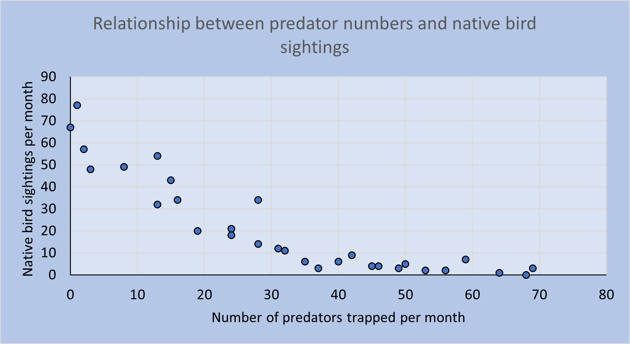
Dear family and whānau,
As part of our mathematics programme, we have been carrying out statistical investigations in a science context: predator control. Ask your child to share one or more of their graphs with you, and explain what the graph shows.