This is a level 3 statistics activity from the Figure It Out series.
A PDF of the student activity is included.

Click on the image to enlarge it. Click again to close. Download PDF (1599 KB)
create a tally chart
decide what chart or graph is best to answer questions from
create a bar graph
create a pie graph
This diagram shows the areas of Statistics involved in this activity.
The bottom half of the diagram represents the 5 stages of the PPDAC (Problem, Plan, Data, Analysis, Conclusion) statistics investigation cycle.
Classmates
Activity One
This activity is based on Wiremu’s quest to fi nd out what pets other students in his class have, presumably to help him decide what pet he will choose for his birthday present. It introduces data cards as a statistical tool. The question Wiremu asks is an “open” question, in which his classmates can name any pets.
Data cards are a means of collecting data in such a way that it can be easily sorted and re-sorted. The data on a card relates to a single person or object. These two cards were collected in surveys on travel to school and lunch activities:
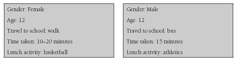
Data cards can be simple, containing only one or two variables, or more complex, as in the examples above.
Use this activity to introduce the students to the concept of data “cleaning”. By this, we mean removing irrelevant or difficult-to-interpret data. The cards in this activity contain a number of comments that come into this category. For example, “1 is sick and being treated” is beside the point. The students will also have to decide how they will interpret “a cat in Aussie” or “1 cat, but she’s my mum’s”. Any data that appears “dirty” can be removed, but you should encourage your students to discuss what impact this will have on the overall distribution.
The students also need to understand how to use tally charts. If your students have had little experience with them, remind them that the fundamental idea is to group marks in fives to make totalling easy.
Question 4 can be discussed and answered in small groups, with a follow-up teacher-led discussion. Particular attention could be paid to the place of fish in the statistics. Do they warrant the dominant position they have in the first chart? This activity provides a good example of the fact that the same data set can often be used to answer different questions. In this case, there is a world of difference between the questions “How many cats do my classmates have?” and “How many of my classmates have cats?”
Wiremu might go on to ask further “I wonder” questions and answer them by collecting other information from his classmates. For example, “I wonder why cats and dogs are the most popular pets?” or “I wonder why so few people have turtles (or axolotls or horses) as pets?”
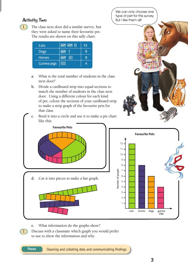
Activity Two
This works best as a teacher-directed activity. Making a strip graph from the tally chart data provides an excellent opportunity for the students to visualise the link between the data and its visual representation.
The students need to divide their strip of cardboard into 30 equal parts to match the favourite pet data from the class next door. Before the students start the task of dividing up the cardboard strips, you could try a practical activity with the class. Give eight students red cards to identify them as horses, give four students blue cards to represent guinea pigs, and so on. Then ask them to arrange themselves so that they model:
• a strip graph
• a pie chart
• a bar graph.
This will help the students to understand that they are dealing with the same data displayed in three different ways, not three distinct sets of data.
Discuss how each type of graphical display represents the data. The strip graph and pie chart show the relative proportions of data in each category. The bar graph shows the actual frequency of each data type (for example, the number of horses). Reinforce the need for the bars to be separated by a gap to show that the data is in the form of discrete categories.
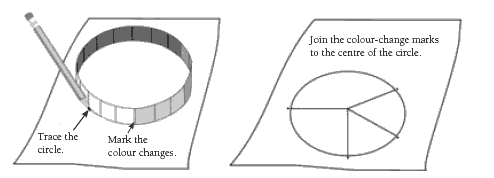
To make the pie chart in 1d, the students can put the bent strip graph on a piece of paper and trace its outline, marking where the colour changes. They then mark a centre point and join it to the marks on the circumference of the circle:
The students should label their graphs meaningfully and provide a succinct, accurate title for each.
As an extension to question 1e, your students could:
• use a graph to estimate what fraction of the class prefers cats. (Which graph did they use and why?)
• use the tally chart to work out what fraction of the class does not prefer cats
• use the tally chart to work out what fraction of the class prefers cats and then compare this answer with the estimate based on the graph
• work out what fraction of the class prefers horses and dogs.
Question 2, which involves evaluating the effectiveness of the various displays, provides another opportunity to develop statistical literacy.
Answers to Activities
Activity One
1. Discussion will vary. Unnecessary information would include “my sister”, the dogs that were dead now or had been given away, the sick bird. (The fact that the mice are female could be relevant if they turn out to be pregnant and increase the pet population!)
Data that is difficult to interpret: You might wonder if the “cat in Aussie” really counts as a pet and whether to include the “2 goldfish in a bowl” as the owner doesn’t seem to regard them as pets. You also need to decide whether to include the cat that is “my mum’s”.
2. a. A possible tally chart (taking into account the comments in question 1) is: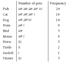
b. Fish (because this category has the most tally marks [frequency])
3. a. (Taking into account the comments in question 1)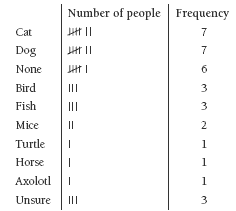
b. Cats (because this category has the most tally marks [frequency])
4. Comments will vary. The first tally chart tells Wiremu how many different pets there are. The second tally chart tells him how many people have those pets – so if Wiremu wants to know how many people like certain sorts of pets (regardless of number), then the second tally chart is the better one. The first tally chart also creates a somewhat false picture by counting each fi sh as a separate pet.
Activity Two
1. a. 30 (on the day that the survey was conducted)
b.–d. Practical activity
e. How many people chose each particular kind of animal as their favourite pet
2. Choices will vary, but most people will prefer to use the bar graph because it shows at a glance how many people prefer each pet.
Key Competencies
Petty Differences can be used to develop these key competencies:
• using language, symbols, and texts
• managing self
• relating to others.