This is a level 3 statistics activity from the Figure It Out series.
A PDF of the student activity is included.
Click on the image to enlarge it. Click again to close. Download PDF (1603 KB)
construct a bar graph
make conclusions based on the data
construct a pie graph
decide which graph best shows a viewpoint
This diagram shows the areas of Statistics involved in this activity.
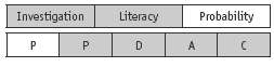
The bottom half of the diagram represents the 5 stages of the PPDAC (Problem, Plan, Data, Analysis, Conclusion) statistics investigation cycle.
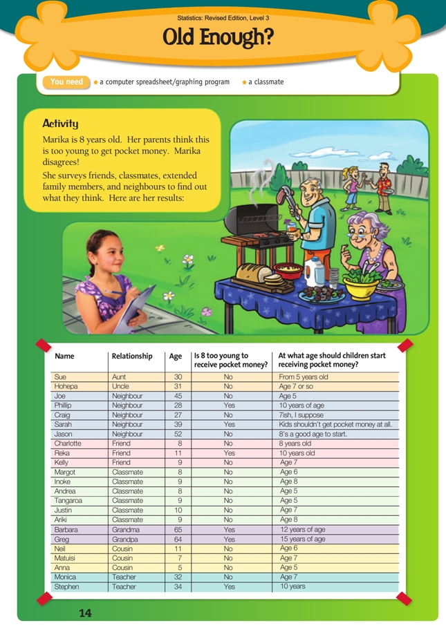
A computer spreadsheet/graphing program
A classmate
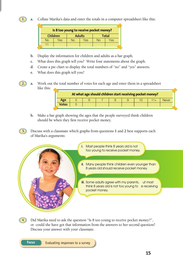
This task gives the students the opportunity to display and interpret a given set of data. A wholeclass discussion as to what to do with the data, including the responses that are a little unclear, would be useful before the students attempt question 1.
Discuss with your students the graphing of discrete data and the various bar graph options available with your spreadsheet or graphing program and the advantages and disadvantages of each type. The students should make their graphs completely self-explanatory. This means labelling the axes, providing a key or legend if necessary, and giving the graph an accurate title.
Question 1b asks for a bar graph. If creating the graph in a computer graphing program, the tricky bit is to get the horizontal axis labelled correctly because it has two sets of labels (No, Yes, No, Yes, No, Yes and Children, Adults, Total). A likely process is:
• Copy the table in question 1 into a spreadsheet, just as it appears in the book.
• Selecting only the number data, create a bar graph.
• From the Chart menu (which appears when you click on a graph), select Source data and then the Series tab. Click the cursor in the box that says Category (X) axis labels and then select all the cells in your spreadsheet that contain the Children, Adults, and Total labels AND the Yes and No labels. Click on OK.
A pie chart is asked for in question 1d. This can easily be created by computer, but if the students are doing the task by hand, make sure they know how to divide a circle into the correct proportions using a calculator and a protractor.
Question 2 involves drawing a second bar graph, this time showing the suggested ages. Along with the first bar graph and the pie chart, this third graph provides the basis for the discussion in question 3.
The answer to question 4 is yes, but some students may find it difficult to see why. Discussion should highlight the importance of thinking extremely carefully about what data is wanted and exactly what questions are needed to ferret it out.
Answers to Activity
1. a.
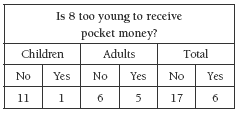
b. Your bar graph should look similar to this:
Is 8 too young to receive pocket money?
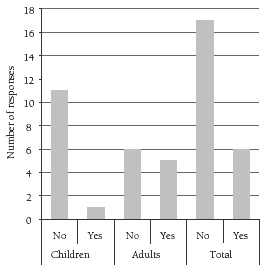
c. Statements will vary. For example, “Most children think 8 is not too young to
receive pocket money. Just over half of the adults think 8 is not too young.”
d. Your pie chart should look similar to this:
Is 8 too young to receive pocket money?
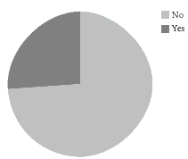
e. Comments will vary. The pie chart shows that there are a lot more “no” answers, but you can’t tell the exact number (unless you put numbers around the outside of
the pie).
2. a.
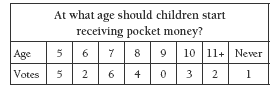
b. Your bar graph should look similar to this:
At what age should children start receiving pocket money?
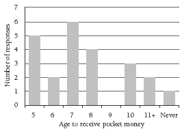
3. Discussion will vary. Choices may be:
i. The pie chart
ii. The bar graph in 2b
iii. The bar graph in 1b.
4. Marika is quite correct in asking the question. Although she could have got that information from her second question (only the people who wrote down an age of more than 8 in response to Marika’s second question answered her first question with a “yes”), asking the first question gives her clear yes/no responses that she can
count up. Note that her data also includes the neighbour who didn’t think that children should get pocket money at any age. She could choose to discount this response as an outlier.
Key Competencies
Old Enough? can be used to develop these key competencies:
• thinking
• managing self
• relating to others.