This is a level 5 statistics and level 4 number activity from the Figure It Out series.
A PDF of the student activity is included.

Click on the image to enlarge it. Click again to close. Download PDF (679 KB)
construct a line graph
describe the data
construct a box and whisker graph
find quartiles and median of data set
A set of kitchen scales
FIO, Level 4+, Statistics, Book Two, Guess the Mass, pages 2-3
Pieces of card, marker pen
Classmates
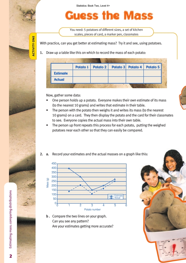
Activity One
In this whole-class activity, students start with a hypothesis and then collect data that may prove or disprove it. The line graphs that result are time-series graphs because they plot data that has been collected over time.
When they have graphed the data, the students need to examine the two lines and say whether their estimation skills are improving. Ask them what features of the graph will give them the information they need. In this case, it does not matter whether the lines are going up or down. (This is determined by the mass of the potatoes selected for weighing and the order in which they were weighed.) What matters is whether the two lines are converging because it is the gap between them that represents the difference between the estimated mass and the actual mass.
You could extend the activity by asking the students to predict what might happen if they were to estimate and weigh 5 more potatoes.
Activity Two
This activity provides a suitable context for drawing and interpreting box-and-whisker plots from class data. While some types of graph (for example, bar graphs) plot the entire data set, a box-and-whisker plot summarises a distribution.
Box-and-whisker plots are a relatively recent and very useful statistical tool. The value of this kind of graph is that it shows five key values from a data set (the maximum, minimum, median, and quartiles) in a strikingly simple visual form. By looking at a box-and-whisker plot, a viewer can instantly get a feel for the spread of
the distribution and, when two or more plots are placed in the same graph, can easily compare the spread of the different distributions.
Once the whole class’s data has been collated by a couple of volunteers, the students need to calculate the median and quartiles. They can find the median by counting from either end of the distribution until they reach the middle. If the number of estimates is even, there will be two values sharing the middle ground, and the median will be the mean of these two.
The lower quartile is the median of the lower half of the data, while the upper quartile is the median of the upper half of the data. See how many different ways your students can state the implications of this division. For example, “50 percent of the data lies between the two quartiles.”
There are different approaches to finding the median, depending on whether the data set has an even or odd number of numbers. Similarly, the number of data items affects the finding of the quartiles. Here are two examples:
• The set {12, 16, 17, 23, 27, 43} has 6 numbers, so the median is halfway between the third and fourth numbers, namely, 20. The quartiles are the middle values out of {12, 16, 17} and {23, 27, 43}, namely, 16 and 27.
• In the set {12, 16, 17, 23, 27, 43, 45}, the median is 23, and the quartiles are the middle values out of {12, 16, 17} and {27, 43, 45}, namely, 16 and 43. Some authorities say to include the median when you are finding the quartiles, in which case, they become the middle values out of {12, 16, 17, 23} and {23, 27, 43, 45}, namely, 16.5 and 35. Either way, the important idea is that we divide the data set into four equal sections as best we can.
Note that the lower quartile is sometimes called the first quartile and may be abbreviated as LQ or 1Q, and the upper quartile is sometimes called the third quartile and may be abbreviated as UQ or 3Q. 2Q is, of course, the median.
Having found the median and quartiles, the students use these (along with the minimum and maximum values) to create the box-and-whisker plot. Make sure they understand that the width (thickness) of the box on a box-and-whisker plot is of no consequence. They should choose a width that looks sensible, as they would for a bar graph, and then use the same width for all plots in the same graph. Whether the plots run horizontally or vertically is also of no significance.
When your students have completed their graphs, ask them to make as many true statements as they can about what each plot says and then to focus on a comparison between the plots. By doing this, they will be able to spot significant changes in the distributions of the estimates from potato 1 through to potato 5. By also plotting the actual mass of each potato on the same graph, the students can examine the estimates in relation to the actual values.
Are the students getting better with practice at estimating mass? Things to look for include:
• The boxes are getting shorter. 50 percent of the class’s estimates are represented by this part of the plot.
• The whiskers are getting shorter. They represent the bottom and top 25 percent of the estimates. One “way out” estimate (outlier) can give a very long whisker.
• The distance from the median bar to the mark indicating the actual mass is becoming less.
Answers to Activities
Activity One
1.–2. Practical activities. Answers will vary depending on the raw data, but the estimates and the actual mass will probably be closer for the later trials.
Activity Two
1.–3. Practical activities. As all students are using the same data, everyone should get the same results. If the class is getting more accurate with its estimates, the box-and-whisker plots will change so that:
• the box becomes shorter (showing that the students’ estimates are getting closer together);
• the median mark in the box gets closer to the real mass of the object;
• the whiskers get shorter (though it only takes one person to make one long).