This is a level 4 number activity from the Figure It Out series. It relates to Stage 7 of the Number Framework.
A PDF of the student activity is included.
Click on the image to enlarge it. Click again to close. Download PDF (427 KB)
find a fraction of a whole number
Number Framework Links
Use this activity to encourage transition from advanced additive strategies (stage 6) to advanced multiplicative strategies (stage 7).
FIO, Levels 3-4, Number Sense and Algebraic Thinking, Book Two, Even Pictures Talk, pages 22-23
Classmates
This activity involves students describing, summarising, and comparing data, as well as identifying relationships within the data and communicating these ideas. It also requires students to use problem-solving strategies by making links between measurement and number.
Give the students time to explore and discuss interpretations of the data with a classmate and time to clarify and elaborate their ideas before and after studying the information presented in each graph. Each graph can be used as a model for an extension activity that involves the students collecting their own data to present in graph form to the class.
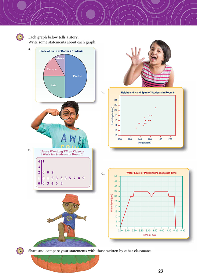
Different information is presented on five different kinds of graph, featuring either discrete or continuous information: a bar graph (question 1), a pie or circle graph (question 2a), a scatter graph (question 2b), a stem-and-leaf plot (question 2c), and a line graph (question 2d). Some students may be familiar with certain styles of graphs and not with others, so the amount of questioning needed to develop ideas and to explore (and prepare) similar problems will vary.
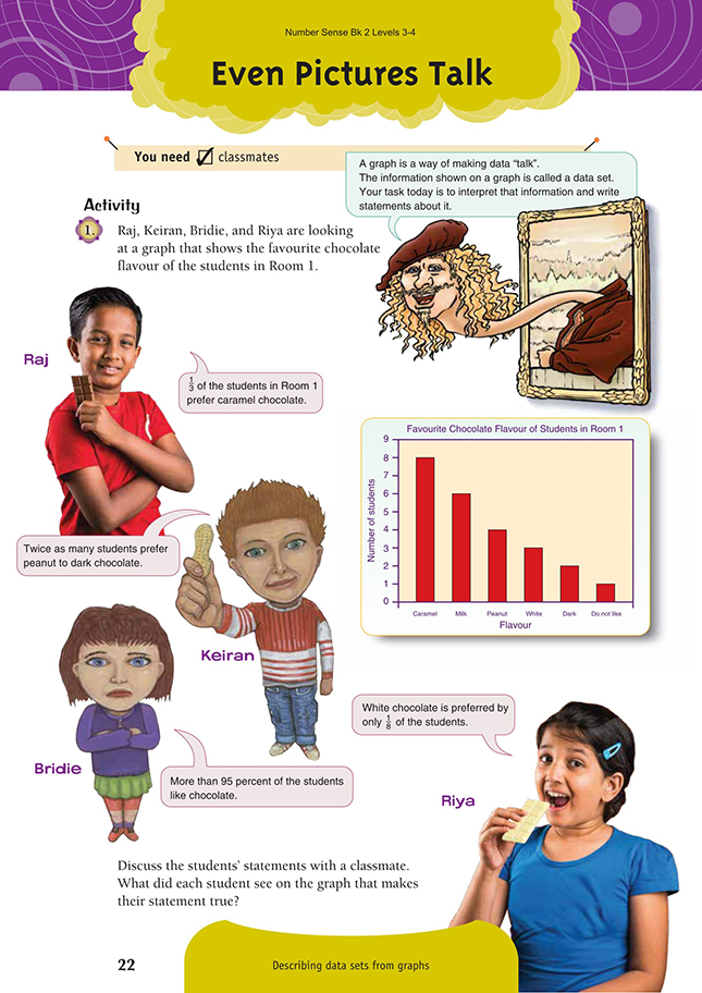
In question 1, the students are able to use the bar graph to find the total number of students in Room 1 by adding the frequencies of the flavour of chocolate liked by students, that is, 1 + 2 + 3 + 4 + 6 + 8 = 24. Each category can be represented as a fraction of the total number of students and/or converted to a percentage and compared to statements about the graph:
2/24 (1/12) like dark chocolate.
3/24 (1/8) like white chocolate.
4/24 (1/6) like peanut chocolate.
6/24 (1/4) like milk chocolate.
8/24 (1/3) like caramel chocolate.
23/24 like chocolate.
Therefore, all of the statements made are true: 1/3 of the students in Room 1 prefer caramel chocolate, twice as many students prefer peanut to dark chocolate, 1/8 of the students prefer white chocolate, and more than 95 percent of the students like chocolate.
In question 2a, the data is represented as a whole on a pie graph and is divided into parts of that whole. The students can make general statements about the data on the pie graph using their observations of the relative size of each sector, for example, more students were born in Asia than Europe, half of the students were born in the Pacific, and the other half of the students were born in Europe, Asia, or Africa. Encourage the students to discuss more specific number information by measuring each sector in degrees, comparing it to the proportion of the whole circle, and
recording this as a fraction:
Pacific: 180/360 =1/2 or 50%
Asia: 90/360 = 1/4 or 25%
Europe: 60/360 = 1/6 or 16 2/3%
Africa: 30/360 = 1/12 or 8 1/3%.
For the pie graph, the number of students is not given. You could give the students different-sized classes and ask them to interpret the information and hence solve practical problems that require finding the fractions of whole numbers. For example: If there were 36 students in the class, how many would be born in Asia? If there were 24 …?
In question 2b, the scatter graph data of hand spans and heights show a relationship (correlation) where the points could be grouped around a central line with a positive slope (gradient) from left to right. The graph shows that hand spans increase with the students’ heights. The number of plots allows the students in Room 6 to be counted (18 students). Statements can be made about the range of data for two values: the hand span and the height. The students in Room 6 have hand spans between 12 and 21 centimetres and are between 130 and 170 centimetres tall. Your students can also make general statements about the trend in the relationship between the hand span and the height of a Room 6 student, for example, as the height of a student increases, the hand span increases.
Your students can be more specific about the relationship between the height of the student and the hand span by reading (estimated) values from the graph, for example,
![]()
They can compare all or several values so that they can make a general statement about this relationship, for example, “A student’s hand span is about 10 percent of their height” and use this information to make predictions, for example, in response to “If a new student in Room 6 had a hand span of 15 centimetres, about how tall might he be?” The students could also rule a line through the scatter dots using a slope of “best fit”, which in this case would leave 9 dots above the line and
9 dots below.
In question 2c, the data is presented as a stem-and-leaf plot. This graph quickly shows the range of data and how it is distributed over that range through several decades. The students can find the number of students in Room 2 by counting the number of leaves on the graph (19 students). The students should be able to make statements about the range of hours of television watched by Room 2 students from 0 to 41 hours, the mode or value that occurs most frequently (13 hours), and the median (13 hours). The students could also make statements about the distribution of
the data:
“Most students in Room 2 watch between 10 and 20 hours of TV in a week.”
“10/19 or just over half watch between 10 to 19 hours of TV in a week.”
“5/19 or slightly more than 25% of students watch less than 10 hours of TV in a week.”
You could also encourage the students to compare the number of hours of TV watched to the numbers of hours in a week to see if the data portrayed is realistic, for example, 168 hours per week (24 hours per day x 7 days) – 35 hours (at or travelling to school) – 56 hours (sleeping at 8 hours per night) – 41 hours (watching TV) = 36 hours for everything else.
In question 2d, the line graph shows the relationship between the water level of a paddling pool and the time of day. Encourage the students to be specific in their discussion about the information presented in the graph.
As part of their stories, the students could suggest why the water level rose and fell at different rates, such as the hose filling the pool was turned off at 3.15, but no one got in until 5 minutes later. The students could also suggest reasons for the maximum and minimum levels of water and why they occurred at particular times. (Perhaps there was some energetic splashing around 3.40!) The child or children in the pool may have got out at 4.10, and 8 minutes later, the pool was emptied.
Answers to Activity
1. Raj noticed that 8 students preferred caramel, while 16 (that is, 1 + 2 + 3 + 4 + 6) chose other options. So there were 24 students in Room 1, and 8/24 or 1/3 of these preferred caramel.
Keiran noticed that 4 preferred peanut and 2 preferred dark chocolate, so twice as many preferred peanut. (Or Keiran may have noticed that the peanut bar on the graph is twice the height of the dark bar.)
Bridie noticed that 1 person didn’t like chocolate at all. That was 1 out of 24. 1 out of 20 (1/20) is 5%, so 1 out of 24 (1/24) is less than 5%. So Bridie is correct in saying that more than 95% like chocolate.
Reece noticed that 3 out of 24 preferred white chocolate. 3/24 = 1/8
2. Answers will vary for all graphs, but each answer should discuss/cover the fact that:
a. Half of Room 7 students were born in the Pacific and 1/4 of them in Asia. About
1/6 were born in Europe and the rest in Africa. (In a class of 36 students, 18 would have been born in the Pacific, 9 in Asia, 6 in Europe, and 3 in Africa.)
b. Taller people tend to have larger hand spans, although this is not true for every individual. The students in Room 6 are mostly between 140 and 160 cm in height, and their hand spans are mostly in the 14–18 cm range. One student in the class is much taller than everyone else (170 cm) and has a much larger hand span (21 cm). The average height would be about 150 cm, and the average hand span would be about 16 cm.
c. Most students in Room 2 watched between 10 and 20 hours of TV or video in the week. 1 student watched 41 hours, and 1 student watched none.
d. Explanations may vary as to why the levels altered, but the times should follow those in the following scenario. From 3.00 until 3.15, the water in the paddling pool rose from nothing to 30 cm, so for each 5 min, it rose 10 cm. The water level had risen another 5 cm by 3.20. From 3.20 until 3.40, the water level remained the same, but over the next 5 min, it went down 5 cm. The water level rose again over the next 5 min, to bring the level back to 35 cm. The water level remained the same for nearly 20 min and then reduced by 5 cm. 8 min later, the pool was emptied.
3. Practical activity