This is a level 3 statistics activity from the Figure It Out series.
A PDF of the student activity is included.
Click on the image to enlarge it. Click again to close. Download PDF (1644 KB)
answer questions from graphs
discuss which graph shows the data most clearly
create graphs using a computer graphing program
This diagram shows the areas of Statistics involved in this activity.
The bottom half of the diagram represents the 5 stages of the PPDAC (Problem, Plan, Data, Analysis, Conclusion) statistics investigation cycle.
FIO, Levels 2-3, Statistics Revised Edition, Discussing Data, pages 14-15
A classmate
Note that the second part of this activity requires access to a computer spreadsheet/graphing program. See the introductory section for basic information on the various graphs encountered in this activity and elsewhere in this book.
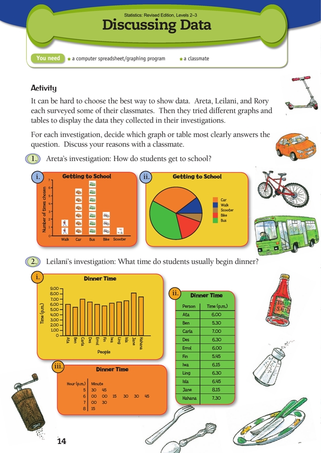
The data gathered by Areta is category data, so she has used a pictograph and a pie chart.
Both graphs are appropriate for Areta’s data, and each has its strengths: the pictograph shows the number of people using each form of transport; the pie chart shows the proportion of people using each form of transport. Both clearly show that bus and car are the two main means of transport, but the pie chart does a poor job of distinguishing between the two (the two sectors look to be very similar in area). For this reason, the pictograph is probably the better graph.
Leilani has collected numeric data. Her displays are a bar graph, a table, and a stem-and-leaf graph. Neither the bar graph nor the table identifi es patterns in the data, whereas the stem-and-leaf graph clearly shows that most (in the sense of more than half) of the students began dinner between 6.00 p.m. and 7.00 p.m. The bar graph could have been improved by arranging the bars in order of size, as is standard practice when the order of the categories is not relevant. A dot plot would have been another useful way of displaying this data:
.gif)
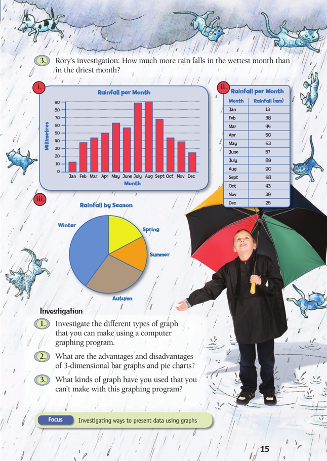
Rory has collected category data, which he has displayed as a bar graph, a table, and a pie chart. The months are the categories. The bar graph shows a clear pattern in the rainfall, and it is easy to identify the wettest and driest months (August and January respectively). This information is all available in the table, but the patterns have to be searched for. The pie chart doesn’t answer Rory’s question at all because the data is collated by season instead of month.
Investigation
Computer graphing programs make it easy to experiment with different displays for any set of data without the time-consuming process of manually drawing them all. The students can enter the data as a table, select the number data, and choose a chart option from the menu. The same data can be dynamically linked to several different graphs at the same time. The students can experiment with changing the data in their table and observe how the various graphs change.
Titles and axis labels can be added as a second step, when it has been decided what kind of graph best displays the data for the purpose in hand.
Encourage your students to explore the many different options available. It is important that they understand that different graphs will be appropriate for different situations and that sometimes more than one graph is needed to highlight different features of the data. This is particularly true of multivariate data.
Students also need to understand that many of the fancy chart options available in computer graphing programs are never going to be suitable for any of their purposes. This is true for most of the 3-dimensional charts. While they may look nice, their appearance comes at the cost of readability. The best graphs are simple and uncluttered.
Answers to Activity
1. Answers will vary. Both graphs show clearly that bus and car are the most common ways of getting to school, so both are satisfactory for the purpose. But only the pictograph tells you how many students used each mode of transport.
The pictograph also makes it very clear that bus was the most popular mode of all. For these reasons, the pictograph is probably the better of the two graphs.
2. The stem-and-leaf graph shows at a glance that most (in the sense of more than half) of the students usually begin dinner between 6 and 7. You can find this out from the other graph and
the table, but it is much less obvious.
3. Answers will vary depending on how you interpret the question. If you take it to mean “how many more millimetres?”, only the table will give you the precise information you need. If you take the question to be more about how rainfall varies over the year, the bar graph is best. The pie chart is not suitable: it is arranged
by season, not month, and it has no millimetres information.
Investigation
1. Practical activity. Note that for many kinds of graphs, you should only select the number data (not the categories) and then choose a chart option. The category labels can be added as a second step. You will fi nd that only some chart types will give you a graph that looks meaningful for a given set of data.
2. The various 3-dimensional bar graphs (including cylinders, cones, and pyramids) and pie charts (including donuts) look exciting, but it is very hard to read values off them; for this reason, they are not recommended. The best graphs are simple and clean.
3. Many graphing programs will not create pictographs, linear dot plots, or stem-and-leaf graphs.
Key Competencies
Discussing Data can be used to develop these key competencies:
• thinking
• using language, symbols, and texts.