This is a level 4 statistics activity from the Figure It Out series.
A PDF of the student activity is included.
Click on the image to enlarge it. Click again to close. Download PDF (877 KB)
collect data
display data on a graph
describe data features
make a conclusion
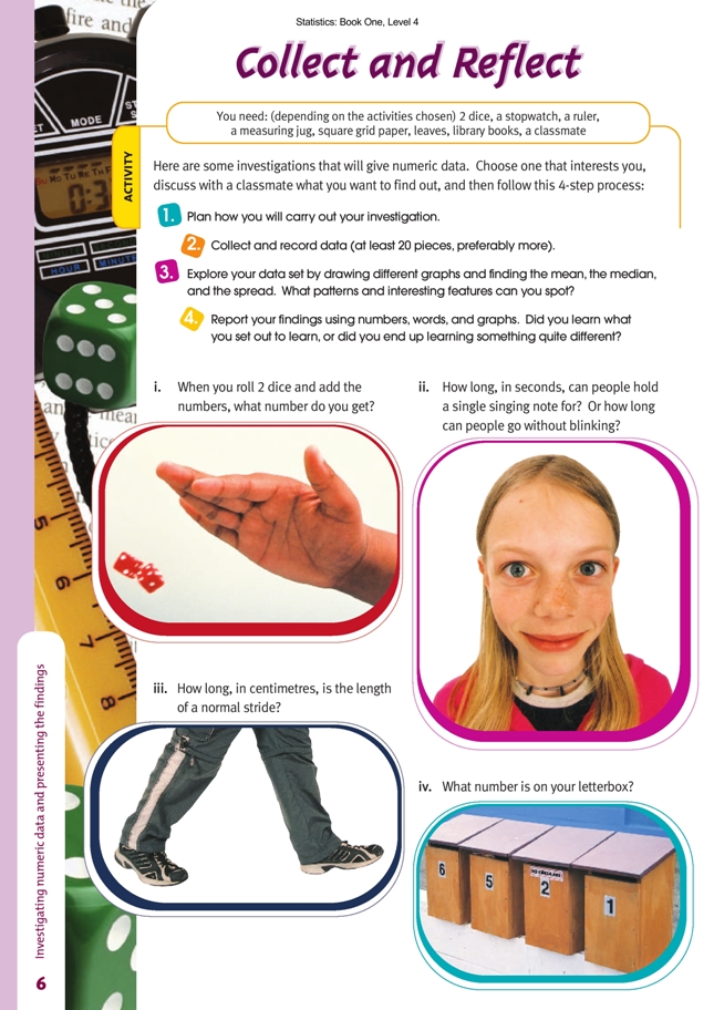
Depending on the activity chosen: 2 dice, stopwatch, ruler, measuring jug, square grid paper, leaves, library books, classmate
In this activity, students start with a question and then try to answer it by collecting and analysing appropriate data. Once they have chosen a question to investigate, they should closely follow the 4-step statistical process that is set out at the beginning of the activity. The process is the principal teaching point.
The activity illustrates the wide variety of questions that can be made the subject of a statistical investigation. Because each investigation is so different, each group will learn something different. For this reason, it will be useful for each group to report to the class on what they did and give their findings and conclusions.
The activity bridges curriculum levels 4 and 5. Before the students begin, you may need to revise earlier statistical work and make sure that they understand key vocabulary (for example, the words data, experiment, numeric, and survey).
Encourage the students to think about which kind of graph is the most suitable for their data. Frequency tables, bar charts, histograms, and time-series graphs are specifically mentioned in the curriculum’s achievement objectives; pie graphs are also mentioned in the suggested learning experiences. Frequency polygons (line graphs, where the line forms a polygon with the x and y axes) are not mentioned in level 4,
but an introduction to these will help the students to develop the skills they need for level 5.
Here are some questions you could ask your students:
• What sort of data will you get in this investigation?
– Category data is data collected by category (for example, the colour of passing cars).
– Discrete data is numeric, whole-number data (data that is obtained by counting, not measuring).
– Continuous data is numeric data that comes from measurement and is limited only by the accuracy of the measuring device used.
– Time-series data is numeric data that is collected at regular intervals over a period of time. Time-series data may be either discrete or continuous.
Discrete numeric data is introduced as a concept in level 3; continuous numeric data is introduced in level 4.
• What is the best way to record data as you collect it?
– A list is appropriate where the range of possible results is great, such as the number of pages in a book, or for time-series data, where the order of the data needs to be retained.
– A stem-and-leaf plot is useful if the data consists of discrete numbers drawn from a limited range, for example, scores out of 50 in a maths test or measurements of arm span.
– A tally chart is useful if the data has few categories, for example, the number obtained when throwing a dice.
• Do you need to group your data before displaying it?
Continuous data always needs to be grouped, and discrete data needs to be grouped unless the data range is very limited or there are only a few categories. Intervals of 5 centimetres may be appropriate for arm span, intervals of 50 pages for a book, and intervals of 5 for a maths test scored out of 50. Encourage the students to use between 5 and 10 intervals of equal size, where possible, when grouping their data.
This will usually allow trends to be seen clearly without sacrificing too much detail.
The students may like to try grouping the data in several different ways (with different-sized intervals or intervals that start at different points) to see how the display changes. Sometimes the choice of intervals can obscure or reveal a message. This activity could be a valuable whole-class learning experience and may illustrate the fact that data can be manipulated to fit with a particular agenda.
• What sort of data display is appropriate to the data you have collected?
– A bar chart is used for discrete data or data collected in categories. It shows the frequency of each category. The bars do not touch each other.
– A histogram is used for continuous data. It shows the frequency of data within each interval. The bars touch each other.
– A frequency polygon is used for either discrete or continuous data, and it shows trends.
– A pie graph is used for discrete, continuous, or category data. It shows what fraction of the whole is occupied by each category.
– A time-series graph is used for data that has been gathered over time. It shows how something changes as time goes by.
– A stem-and-leaf plot is used for discrete or continuous data. It is similar to a bar graph, but it is on its side. It is useful for working out the median and quartiles and as a preparation for drawing other graphs.
• What has the graph told you?
Look at the distribution (shape) of your set of results. Consider outliers (one-off, unusual results) and clusters (groups) within the distribution. When dealing with line graphs or time-series graphs, consider any seasonal and long-term trends.
The students should be able to make several comments about what their graphs show. For example:
– “Most of the data lies between 5 and 8.”
– “Red is the most common colour.”
– “One result is out on its own. The cause could be …”
– “Nobody scored over 15.”
– “The boys did better than the girls.”
• What statistics would be useful here?
Although suggested learning experiences for level 4 include finding the mode and estimating the mean and median, statistical calculations are not officially introduced until level 5 of the curriculum. Calculations could therefore be used as an extension activity.
Comments specific to the student investigations
i. This investigation is based on the concept of long-run relative frequency (the outcome that is expected over time but that may not be obvious in the short term). For the results to be meaningful, that is, to show any trend, at least 50 trials (throws) will be needed.
ii. For each individual student, 2 or 3 timings could be taken and then averaged.
iii. The best approach is for the students to measure a number of paces and then average the results.
iv. This activity should involve the students surveying a range of people. The results may be hard to display, especially if some of the numbers come from very long streets or if the students live in rural areas.
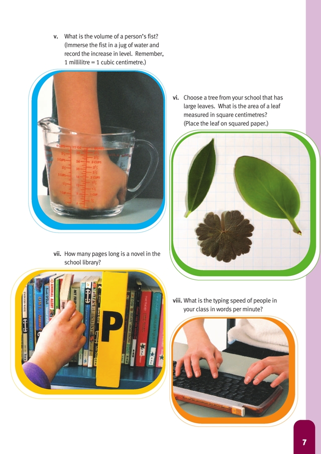
v. Lower-ability students could find the measurement needed here difficult. Once they have made the measurements, they need to be able to convert them from millilitres to centimetres cubed. The curriculum suggests that this kind of conversion is a level 5 learning experience. The students should understand the meaning of such conversions, especially if they are giving feedback to the class later on.
vi. Remind your students not to strip trees bare in their quest for leaves! Also, encourage them to measure whole, full-grown leaves rather than new, damaged, or eaten ones.
vii. If the books are arranged alphabetically by author, the students could find the number of pages of, say, every fifth and tenth book in the A author section, the B author section, and so on.
viii. This is another task that requires an averaging strategy. Other suggested sources of data for investigations:
• test scores
• the number of people in a household
• the size of hand spans or arm spans
• heights
• time spent viewing television or playing computer games
• temperature
• barometric pressure.
Answers to Activity
Answers will vary greatly depending on the choice of activity, but when you have finished, your experiment should have these features:
• a data collection containing at least 20 results for your experiment (but if it is easy to collect data for your experiment, you should collect more)
• your data collected and sorted into a table with suitable headings
• one or more graphs that enable a viewer to quickly see the important facts you have
discovered
• mean, median, and spread (you could use a box-and-whisker graph to present the mean and spread visually)
• “The story in the picture”: what you have discovered from your investigation or what you have proved.