This is a level 2 statistics activity from the Figure It Out series.
A PDF of the student activity is included.

Click on the image to enlarge it. Click again to close. Download PDF (2226 KB)
discuss which graph shows the data most clearly
answer questions from graphs
pose a question to investigate
collect and sort data
construct a bar graph
This diagram shows the areas of Statistics involved in this activity.
The bottom half of the diagram represents the 5 stages of the PPDAC (Problem, Plan, Data, Analysis, Conclusion) statistics investigation cycle.
3 class sets of blank choice sqaures (see Copymaster) for each student
FIO, Levels 2-3, Statistics Revised Edition, Choice Squares, pages 1-3
Classmates
Activity One
Before the students go on to answer the questions in this activity, discuss with them why Room 8 might want to fi nd out which fruits were most preferred in their class. It is important that students see a reason for their own or others’ investigations. A reason is suggested in question 4, which implies that the students are dissatisfied with their lunchbox contents.
You could also discuss why the students in Room 8 decided to use choice squares to gather their information. When your students do their own investigations, they can design suitable squares with the help of the blank copymaster (to keep the squares the same size) and then photocopy them for use.
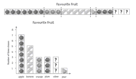
The ![]() referred to in question 1 makes it possible to restrict the number of categories while ensuring that everyone can respond to the survey. As indicated in the Answers, the
referred to in question 1 makes it possible to restrict the number of categories while ensuring that everyone can respond to the survey. As indicated in the Answers, the ![]() in some surveys can mean “don’t know”, but in this activity, it corresponds to the “other” category found in survey questions such as: “What is your favourite meat?”
in some surveys can mean “don’t know”, but in this activity, it corresponds to the “other” category found in survey questions such as: “What is your favourite meat?”![]()
If a large number of people picked the “other” category, this would warrant further investigation. It may be, for example, that quite a few people would have selected venison if this option had been offered. [How might a vegetarian respond, given the above options?]
Question 2 involves comparing three different data displays: strip graph, bar graph, and pie chart. Discuss the characteristics of each type of graph.
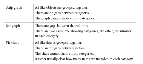
In question 2, the strip graph is manipulated to form a pie chart and a bar graph. This makes it clear that the data displayed in the three examples is the same data displayed in three different ways, not three distinct lots of data.
These diagrams may be helpful:
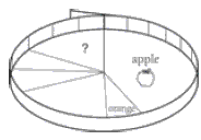
For the pie chart, bend the strip graph around to form a circle and draw line segments from the centre to the circumference to show each category.
For the bar graph, cut each section of fruit and use for the bars:
Ensure that the students understand the importance of labelling axes and giving each graph a succinct, descriptive title. These should not be viewed as technical requirements or “teacher says” rules but as keys to interpretation.
In each of the three graphs, the area allocated to each category is proportional to the number of items or values it represents: if one of the sectors in a pie chart (for example) is twice the area of another, it represents twice the number of items or values.
The students could collect the data for question 3a as a class and then work through the questions either as individuals or as small groups working independently. If the students’ own surveys bring a large number of ![]() responses, suggest they treat this as an opportunity for refi ning the options. They can then administer a revised survey.
responses, suggest they treat this as an opportunity for refi ning the options. They can then administer a revised survey.
After the data is collated and displayed in a graph, questions 3b and 3c will help the students interpret their results. Although the task is a simple one, encourage your students to state their fi ndings in writing. By doing so, they learn how to make interpretative statements and then to put them up for scrutiny by classmates.
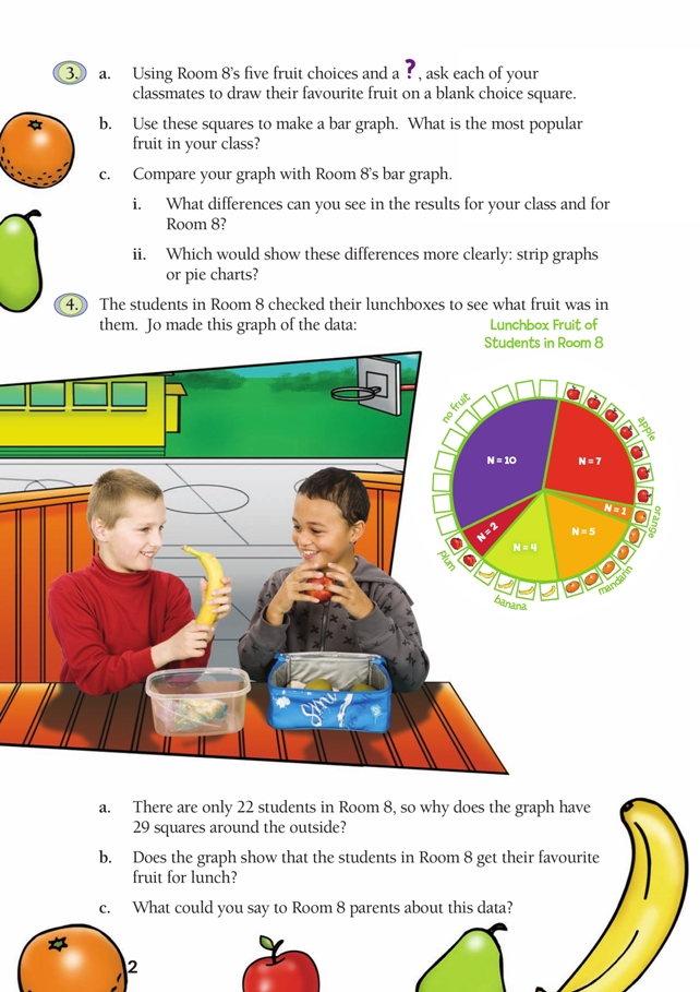
It is important that the students understand that question 4 introduces a new set of data, this time showing what is in Room 8’s lunchboxes, not what the students would prefer to be there.
Question 4a introduces the idea that survey questions can sometimes allow for multiple responses from the one person. A quick look at the students’ own lunches would illustrate that some (perhaps many) contain more than one fruit.
Question 4b asks students if they can link the “favourites” data with the “actuals” data. While some thoughtful comparisons can be made, the important idea here is that the data in the two graphs is not linked to particular individuals. It is impossible to tell whether a student who has put herself down as an apple lover in the first data set happens to have an apple in her lunchbox that day.
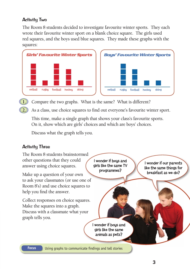
Activity Two
Note that although the vertical axes on the graphs in question 1 are not numbered, the graphs are easy to interpret.
Your students should be given the opportunity to answer question 2 with a minimum of assistance. Let them fi nd a way of clearly representing the two sets of data in a single graph in such a way that none of the original data is lost. Avoid over-emphasising technical correctness, especially at this level. What matters is that the students are gaining confi dence in their ability to create graphs that tell stories. They can test their graphs out on their peers.
Activity Three
This activity would make an excellent assessment task because it encompasses all aspects of the statistical enquiry cycle.
Answers to Activities
Activity One
1. Those whose favourite fruit is not pictured can use the ![]() . (The
. (The ![]() could also mean “don’t know”, but in this case, the graphs in the activity show that it means “other”.)
could also mean “don’t know”, but in this case, the graphs in the activity show that it means “other”.)
2. Answers will vary. You may say the bar graph because it is easy to identify the tallest column or the pie chart because it is clear which is the biggest sector. If you ask yourself “Which graph most clearly shows how many voted for the most preferred fruit?”, your answer should be the bar graph because the numbered vertical
axis makes it possible to see in an instant how many people made each choice.
3. a.–c. Results and comments will vary. For 3 c ii, a pie chart would probably show
these differences more clearly.
4. a. Of those students who had fruit, some must have had more than one kind of
fruit in their lunchbox.
b. No. Everyone had a favourite fruit, yet 10 students (nearly half the class) had
no fruit in their lunchbox. Also, it is not possible to tell if the person who, for
example, had the orange in their lunchbox was one of those who said that
oranges were their favourite fruit; neither graph identifi es individuals.
c. Possible answers may include:
• While all students had a favourite fruit, almost half had no fruit in their
lunchbox.
• Students should be involved in making up their lunchboxes.
• Parents should talk to their children about what goes into lunchboxes.
Activity Two
1. Possible answers:
• Football is popular with both the girls and the boys (4 girls and 3 boys).
• For the boys, rugby and football are both more popular than other sports (4 votes
for rugby and 3 for football).
• Netball is only popular with the girls (4 girls).
• More girls than boys like hockey (3 girls but only 1 boy).
• Only two people (1 girl and 1 boy) chose skiing.
2. Class activity. Graphs and discussion will vary.
Activity Three
Results will vary.
Key Competencies
Choice Squares can be used to develop these key competencies:
• thinking
• using language, symbols, and texts
• participating and contributing.