This is a level 4 statistics activity from the Figure It Out series.
A PDF of the student activity is included.
Click on the image to enlarge it. Click again to close. Download PDF (1091 KB)
identify data features of a graph
create a histogram
compare graphs
critique the graph as a data display
This diagram shows the areas of Statistics involved in this activity.
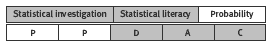
The bottom half of the diagram represents the 5 stages of the PPDAC (Problem, Plan, Data, Analysis, Conclusion) statistics investigation cycle.
Statistical Ideas
Blockbusters involves the following statistical ideas: using the PPDAC cycle, multivariate data sets, dot plots, histograms, tally charts, stacked bar graphs, means and medians, and evaluating statements made by others
A classmate
Activity One
Encourage your students to look at the shape of the graph when they note the features. It is more useful to look at a larger interval than simply at the longest or shortest bar when making statements.
Ask: We could estimate a median of 125 from the histogram, but 123 would be better. Can you see why? (There are 50 films, so the middle, or median, is between the 25th and 26th values in the 120–129 interval. Although 124.5 is the middle of that interval, the 25th and 26th values are the 4th and 5th values out of the 14 values in the interval. This is about one-third of the way through the interval, so 123 might be
a better estimate than 125.)
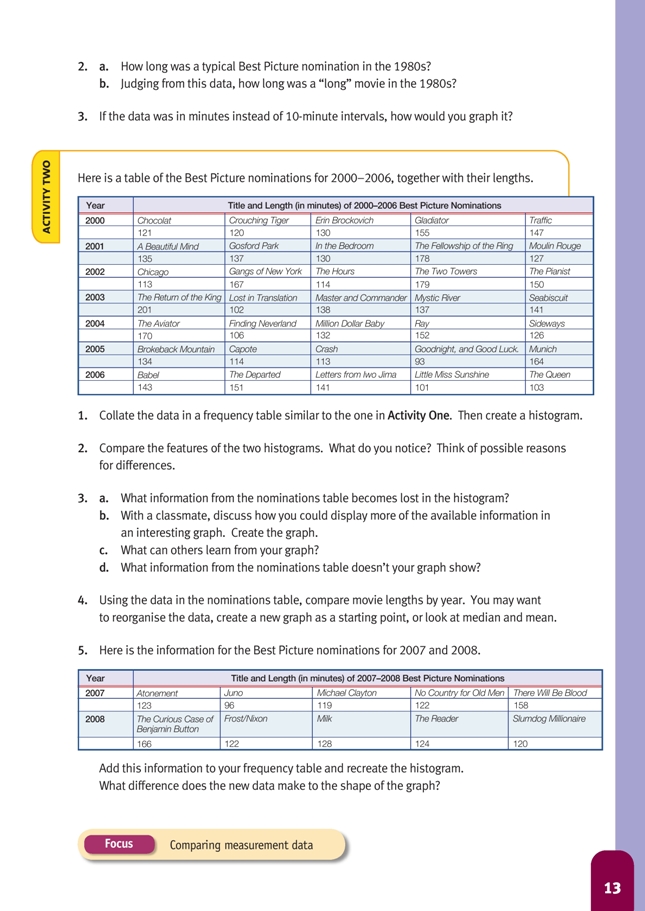
For question 3, the students are not required to make a graph. In case you want them to do so, here is the 1980s data (which could also be used later for comparison in Activity Two):
.gif)
A possible dot plot, showing the data in minutes, is:
.gif)
Activity Two
Although the students are asked to make a histogram to compare with the one in the students’ book, also encourage them to play around with different ways of graphing this data, for example:
.gif)
To create a stacked bar graph using a computer spreadsheet, as shown in the answers for question 4, the students will need to order the data:
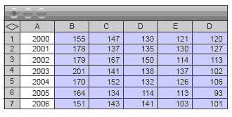
When first creating the graph, select only the movie lengths (shaded). This is best done as a stacked column graph, rather than a bar graph, so that you can add the year labels as category labels on the x axis.
A useful exercise would be to have the students calculate the total length of the 5 nominated movies for each year {673, 707, 723, 719, 686, 618, 639} and the mean length of the nominated movies in each year {135, 141, 145, 144, 137, 124, 128}. Using this information, they will see that the total and mean lengths were greatest in 2001–2003. Further, they should see that this was because the three very long Lord of the Rings movies (The Fellowship of the Ring, The Two Towers, and Return of the King) featured in those years. The mean length for each of the years 2000–2004 was between 135 and 145, a range of just 10 minutes. For the years 2005–2006, the mean length was 124 and 128, so clearly the movies for these latter 2 years were shorter overall than for the previous 6 years. However, this information is not enough to make any assumptions about trends.
As an extension to question 5, later years than 2008 can be accessed on the Internet when available. Nominations for all available years can be accessed at www.oscars.org/awardsdatabase/index.html
To fi nd the movie length, do an Internet search on the movie name; the best option is the Wikipedia (film) version, where each movie listed has a box on the right with key information about the movie, including length.
Extension
The students could do a longitudinal study of the change in movie lengths over a period of time and turn the data into graphs such as those shown in the answers for this activity (but over a much longer time period). The line on the dot plot below shows the median for each year in the 1980s (see the information in the notes
for Activity One)
.gif)
They could discuss what including the director’s cuts would do to the length of film data.
To find the information about the Best Pictures for a particular year or range of years, go to the website www.oscars.org/awardsdatabase/index.html. For example, to get the 1990s information, use the Basic Search, select Best Picture in the Award Category and 1990 to 1999 in Award Years. This gives a complete list of all the movies that were nominated for Best Picture during those years.
Students may also be interested in doing some research on the genre of the winner of Best Picture. One site that had summary information (as a percentage) from 1927 to 2001 (at time of writing) was www.filmsite.org/bestpics2.html
Answers to Activities
Activity One
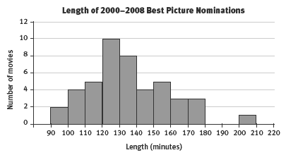
1. a. Most of the movies were between 100 and 130 minutes; just under one-third were 130 minutes or over, but these were widely spread between 130 and 200 minutes; the most common length was 120–130 (14 movies), closely followed by 110–120 (12 movies).
b. Given that there is an even number of movies (50), there is no middle: the median actually falls between the 25th and 26th movie. Both these movies are to be found somewhere in the 120–130 interval. So the “mid-length” or median movie is
somewhere between 120 and 130 minutes.
2. a. The typical best picture movie length in the 1980s was between 110 and 130 minutes. Just over half of the data falls into this interval, but if you also include the 8 movies between 100 and 110 minutes, nearly 70% of movies were between 100
and 130 minutes.
b. 180–200 minutes
3. You could use a dot plot to show the length of each film. To do so, you would have to use a horizontal axis that extended from 90 to 200 minutes. If you wanted
to use a histogram or bar graph, you would have to group the data as shown in the example in the student book.
Activity Two
.gif)
The histogram from page 12 in the students’ book is repeated here to make it easier to compare the features of the two histograms. (You could also graph this information on dot plots.)
2. The second set of data is for 7 years only, so you cannot compare actual numbers. However, you can make comments such as: Compared with the 1980s graph, the 2000–2006 data is more evenly spread; only one bar stands out, and 5 of the bars are the same height. The movies are generally longer – just over 60% were 130 minutes or longer, compared with 30% of the 1980s movies. Reasons may include:
• Using the latest digital technology, it may cost less to make longer movies than it did in the 1980s.
• It may be that long, blockbuster-type movies are more in demand.
• It may be that more of the top movies happen to be based on lengthy novels.
• It may be that people have come to expect at least 2 hours of movie time to get value for their money.
• Directors may be going to more trouble to develop their characters, and this takes time.
• Perhaps movies only get taken seriously (and nominated for Best Picture!) if they are long.
3. a. The actual lengths of individual movies, the names of the movies, the year of each movie
b. Different graphs are possible, for example, dot plots and stacked bar graphs. For example, on the following page is a bar graph that shows names and lengths.
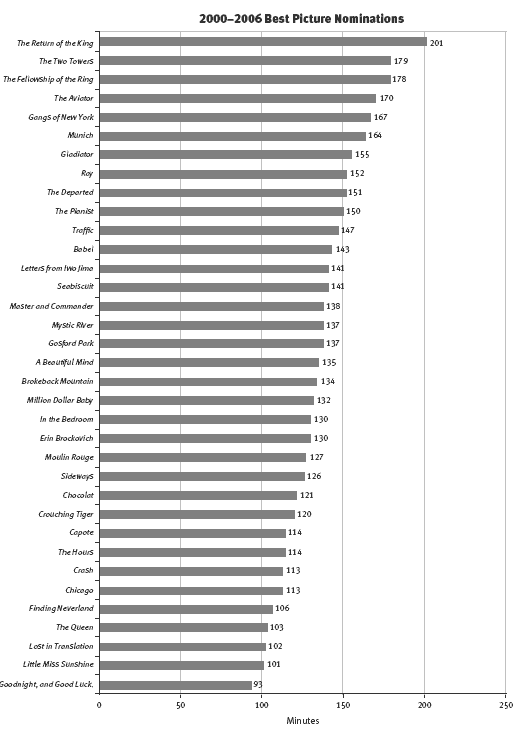
From this graph, you can easily see all the movies by name and how their lengths compare. You can also see which movie was the shortest or the longest and work out the median length (135) and information such as:
10 movies were 2 or more hours, 10 were 2 hours or less, and 15 were between 2 and 2 hours.
c. Answers will vary. If your graph shows similar information to the one above, other people can see from it that most of the nominated movies were more than 2 hours long.
d. Answers will vary. The graph above ignores the years of nomination, so you can’t look for time-related patterns.
4. One way of comparing movie lengths by year is a stacked bar graph like this:
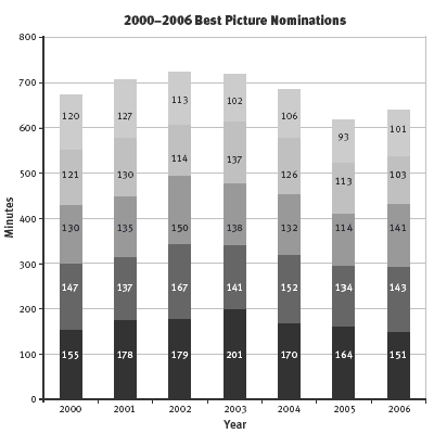
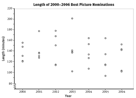
You could also make a dot plot to show the lengths for each year.
For a table such as the one below, you will need to do some mean and median calculations.
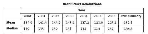
The graphs and the table show that there doesn’t appear to be a trend toward increasing lengths in movies with each year. In fact, they may be getting shorter overall. Between 2001 and 2003 (and especially in 2002), there were longer movies, with one movie in each of those years being particularly long.
5. Your frequency table would look like this for data up to 2008:
.gif)
Your histogram would therefore look like this:
The shape of the histogram basically stays the same, except that the peak is now the 120–130 interval rather than the 130–140 interval, which remains unchanged. (However, this is not enough extra data to be able to say that the trend is now towards shorter movies.)