The purpose of this activity is to engage students in discussion, evaluating the effectiveness of different data displays in presenting the findings of a statistical investigation.
This activity assumes the students have experience in the following areas:
- Displaying category and number data in appropriate ways.
- Interpreting bar graphs and pie charts.
- Connecting patterns and differences in bar charts and pie charts to situations.
- Communicating findings from data displays.
The problem is sufficiently open ended to allow the students freedom of choice in their approach. It may be scaffolded with guidance that leads to a solution, and/or the students might be given the opportunity to solve the problem independently.
The example responses at the end of the resource give an indication of the kind of response to expect from students who approach the problem in particular ways.
A reporter is writing an article about how our eating habits have changed over the past thirty years.
She looked at what types of food people typically consumed in 1985 and in 2015.
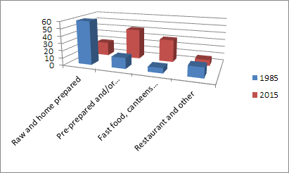
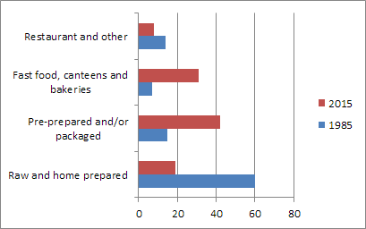
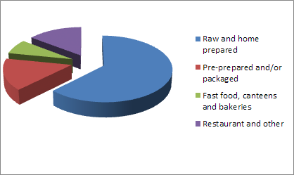
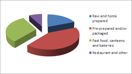
Her results are shown in the table and graphs below. The graphs have not been labelled yet, but will be when the article is complete.
If she arguing that nowadays we are less aware of what we are eating, which type of graph will be the most powerful to support her article? Give reasons for your choice.
| Type of Food Consumed (by weight) | 1985 | 2015 |
| Raw and home prepared | 60% | 19% |
| Pre-prepared and/or packaged | 15% | 42% |
| Fast food, canteens and bakeries | 7% | 31% |
| Restaurant and other | 14% | 8% |
The following prompts illustrate how this activity can be structured around the Analysis and Conclusion parts of the Statistical Enquiry Cycle
Analysis
The analysis section is about exploring the data and reasoning with it.
- Does the reporter have a clear “I wonder...” question to investigate? If not, what would her question be?
- Do I get ideas about patterns, and differences from just ‘eyeballing’ the table of data?
- Are my important variables categoric, discrete numeric, or continuous (measurements)?
- What features of the graphs support the reporter most in finding patterns and differences?
- What tools will help her to display the data in these ways? What ways are appropriate to her data and help answer her question?
- Why might she display her data in different ways? What benefits does she get from creating different displays?
- What variation can I see in her data between the two dates? What might be the causes of that variation?
- Can I make preliminary statements about her findings, starting with “I noticed that...”
Conclusion
The conclusion section is about answering the question in the problem section and providing reasons based on their analysis.
- How will the reporter answer her original question?
- How will she convince someone else that she has answered the question?
- What displays will be best to show what she has found out?
- Create a clearly written summary of findings that the reporter might use.
- Should she go back to the context to suggest why the patterns, and differences, occur? Why is explanation important in the context of food eating?
- What should the reporter say about the limitations of what she has found out? What can she say and what can’t she say?
- What other things or what further questions might the reporter have?
Examples of work
Work sample 1
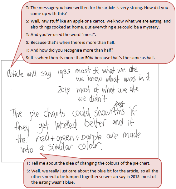
The student identifies key features of different data displays and uses these features to compare the effectiveness of the displays at conveying a message.
Click on the image to enlarge it. Click again to close. 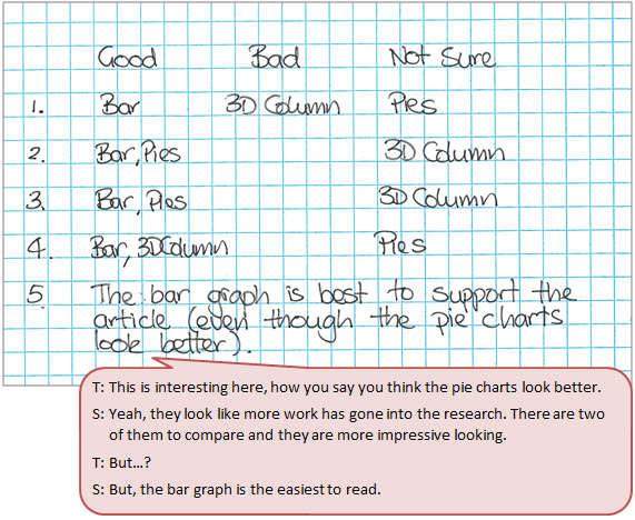
Work sample 2
The student evaluates the effectiveness of the displays at conveying a message.
Click on the image to enlarge it. Click again to close.