Bar Graph

The Ministry is migrating nzmaths content to Tāhurangi.           
Relevant and up-to-date teaching resources are being moved to Tāhūrangi (tahurangi.education.govt.nz). 
When all identified resources have been successfully moved, this website will close. We expect this to be in June 2024. 
e-ako maths, e-ako Pāngarau, and e-ako PLD 360 will continue to be available. 

For more information visit https://tahurangi.education.govt.nz/updates-to-nzmaths
There are two uses of bar graphs.

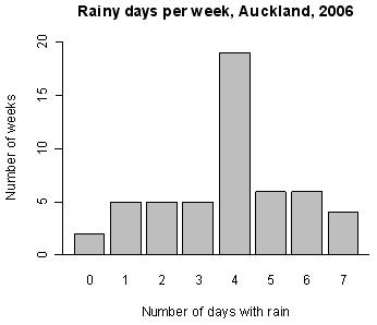
First, a graph for displaying the distribution of a category variable or whole-number variable in which equal-width bars represent each category or value. The length of each bar represents the frequency (or relative frequency) of each category or value. See Example 1 below.

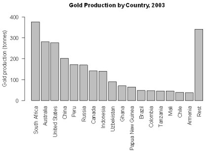
Second, a graph for displaying bivariate data; one category variable and one numerical variable. Equal-width bars represent each category, with the length of each bar representing the value of the numerical variable for each category. See Example 2 below.

The bars may be drawn horizontally or vertically.

Bar graphs of the first type are useful for showing differences in frequency (or relative frequency) among categories and bar graphs of the second type are useful for showing differences in the values of the numerical variable among categories.

For category data in which the categories do not have a natural ordering it may be desirable to order the categories from most to least frequent or greatest to least value of the numerical variable.

Example 1

The number of days in a week that rain fell in Grey Lynn, Auckland, from Monday 2 January 2006 to Sunday 31 December 2006 is displayed on the bar graph below.


Example 2

World gold mine production for 2003 by country, based on official exports, is displayed on the bar graph below.

Alternatives: bar chart, bar plot, column graph (if the bars are vertical)

Curriculum achievement objectives references
Statistical investigation: Levels (2), (3), (4), (5), (6), (7), (8)