Session 1: Measuring the class
PROBLEM: Generating ideas for statistical investigation and developing investigative questions
- Tell the students that school uniform manufacturers may be interested in information about different body sizes. Introduce differences in sizes by asking for volunteers and standing two students up to discuss what about them could be measured to inform clothing or footwear producers.
Research online information about sizing guides as well. - Brainstorm things that could be measured and compared (height, head circumference, arm span, handspan, foot length). Ideas from this prompt should mostly be numerical (measured) variables.
Note: that some students may be sensitive about being measured. It is not appropriate to measure weight. Ideas around the ethics of data collection are attended to in 4. Students who do not want to be measured could become the measurer for a measurement station. - Ask what other things school uniform or sportswear manufacturers may be interested in to help with their creation of clothing or footwear. Brainstorm additional ideas to explore. Ideas from this prompt may tend to be more categorical variables.
- Once the initial brainstorming of ideas is done interrogate the ideas by checking them using the following questions:
- Is this a measurement/idea that the students in our class would be happy to share information with everyone? If not reject the idea [ethics].
- Can we collect data to answer an investigative question based on this measurement/idea? If not reject the idea [ability to gather data to answer the investigative question].
- Would you be able to collect the data to answer the investigative question in the timeframe we have (specify)? If not reject the idea [ability to gather data to answer the investigative question].
- What would be the purpose of asking about the measurement/idea that you have? If it is not purposeful then reject the idea [purposeful or interesting].
- Would the investigative question we pose involve everyone in the group (e.g. the class)? If not reject the idea [does not involve the whole group].
- Students to form small groups and select one attribute to measure (each group to select a different attribute). Ensure that one group selects height. Support the students to develop an appropriate investigative question to ask of the data. They should identify the variable of interest (e.g. height, arm length) and the group of interest (the class). Some groups might want to explore a categorical variable. This is ok as later they will have to do a measurement variable.
PLAN: Planning to collect data to answer our investigative question
- Discuss ways to collect and record the data considering that every group will have data they want to collect. Get students to develop a survey question with instructions to collect their measure (numerical and categorical).
- Exploring the guide on how to make measures for the CensusAtSchool questionnaire. The guide provides ideas on how to measure numerical data.
- See session 2 in Crunch the Coach and particularly the data collection stations for additional ideas.
- Measurement stations could be set up around the room for students to make their measures for the different survey questions designed. A recording card can be used to record individual student responses. See for example the data cards used in the 2019 CensusAtSchool survey. For categorical variables, the station will include the survey question with any response options.
- A suggested option for the class is to develop an online questionnaire where students can input their responses to all the groups different survey questions (from their individual data card), for example, using Google Forms. This reduces the amount of time needed to collate data and the data can be downloaded into a .csv file for analysis. It is good to think about any demographic data that would be useful as well, e.g. gender (be aware of sensitivity around this also). Names are not needed to be recorded, nor should any identifying demographic data be collected. The teacher needs to be aware of the overall survey and if there are any potential ethical issues. See more about ethics in How much bullying? activity.
Session 2: DATA: Collecting and organising data
- Students work around the different stations for the collective class survey questions and record the data onto their individual data cards. As the students gather data, the teacher should circulate and provide advice or assistance as required. Ensure that accuracy of measurements is maintained. Any students who were really not keen to be measured could be supervising a measurement station to ensure consistent and valid measures are made at it. For example, they could measure everyone’s height.
- Students to check in with one another about the measurements they have made. They are checking for errors in recording their results, errors in making measurements or errors in reading measurements. They should share and discuss their thinking.
- Once they have checked all their measurements and recorded results to any categorical survey questions get the students to input their responses into the class Google Form (or similar).
ANALYSIS introduction: Using an online tool to make data displays
In the remaining time for the session, the students will be introduced to using an online tool for data analysis. One suggested free online tool is CODAP. Feel free to use other tools you are familiar with. This is written with CODAP as the online tool and is assuming students have not used CODAP before. If your students are familiar with CODAP then they can move straight into analysing the data from the class survey.
If you do not want to use an online tool then head to the making displays part and progress with paper versions of bar graphs, dot plots and histograms.
Learning how to use CODAP
- Allow the students some time to get familiar with CODAP. Using the Getting started with CODAP example is a good starting point. This has a built-in video that shows the basic features of CODAP and gets you started using the tool. Other support videos can be found here.
- Note for teachers: Students will use the data collected in this session to make their displays in the next session. Between sessions download the survey data into a .csv file and set up the CODAP document with the data and share a link to this. See the video or written instructions on how to do this. Note the video and the instructions include getting started with CODAP too.
Session 3: ANALYSIS: Displaying and describing the data
Students use data from the previous session to produce graphs in CODAP or similar statistical analysis software.
- Discuss the data collected in the previous session and explain that the students will be using CODAP or similar software to produce graphs of the data to answer their investigative question(s).
- Share the link to the CODAP document that has all the class data.
- Students should first look at the data that is given and decide which variable(s) they need to graph to answer their investigative question.
- Initially students should be given freedom to experiment with what type of graph they feel best shows the information.
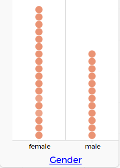
- Once groups have produced a graph or graphs to answer their investigative question, bring the class together and discuss the graphs produced. Most will have produced a dot plot (default graph for numerical and categorical data). CODAP allows us to look at this data in different ways.
Example of a categorical graph in CODAP:
Example of a numerical graph in CODAP:
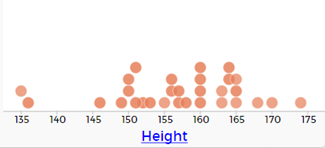
We might explore what is missing from the height graph (units) and show students how to include the units in the graph.
Click on the variable in the table or case card view. This gives a pop-up menu.
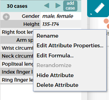
Select edit attribute properties, and in the pop-up window type in the unit (cm), and click apply.
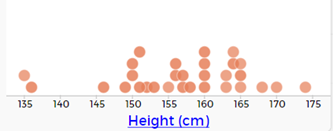
This updates the graph to show the units.
Students can update all the measurement variables in the table to include the units of measure. - Students will now learn about bar graphs (for categorical data) and histograms (for numerical data) as alternative displays.
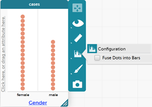
- Making bar graphs in CODAP for categorical data: If they chose a numerical variable for their investigative question, get them to choose a categorical variable to practice this with. They should display the categorical variable they have chosen.
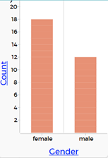
Click on the graph to bring up the tool bar. Select the graph icon and then select 'Fuse Dots into Bars' to make a bar graph.
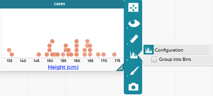
- Making histograms in CODAP for numerical data: If they chose a categorical variable for their investigative question, get them to choose the height to practice this with. They should make a display of the height first.
Click on the graph to bring up the tool bar. Select the graph icon and then select 'Group into Bins' (note the different option when numerical data is recognised).
This action groups the dots into bins. Click on the graph icon again and now the options for 'Bin width', 'Alignment' and 'Fuse Dots into Bars' comes up. Generally, go with the default settings for bin width and alignment; then select 'Fuse Dots into Bars'.
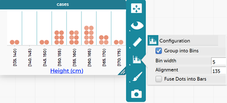
The resulting graph is:
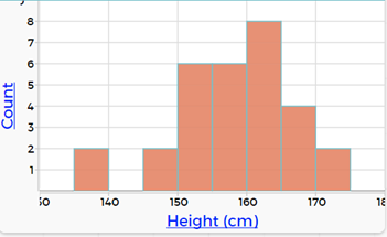
Students can explore changing the bin width and the alignment. What happens when the alignment is changed?
Students can compare the dot plot with the histogram and have a korero about what is similar and what is different. What are the advantages of the dot plot? What are the advantages of the histogram?
Remind them that they can use multiple displays to show different features of the data to answer their investigative questions. Students describe their data displays. A good starter is using “I notice…” as students start to notice features of their displays. For numerical data they might notice:
- The largest value
- The smallest value
- Where most of the values lie e.g. between X and Y
- Where the data peaks
- Gaps or clusters
- Unusual values
For categorical data they might notice:
- The most common
- The least common
- The majority
- Combinations of categories
- Any patterns (depending on the categories)
All statements in the descriptions need to include the name of the variable and the group, and for numerical data, the value and the units as well.
CONCLUSION: Answering the investigative question and reporting findings
- Students answer their investigative question using evidence from their analysis. Ensure students support each other and have opportunities to experience both tuakana and teina roles as they do this.
- Students can present their findings using a PowerPoint or similar presentation. Restrict to 3-4 slides
- Their investigative question
- Display(s) with descriptions (1-2)
- Answer to their investigative question – linking to the school uniform or sportswear manufacturer purpose
Session 4: Comparing to students like us in New Zealand
The class will use data from CensusAtSchool to compare to their class results.
- Students from around New Zealand have engaged in the CensusAtSchool questionnaire and measurement data has been collected, some like what we collected. This data is available on the CensusAtSchool site.
- In this session students will get their own sample of students their age from the CensusAtSchool database to compare with the class data from the previous sessions for measurement variables. The measurements you have taken will determine which variables you can compare. If students do not have an appropriate measurement variable get them to compare heights.
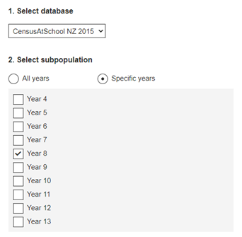
- Show students the CensusAtSchool random sampler, remembering to accept the conditions of use. Once in there familiarise the students with the tool. There are five parts to the tool.
- Select database – here we can choose any database from 2005 onwards. Recommend they use the 2015 or 2017 database as these have a larger range of body measurements.
- Select subpopulation – because we want to compare with other New Zealander students our age, we want to select specific years. When we select specific years, we get a drop-down list that allows us to select the same year level as the students. Select the year level. The example shows year 8 selected, but you could select any year group.
- Some students may want to also compare data by region. Ask if any students would like to share their iwi, hapū, marae, or location of other whānau connections with the class. They may decide to compare data from their home region with data from a region of Aotearoa they have iwi, hapū or whānau connections with.
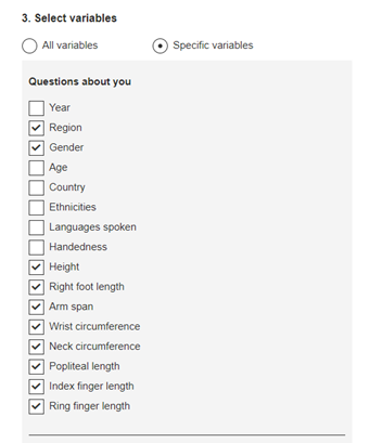
- Select variables – because we want to look at measurements specifically, we only want to select specific variables. When we select specific variables, we get a drop-down list of all the variables in the survey. Suggest the following variables are selected:
- Select sample type – leave as random sample
- Enter sample size (Maximum 1000) – suggest they select 100 to give a slightly bigger group to work with.
- Note: 100 is a good size for a later activity where we find the middle and the middle 50%, also 100 will give a bigger group (sample) size than the class and provides the opportunity to deal with comparing different size groups, something students sometimes think we cannot do.
- Once they have made the selections in the five parts, they click on generate sample and then download sample.
- Students save the .csv file and then import into CODAP. (The video here shows how to import data from CensusAtSchool.)
- Once the data has been collected from the site get the students to discuss how they might make a comparison with our class data e.g. they might suggest that a histogram is easier to compare than the dot plot.
- Students display the data for any variables we have identified that we can compare using CODAP. If they need to choose, suggest they choose height.
- They should write “I notice” statements about what they see in their data from CensusAtSchool.
- Focus the discussion on similarities and differences between the data sets, the class data and the CensusAtSchool sample (we are calling the group from CensusAtSchool, CensusAtSchool sample to describe the group. We are NOT doing sample to population inference – this is in curriculum level 5).
Note also that the different group sizes might be a sticking point for students as they may not think they are able to compare different sized groups. Get them to focus on the summary information e.g. where is most of the data, where does the data peak, what is the biggest value, the smallest value, the middle value, how do these compare? These were the suggested features from the description of their class data.
Note: If the students have all downloaded their own individual samples from CensusAtSchool the discussions each student makes could be quite different. If you want them all to have the same sample from CensusAtSchool you can download a sample yourself, import into CODAP and then share the CODAP document with your students (see this video on saving and sharing CODAP documents).
Session 5: ANALYSIS: Going deeper - investigating the middle and the middle 50% of our data using CODAP
Note that measures of centre are not introduced in The New Zealand Curriculum until level 5. At curriculum level 4 we introduce informal ideas of the middle and the middle 50%
Describing the middle
Students to work with their class data initially. The example given is for heights, but the ideas are the same for any numerical data.
Introducing the idea of the median, this is the middle of the data
- Make the graph for height using CODAP. Stretch the graph out so that the dots are not over top of one another. This can be done by dragging the bottom corner along so that the graph is wider.
- Select the ruler (measures) and tick 'Count' and add a movable value.
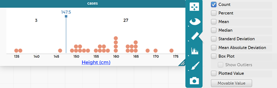
- Ask the students what they see on their graph now.
- They should see a line with a number in blue with a number on the top and two values, one to the left of the line and one to the right of the line. What do the two values (left and right of the line) represent? This is the count of the number of people in the class (in the given example it is 3+27, 30 students in the class).
- Discuss where the middle value would be, e.g. for this graph it would be in the middle of 30 which is 15, that is 15 on each side of the movable line.
- Therefore, we want to move the movable value so that the counts are about half each side.
- The place that we settle the movable value at is the middle value or the median. The median is the technical statistics term for the middle value in a set of data when the data are placed in order from smallest to largest.
- Get the students to read the middle value from their graph. In this example the middle value (OR middle height) is 157.5 cm (always include the unit).
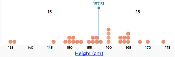
- They should now write a statement in a text box under their graph that says…
- The median height for students in our class is __________ cm.
Repeat the idea for the data they have from CensusAtSchool.
- Students make the graph for heights for the CensusAtSchool group.
- They click on the ruler and select 'Count' and 'Movable Value'.
- They move the line until they have about half on each side (if they have selected 100 students then there will be 50 on each side).
- They write a statement about the middle value of their graph.
- The median height for students in the CensusAtSchool sample is _________cm.
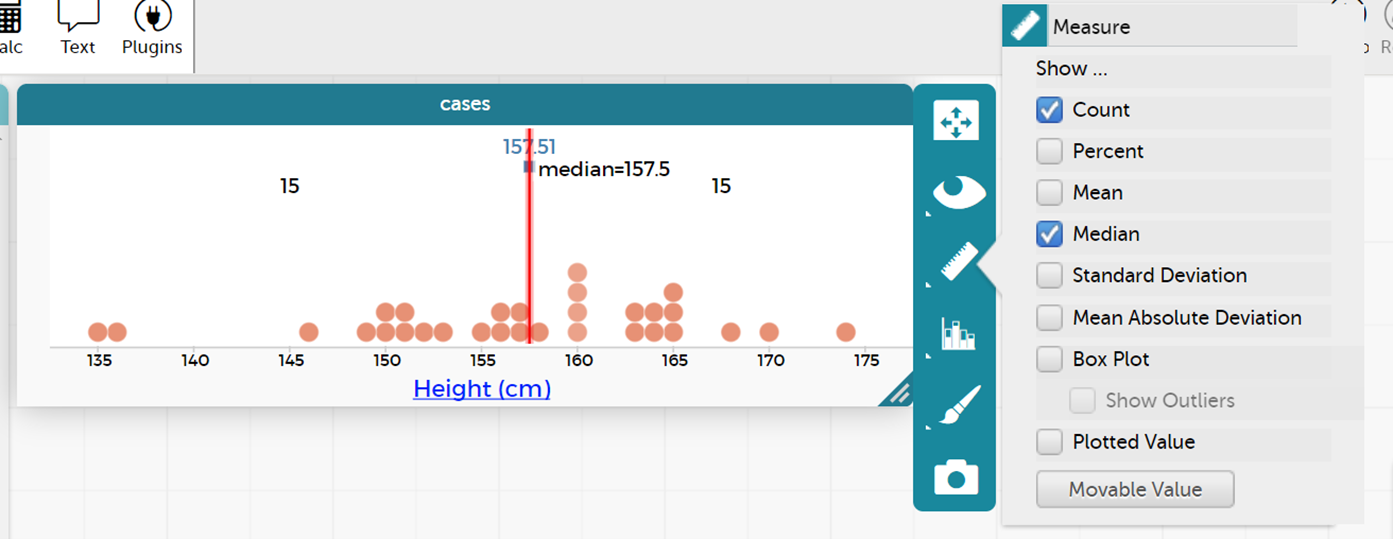
This special value, the median, can be found using the CODAP measures tool. Click on the ruler and then select median. They should get a red line showing the 'Median'. By hovering over this red line, they can find the median value, e.g. for first height example see picture below. They can also notice how close their guess at the middle was to the actual median (the middle of the values when placed in order from smallest to largest).
Introduce the idea of the middle 50% of the data
The “signal” for the data is often where the middle 50% of the data is.
- Go back to the class height graph
- Untick 'Median'
- Tick 'Movable Value' (add) so there are two movable values on the graph
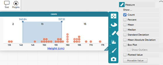
- Discuss with the students how many people would be in the middle 50% (in this case 15). This would leave 15 outside the middle 50% or 7/8 either side.
- Move the lines so that the counts match this or are very close to this.
- Read the values for the middle 50%, from the two movable values. In this case it would be 151.5 cm for the bottom value and 163.5 cm for the top value.
- We would describe this as the middle 50% of heights for students in our class is between 151.5 cm and 163.5 cm.
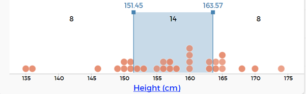
Repeat idea for the CensusAtSchool sample heights data.
Making comparisons between our class data and the CensusAtSchool sample data
With these two additional pieces of information – the middle (median) and the middle 50% update your discussion around the similarities and differences between the class data and the CensusAtSchool sample data. Ensure students support each other and have opportunities to experience both tuakana and teina roles as they do this.
Measuring up
In this unit the students will collect statistical data about their own class and school and learn how to compare it to data from students from CensusAtSchool.
By Level 4 students are able to take increasing responsibility for the planning and conducting of statistical investigations. Students should be capable now of incorporating technology into their work.
Informal measures of centre and spread (at curriculum level 4)
Formal measures of centre and spread are introduced at curriculum level 5. If your students are ready to explore these then look to curriculum level 5 activities. At curriculum level 4 we introduce the ideas of the middle and the middle 50% of numerical data. We can match the middle of the data on a graph up with the median in an informal sense using technology. We can identify the middle and the middle 50% using technology or marking by eye on a physical graph.
The learning opportunities in this unit can be differentiated by providing or removing support to students and by varying the task requirements. Ways to support students include:
The context for this unit can be adapted to suit the interests and experiences of your students. For example:
Session 1: Measuring the class
PROBLEM: Generating ideas for statistical investigation and developing investigative questions
Research online information about sizing guides as well.
Note: that some students may be sensitive about being measured. It is not appropriate to measure weight. Ideas around the ethics of data collection are attended to in 4. Students who do not want to be measured could become the measurer for a measurement station.
PLAN: Planning to collect data to answer our investigative question
Session 2: DATA: Collecting and organising data
ANALYSIS introduction: Using an online tool to make data displays
In the remaining time for the session, the students will be introduced to using an online tool for data analysis. One suggested free online tool is CODAP. Feel free to use other tools you are familiar with. This is written with CODAP as the online tool and is assuming students have not used CODAP before. If your students are familiar with CODAP then they can move straight into analysing the data from the class survey.
If you do not want to use an online tool then head to the making displays part and progress with paper versions of bar graphs, dot plots and histograms.
Learning how to use CODAP
Session 3: ANALYSIS: Displaying and describing the data
Students use data from the previous session to produce graphs in CODAP or similar statistical analysis software.
Example of a categorical graph in CODAP:
Example of a numerical graph in CODAP:
We might explore what is missing from the height graph (units) and show students how to include the units in the graph.
Click on the variable in the table or case card view. This gives a pop-up menu.
Select edit attribute properties, and in the pop-up window type in the unit (cm), and click apply.
This updates the graph to show the units.
Students can update all the measurement variables in the table to include the units of measure.
Click on the graph to bring up the tool bar. Select the graph icon and then select 'Fuse Dots into Bars' to make a bar graph.
Click on the graph to bring up the tool bar. Select the graph icon and then select 'Group into Bins' (note the different option when numerical data is recognised).
This action groups the dots into bins. Click on the graph icon again and now the options for 'Bin width', 'Alignment' and 'Fuse Dots into Bars' comes up. Generally, go with the default settings for bin width and alignment; then select 'Fuse Dots into Bars'.
The resulting graph is:
Students can explore changing the bin width and the alignment. What happens when the alignment is changed?
Students can compare the dot plot with the histogram and have a korero about what is similar and what is different. What are the advantages of the dot plot? What are the advantages of the histogram?
Remind them that they can use multiple displays to show different features of the data to answer their investigative questions.
Students describe their data displays. A good starter is using “I notice…” as students start to notice features of their displays. For numerical data they might notice:
For categorical data they might notice:
All statements in the descriptions need to include the name of the variable and the group, and for numerical data, the value and the units as well.
CONCLUSION: Answering the investigative question and reporting findings
Session 4: Comparing to students like us in New Zealand
The class will use data from CensusAtSchool to compare to their class results.
Note also that the different group sizes might be a sticking point for students as they may not think they are able to compare different sized groups. Get them to focus on the summary information e.g. where is most of the data, where does the data peak, what is the biggest value, the smallest value, the middle value, how do these compare? These were the suggested features from the description of their class data.
Note: If the students have all downloaded their own individual samples from CensusAtSchool the discussions each student makes could be quite different. If you want them all to have the same sample from CensusAtSchool you can download a sample yourself, import into CODAP and then share the CODAP document with your students (see this video on saving and sharing CODAP documents).
Session 5: ANALYSIS: Going deeper - investigating the middle and the middle 50% of our data using CODAP
Note that measures of centre are not introduced in The New Zealand Curriculum until level 5. At curriculum level 4 we introduce informal ideas of the middle and the middle 50%
Describing the middle
Students to work with their class data initially. The example given is for heights, but the ideas are the same for any numerical data.
Introducing the idea of the median, this is the middle of the data
Repeat the idea for the data they have from CensusAtSchool.
This special value, the median, can be found using the CODAP measures tool. Click on the ruler and then select median. They should get a red line showing the 'Median'. By hovering over this red line, they can find the median value, e.g. for first height example see picture below. They can also notice how close their guess at the middle was to the actual median (the middle of the values when placed in order from smallest to largest).

Introduce the idea of the middle 50% of the data
The “signal” for the data is often where the middle 50% of the data is.
Repeat idea for the CensusAtSchool sample heights data.
Making comparisons between our class data and the CensusAtSchool sample data
With these two additional pieces of information – the middle (median) and the middle 50% update your discussion around the similarities and differences between the class data and the CensusAtSchool sample data. Ensure students support each other and have opportunities to experience both tuakana and teina roles as they do this.
Dear parents and whānau,
At school this week we will be measuring the heights of the students in the class and comparing our results to the heights of students around Aotearoa. As another comparison we would like to be able to talk about the heights of family members. Could you please help your child measure the heights of their family members and record the information to bring to school?
Can each person in the family answer the following survey question:
How tall are you without your shoes on (answer to the nearest cm)?
Thank you.
Figure it Out Links
Some links from the Figure It Out series which you may find useful are:
Sports Statistics
In this unit students are given the opportunity to investigate a sport of their choice, access statistics through surveys and from the internet, and present their findings as graphs created using technology.
This unit is a very open unit which allows students to investigate a sport of their choice. It should be noted that not all sports have a great deal of easily accessible statistical data available. If you are not confident in your ability to find data on any sport, you could restrict the choice of sports available.
This unit focuses on gathering statistics both through a survey and from the internet. Students will discuss the relevance of data, ways to gather data, and will present the results of their investigation using appropriate technology. This could include using CODAP, online survey forms and spreadsheets. See Travel to school and Measuring up for further information on using technology to analyse data.
The learning opportunities in this unit can be differentiated by providing or removing support to students and by varying the task requirements. Ways to support students include:
The context for this unit can be adapted to suit the interests and experiences of your students. The statistical enquiry process can be applied to many topics and selecting ones that are of interest to your students should always be a priority.For example: Whilst this unit is planned around a statistics project on a sport of the students’ choice, it could be adapted to focus on Olympic sports, popular summer sports, sports from different cultures, team sports, ball sports etc. Revise the context as necessary to engage your students and make connections with their cultural backgrounds, learning from other curriculum areas, interests, and experiences of sports. You could also change the context to focus on another, completely different subject area or other context for health and physical education.
Te reo Māori kupu such as tirohanga tauanga (survey, statistical survey), tūhuratanga tauanga (statistical investigation), taurangi (variable), and kauwahata (graph) could be introduced in this unit and used throughout other mathematical learning.
Session 1
Arnold’s (2013) research identified six criteria for what makes a good investigative question. At curriculum level 4, students should be introduced to the criteria, potentially through “discovering” them. See for example, the following lesson on CensusAtSchool New Zealand: https://new.censusatschool.org.nz/resource/posing-summary-investigative-questions/
The six criteria are:
See Travel to school for further information on developing investigative questions, including interrogating ideas for exploration.
Session 2
Session 3
Session 4
Have you found information to answer your investigative questions?
Can you put the information into graphs?
What kind of graphs will you use?
Session 5
What kinds of graph are best for which kinds of information?
What are the important things to remember about each type of graph?
Dear parents and whānau,
This week in maths we are investigating sports statistics. Your child will be looking for statistics on a sport of their choice. We would appreciate it if you could help them in any way possible.
Figure it Out Links
Some links from the Figure It Out series which you may find useful are:
Sports
In this unit data about sporting activities is collected and presented using dot plots and bar graphs.
The key idea of statistical investigations at level 3 is telling the class story with supporting evidence. Students build on the ideas from level two and their understanding of the PPDAC (Problem, Plan, Data, Analysis, Conclusion) cycle – see Planning a statistical investigation – level 3 for a full description of all the phases of the PPDAC cycle. Key transitions at this level include posing summary investigative questions and collecting and displaying multivariate and time series data.
Summary or time series investigative questions will be posed and explored. Summary investigative questions need to be about the group of interest and have an aggregate focus. For example, What types of lunch-time activities do the students in year 5 like doing? What are the heart rates of students in our class?
Data displays build on the use of frequency plots from level two and can be formalised into dot plots and bar graphs. Students should be encouraged to show a second variable, for example, by using colour. They may like to look at boys’ and girls’ lunch-time activity preferences.
Students will be making summary statements. For example, the most common resting heart rate for our class is 70 beats per minute, four people have a resting heart rate of 66 beats per minute (read the data), or most students (16 students out of the 27 in our class) have a resting heart rate between 65 and 75 beats per minute (read between the data). Teachers should be encouraging students to read beyond the data by asking questions such as: “If a new student joined our class, what resting heart rate do you think they would have?”
Dot plots
Dot plots are used to display the distribution of a numerical variable (for example, hours of sleep) in which each dot represents a value of the variable (for example, 8 hours). If a value occurs more than once, the dots are placed one above the other so that the height of the column of dots represents the frequency for that value. Sometimes the dot plot is drawn using crosses instead of dots. Dot plots also be used for categorical data (i.e. data that can be organised into distinct categories, such as types of preferred lunchtime activities).
Bar graphs
In a bar graph equal-width rectangles (bars) represent each category or value for the variable. The height of these bars tells how many of that object there are. The bars can be vertical, as shown in the example below, or horizontal.
The bar graphabove shows the types of shoes worn in the class on a particular day. There are three types of shoes: jandals, sneakers, and boots. The height of the corresponding bars shows that there are six lots of jandals, 15 lots of sneakers and three lots of boots. It should be noted that the numbers label the points on the vertical axis, not the spaces between them. Notice too, in a convention used for discrete data (category and whole number data), there are gaps between the bars. A histogram, which features bars without gaps, is used to present continuous, numerical data that has been organised into continuous intervals (e.g. average temperature inside the classroom over the course of a day). Histograms are covered further at late Level 3 and at Level 4.
The learning opportunities in this unit can be differentiated by providing or removing support to students and by varying the task requirements. Ways to support students include:
The context for this unit can be adapted to suit the interests and experiences of your students. The statistical enquiry process can be applied to many topics and selecting ones that are of interest to your students should always be a priority. Consider how you could make links between this unit and learning from another curriculum area. For example, to complement learning about conservation and the life cycle of plants, you could frame the unit around creating a graph showing native plants found in the bush, or birds observed in the local environment. Comparisons to the amount of birds could be made from one day to the next, or at two different times of the day.
Te reo Māori vocabulary terms such as kauwhata ira (dot plot, dot graph), kauwhata pou (bar graph), tauanga (statistics), kohikohi raraunga (data collection), raraunga whakarōpū (category data), and raraunga (data) could be introduced in this unit and used throughout other mathematical learning. Numbers in te reo Māori can be used alongside numbers in English.
Session 1
We begin the session by looking at our resting heart rate and our heart rate after we’ve done some exercise. We display this data using dot plots. Discuss with the students what they already know about dot plots graphs. Show and discuss some examples. These could be found in media (e.g. newspapers, CensusAtSchools data) or in texts. Briefly refer to the important features (e.g. title, y and x-axis, scale, regular intervals, type of data displayed - number or category). Explain that you are going to collaborate (mahi tahi) and create a dot plot. You have chosen a dot plot because you want to display number/numerical data.
Can anyone explain why I have put those numbers at that place on the graph? [Think about scale. For example, 76 is just over halfway between 70 and 80].
Where are most of the heart rates?
Which heart rate is near the middle? (Dot plots are great for answering this question as you can mark where you think the middle is and check that half the data is to the left and half the data is to the right)
Which heart rates are grouped together in clusters?
Which heart rates are lying outside the cluster?
Are there any surprises?
What are the differences between the two sets of data?
Ensure the statements include the variables (resting heart rate and heart rate after exercise) and the group (our class). As this is numerical data the statements should also include values and units (beats per minute). Use this information to answer the investigative question using evidence from our statements (conclusion). Students can share their statements with each other and provide feedback to each other.
Session 2-3
In these two sessions we focus on the use of bar graphs to display results of categorical data.
Discuss with the students what they already know about bar graphs. Show and discuss some examples. These could be found in media (e.g. newspapers, CensusAtSchools data) or in texts. Briefly refer to the important features (e.g. title, y and x-axis, scale, regular intervals, type of data displayed - number or category). Explain that you are going to collaborate (mahi tahi) and create a bar graph. You have chosen a bar graph because you want to display category/categorical data
Are there any surprises in the data we’ve collected?
What can you say about the information in this graph?
Session 4-5
Over the next two days the students gather information around the theme of sports. They use the PPDAC cycle to collect, display and share the information with others.
How many crunches (sit ups) can they do in a minute?
How many breaths do they take in a minute before exercise, after exercise?
How long does it take to run a certain distance (time in seconds)?
How many skips can they do in a minute?
Remind them to include the variable and the group in any statements they make about the data, and if the data is numerical to also include values and units. Give students the opportunity to share their learning with others within the class or as a whole class group.
Dear family and whānau,
At school this week we have been gathering information about our heart rates. We have displayed the data using a dot plot. A dot plot is useful for arranging numerical data in a display. Ask your child to share with you how we found our heart rates and then can you place the heart rates of your family on the chart below.
We have been solving heart-beat problems with the help of calculators. Here’s one for you to work on with your child:
How many times does your child’s heart beat in a week?
(Include Copymaster 2)
Figure it Out Links
Some links from the Figure It Out series which you may find useful are: