It is vital, when planning statistical investigations, that students understand the importance of the way in which they collect, record and present their information (data). Inconsistencies in the carrying out any of these steps can lead to altered findings, and therefore an invalid investigation. Students will first look at choosing a topic to investigate, making sure that the topic lends itself to being investigated statistically. They will then look at a variety of ways of collecting their data and choose the best way to record it. Once they have collected and recorded their data they will investigate the best way to present their findings, taking into consideration the needs of their intended audience. To evaluate the investigations there can be a combination of methods used, depending on the students, the topics and the intended audience. It could be useful for the students to send their completed investigations and findings to interested parties for more realistic feedback.
Investigative questions
At Level 3, students should generate broad ideas to investigate, before refining their ideas into an investigative question that can be answered with data. The teacher supports the development of students' investigative questions through questioning, modelling, and checking appropriateness of variables. Investigative summary, simple comparison and time series questions are posed, where the entire data set can be collected or provided. The variables are categorical or whole numbers.
An important distinction to make is that of the difference between investigative questions, meaning the questions we ask of the data, and data collection or survey questions, meaning the questions we ask to get the data. The data collected through survey of data collection questions allows us to to answer the investigative question. For example, if our investigative question was “What ice cream flavours do the students in our class like?” a corresponding survey question might be “What is your favourite ice cream flavour?” As with the investigative question, survey question development is done by the students with teacher support to improve them so that suitable survey questions are developed.
Analysis questions
Analysis questions are questions we ask of displays of data as we start to describe it. The teacher will often model this through asking students about what they see in their displays. A series of analysis questions can be developed in conjunction with the students. Analysis questions include questions about the features of the display. Questions such as: what is the most common? the least common? how many of a certain category? what is the highest value (for numerical data)? lowest value (for numerical data)? are analysis questions.
Dot plots
Dot plots are used to display the distribution of a numerical variable in which each dot represents a value of the variable. If a value occurs more than once, the dots are placed one above the other so that the height of the column of dots represents the frequency for that value. Sometimes the dot plot is drawn using crosses instead of dots. Dot plots can also be used for categorical data.
Bar graphs
In a bar graph equal-width rectangles (bars) represent each category or value for the variable. The height of these bars tells how many of that object there are. The bars can be vertical, as shown in the example, or horizontal.
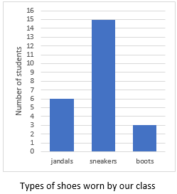
The example above shows the types of shoes worn in the class on a particular day. There are three types of shoes: jandals, sneakers, and boots. The height of the corresponding bars shows that there are six lots of jandals, 15 lots of sneakers and three lots of boots. It should be noted that the numbers label the points on the vertical axis, not the spaces between them. Notice too, in a convention used for discrete data (category and whole number data), there are gaps between the bars.
Strip graphs
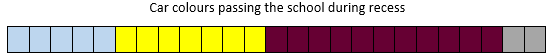
A strip graph represents frequencies as a proportion of a rectangular strip. For example, the strip graph below shows that the students saw five light blue cars, seven yellow cars, 11 maroon cars and two grey ones. The strip graph can be readily developed from a bar graph. Instead of arranging the bars beside one another join them end to end. (Alternatively, you can easily get a bar graph from a strip graph by reversing the process.)
Tally charts
A tally chart provides a quick method of recording data as events happen. If the students are counting different coloured cars as they pass the school, a tally chart would be an appropriate means of recording the data. Note that it is usual to put down vertical strokes until there are four. Then the fifth stroke is drawn across the previous four. This process is continued until all the required data has been collected. The advantage of this method of tallying is that it enables the number of objects to be counted quickly and easily at the end.

In the example above, in the time that we were recording cars, there were 11 red cars, four yellow cars, 18 white cars and five black ones and 22 cars of other colours.
Using software for statistical displays
Microsoft Excel or Google Sheets are readily available tools that allow summarised data to be entered onto a spreadsheet and then graphed.
Other online statistical tools that are good for graphing data, for example CODAP – Common Online Data Analysis Platform, work with raw data and allow a more flexible approach to data analysis. Support videos for students and teachers in New Zealand on using CODAP can be found here.
Sports Statistics
In this unit students are given the opportunity to investigate a sport of their choice, access statistics through surveys and from the internet, and present their findings as graphs created using technology.
This unit is a very open unit which allows students to investigate a sport of their choice. It should be noted that not all sports have a great deal of easily accessible statistical data available. If you are not confident in your ability to find data on any sport, you could restrict the choice of sports available.
This unit focuses on gathering statistics both through a survey and from the internet. Students will discuss the relevance of data, ways to gather data, and will present the results of their investigation using appropriate technology. This could include using CODAP, online survey forms and spreadsheets. See Travel to school and Measuring up for further information on using technology to analyse data.
The learning opportunities in this unit can be differentiated by providing or removing support to students and by varying the task requirements. Ways to support students include:
The context for this unit can be adapted to suit the interests and experiences of your students. The statistical enquiry process can be applied to many topics and selecting ones that are of interest to your students should always be a priority.For example: Whilst this unit is planned around a statistics project on a sport of the students’ choice, it could be adapted to focus on Olympic sports, popular summer sports, sports from different cultures, team sports, ball sports etc. Revise the context as necessary to engage your students and make connections with their cultural backgrounds, learning from other curriculum areas, interests, and experiences of sports. You could also change the context to focus on another, completely different subject area or other context for health and physical education.
Te reo Māori kupu such as tirohanga tauanga (survey, statistical survey), tūhuratanga tauanga (statistical investigation), taurangi (variable), and kauwahata (graph) could be introduced in this unit and used throughout other mathematical learning.
Session 1
Arnold’s (2013) research identified six criteria for what makes a good investigative question. At curriculum level 4, students should be introduced to the criteria, potentially through “discovering” them. See for example, the following lesson on CensusAtSchool New Zealand: https://new.censusatschool.org.nz/resource/posing-summary-investigative-questions/
The six criteria are:
See Travel to school for further information on developing investigative questions, including interrogating ideas for exploration.
Session 2
Session 3
Session 4
Have you found information to answer your investigative questions?
Can you put the information into graphs?
What kind of graphs will you use?
Session 5
What kinds of graph are best for which kinds of information?
What are the important things to remember about each type of graph?
Dear parents and whānau,
This week in maths we are investigating sports statistics. Your child will be looking for statistics on a sport of their choice. We would appreciate it if you could help them in any way possible.
Figure it Out Links
Some links from the Figure It Out series which you may find useful are:
Planning a statistical investigation (Level 3)
In this unit students will identify how to plan and carry out a statistical investigation about a topic of interest.
It is vital, when planning statistical investigations, that students understand the importance of the way in which they collect, record and present their information (data). Inconsistencies in the carrying out any of these steps can lead to altered findings, and therefore an invalid investigation. Students will first look at choosing a topic to investigate, making sure that the topic lends itself to being investigated statistically. They will then look at a variety of ways of collecting their data and choose the best way to record it. Once they have collected and recorded their data they will investigate the best way to present their findings, taking into consideration the needs of their intended audience. To evaluate the investigations there can be a combination of methods used, depending on the students, the topics and the intended audience. It could be useful for the students to send their completed investigations and findings to interested parties for more realistic feedback.
Investigative questions
At Level 3, students should generate broad ideas to investigate, before refining their ideas into an investigative question that can be answered with data. The teacher supports the development of students' investigative questions through questioning, modelling, and checking appropriateness of variables. Investigative summary, simple comparison and time series questions are posed, where the entire data set can be collected or provided. The variables are categorical or whole numbers.
An important distinction to make is that of the difference between investigative questions, meaning the questions we ask of the data, and data collection or survey questions, meaning the questions we ask to get the data. The data collected through survey of data collection questions allows us to to answer the investigative question. For example, if our investigative question was “What ice cream flavours do the students in our class like?” a corresponding survey question might be “What is your favourite ice cream flavour?” As with the investigative question, survey question development is done by the students with teacher support to improve them so that suitable survey questions are developed.
Analysis questions
Analysis questions are questions we ask of displays of data as we start to describe it. The teacher will often model this through asking students about what they see in their displays. A series of analysis questions can be developed in conjunction with the students. Analysis questions include questions about the features of the display. Questions such as: what is the most common? the least common? how many of a certain category? what is the highest value (for numerical data)? lowest value (for numerical data)? are analysis questions.
Dot plots
Dot plots are used to display the distribution of a numerical variable in which each dot represents a value of the variable. If a value occurs more than once, the dots are placed one above the other so that the height of the column of dots represents the frequency for that value. Sometimes the dot plot is drawn using crosses instead of dots. Dot plots can also be used for categorical data.
Bar graphs
In a bar graph equal-width rectangles (bars) represent each category or value for the variable. The height of these bars tells how many of that object there are. The bars can be vertical, as shown in the example, or horizontal.
The example above shows the types of shoes worn in the class on a particular day. There are three types of shoes: jandals, sneakers, and boots. The height of the corresponding bars shows that there are six lots of jandals, 15 lots of sneakers and three lots of boots. It should be noted that the numbers label the points on the vertical axis, not the spaces between them. Notice too, in a convention used for discrete data (category and whole number data), there are gaps between the bars.
Strip graphs
A strip graph represents frequencies as a proportion of a rectangular strip. For example, the strip graph below shows that the students saw five light blue cars, seven yellow cars, 11 maroon cars and two grey ones. The strip graph can be readily developed from a bar graph. Instead of arranging the bars beside one another join them end to end. (Alternatively, you can easily get a bar graph from a strip graph by reversing the process.)
Tally charts
A tally chart provides a quick method of recording data as events happen. If the students are counting different coloured cars as they pass the school, a tally chart would be an appropriate means of recording the data. Note that it is usual to put down vertical strokes until there are four. Then the fifth stroke is drawn across the previous four. This process is continued until all the required data has been collected. The advantage of this method of tallying is that it enables the number of objects to be counted quickly and easily at the end.
In the example above, in the time that we were recording cars, there were 11 red cars, four yellow cars, 18 white cars and five black ones and 22 cars of other colours.
Using software for statistical displays
Microsoft Excel or Google Sheets are readily available tools that allow summarised data to be entered onto a spreadsheet and then graphed.
Other online statistical tools that are good for graphing data, for example CODAP – Common Online Data Analysis Platform, work with raw data and allow a more flexible approach to data analysis. Support videos for students and teachers in New Zealand on using CODAP can be found here.
The learning opportunities in this unit can be differentiated by providing or removing support to students and by varying the task requirements. Ways to support students include:
The context for this unit can be adapted to suit the interests and experiences of your students. For example:
Te reo Māori kupu such as tūhuratanga tauanga (statistical investigation) and taurangi (variable) could be introduced in this unit and used throughout other mathematical learning
This unit is set out to cover the topic of statistical investigations in depth will likely take 1-2 weeks. Some of the sessions may take more than one classroom session to complete. There is an introduction session followed by five sessions that follow the statistical enquiry cycle (PPDAC cycle) as described in the New Zealand Curriculum. Data detective posters showing the PPDAC (problem, plan, data, analysis, conclusion) cycle are available to download from Census At School in English and te reo Māori.
While this unit plan uses the five phases of the PPDAC cycle as a step by step process, in reality when using the PPDAC cycle one often moves between the different phases. For example, students might need to revisit the investigative question (problem) as a result of the planning phase.
Session 1: Introduction
This session provides an introduction and purpose to statistical investigations. The teacher will need to provide the students with plenty of magazines, newspapers and websites that have some good examples of how data can be presented effectively and perhaps some examples of poorly displayed data. This could be collated into a chart or slideshow. Prior to the session, ask the students to spend some time at home looking through magazines and newspapers to find examples of statistics to bring in for the session.
What is a statistical investigation?
Can you think of an example when we might need to carry out a statistical investigation?
Who has done the research for/carried out this investigation?
Who will benefit from the results of this investigation?
Is it clear to you what the purpose of the investigation is?
What do you like about the way that the information is presented?
Does it help you in any way to understand the information better?
Do you think the information could have been presented in a different way to help the audience understand the findings? If so, what would have made it better?
Session 2: PROBLEM (Generating ideas for statistical investigation and developing investigative questions)
This session is ultimately about choosing an appropriate topic to investigate. You will need to discuss what data is actually measurable within your context and realistic topics that can be investigated in the given time frame. It would be a good idea to provide the students with a list of topics (perhaps relating to a current school issue, relevant curriculum area, or your students' cultural backgrounds and interests). Encourage students to come up with something original where possible.
These are the questions we ask of the data; it will be the question(s) we explore using the PPDAC cycle.
Session 3: PLAN (Planning to collect data to answer our investigative question)
Data collection is a vital part of the investigation process. The teacher will need to stress to the students, once again, the importance of being consistent in the collection of their data. There will also need to be sufficient discussion around efficient methods for data collection and recording.
Fundamentally, data collection and survey questions are the same – they are both questions we ask to get the data.
Managing surveys: depending on the target groups and how you plan to manage the survey process there are a few options here to choose from.
Option 1: an online questionnaire is developed for each group that will be surveyed. This following should be considered:
Option 2: a paper questionnaire is developed for each group that will be surveyed. Similar considerations to the online questionnaire are needed, except that a paper copy will need to be printed for each person to fill out. These should be collected up and brought back to the class if the people who have filled them out are not in the class
Other data collection methods
Depending on the topics, students might be collecting data about litter, cars, pedestrian traffic. These are not things that we would use a questionnaire for so the students will need to think about a plan to collect the data. They may decide to use a pre-prepared table or grid to do this. The table should be set up so that the information for each of their data collection questions for a single object can be recorded in a single row. For example:
Collecting information about vehicle make and colour – students might also think to collect the vehicle type too.
Set up a table with four columns:
Students need to check with the teacher before commencing data collection to ensure that their method of collection is the most appropriate and will result in data that is useful for analysis.
Session 4: DATA (Collecting and organising data)
Note for teachers:
Students will use their .csv file to make their displays in the next session. If it is not possible for them to save as a .csv then the teacher may need to do this and share with them or set up the CODAP document with their data and share a link to this. See the video or written instructions on how to do this. Note the video and the instructions include getting started with CODAP too.
Session 5: ANALYSIS part 1 (Using an online tool to make data displays)
In this session the students will be introduced to using an online tool for data analysis. One suggested free online tool is CODAP. Feel free to use other tools you are familiar with. This session is written with CODAP as the online tool and assumes students have not used CODAP before.
If you do not want to use an online tool, then continue to Making Displays, and construct paper versions of bar graphs and dot plots.
Learning how to use CODAP
The main features that students need to be familiar with are how to draw a graph and how to import their data. More on importing data into CODAP can be found here.
Bar graphs for categorical data
CODAP by default makes a dot plot for both categorical and numerical data. If the data is categorical the bar graph icon (configuration icon) can be selected to fuse the dots into bars, shown in the two pictures below. The graphs are showing the habitats of mammals.
Students should be encouraged to try different things out with the data to get further insights as to what the data might show them. For example, for the above data about mammals students might want to see what happens to the diet for different habitats. They can drag the diet attribute onto the top axis of the graph (and to get different colours they can drag the diet attribute into the middle of the graph to make a legend) and the following display will result.
This gives a deeper insight into the data. You will find that students at this age are comfortable with using CODAP once they have had a little time to play with the software.
Dot plots for numerical data
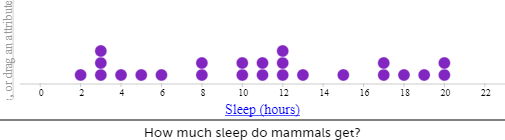
When using CODAP for numerical data a dot plot is the default setting. For example, sleep in hours for mammals shown below.
The data can be split into groups by dragging a categorical attribute to the vertical axis. To explore the sleep by the different habitats, drag habitat to the vertical axis, or to explore sleep by the different diets, drag diet to the vertical axis. The following graphs result.
Making displays for the data they have collected to answer their investigative question
Session 6: ANALYSIS part 2 (Describing data displays)
Session 7: CONCLUSION (Answering the investigative question and reporting findings)
This last session will focus on the final presentation of the data each group has found out. Encourage the students to be constantly evaluating what they are doing. Explain that it is fine to discover that a particular way of presentation is not working, and that it is a good idea to adjust.
Dear parents and whānau,
During the next two weeks we will be working on statistical investigations. Over this time, your child will be gathering data and presenting it using tables and graphs. Your child now needs to be thinking about choosing a topic to investigate. It would be helpful for your child if you could support him/her with selecting a topic, gathering data and perhaps watching for relevant newspaper or television items that will help him/her with analysing the information and forming a conclusion.
Thank you for helping with your child's statistical investigation.
Figure it Out Links
Some links from the Figure It Out series which you may find useful are:
Data cards: Level 3
This unit provides a way of looking at multivariate data (i.e. data that includes many variable, such as gender, age, height, eye colour, bedtime, etc.) that comes from a group of individuals. Data cards hold several pieces of information about individuals, and by sorting and organising a set of data cards, things can be found out about the group. This unit uses secondary data (data collected by others) as well as primary data (data collected by the class).
The key idea of statistical investigations at level 3 is telling the class story with supporting evidence. Students are building on the ideas from level two and their understanding of different aspects of the PPDAC (Problem, Plan, Data, Analysis, Conclusion) cycle – see Planning a statistical investigation – level 3 for a full description of all the phases of the PPDAC cycle. Key transitions at this level include posing summary investigative questions and collecting and displaying multivariate and simple time series data.
Summary or time series investigative questions will be posed and explored. Summary investigative questions need to be about the group of interest and have an aggregate focus, meaning the questions can be used to, find out about the whole group. For example, What position in the family are the students in our class? What are the reaction times of students in our class?
Data displays build on the frequency plots from level two and can be formalised into dot plots and bar graphs. Students should have opportunities to work with multivariate data sets, data cards are a good way to do this. Data cards allow students to flexibly sort their data and to correct errors or make adjustments quickly.
Students will be making summary statements, for example, the most common reaction score for our class is 13 cm, five people have a reaction score of 12 cm (read the data), or most students (16 students out of the 27 in our class) have a reaction score between 13 and 14 cm (read between the data). Teachers should be encouraging students to read beyond the data by asking questions such as: “If a new student joined our class, what reaction score do you think they would have?”
The learning opportunities in this unit can be differentiated by providing or removing support to students and by varying the task requirements. Ways to support students include:
The context for this unit can be adapted to suit the interests and experiences of your students. Preparing data cards with other information on them (sourced from Census At School New Zealand) that will be of interest to your students is one way to do this. Students will be interested in questions they can ask their classmates that are of significance to them, such as “How fluent are you at speaking te reo?”, “What is your marae, maunga, iwi, etc.?”, “Should fireworks only be seen in public displays?”, or “Does your whānau grow their own vegetables at home?” Māori can also be used alongside English on the data cards to develop students’ use of te reo Māori. Consider how you can use the data discussed, and found, throughout these lessons to inform learning in other curriculum areas (e.g. persuasive writing).
Te reo Māori vocabulary terms such as tirohanga tauanga (statistical survey), kāri raraunga (data card), taurangi (variable) and kohikohi raraunga (data collection) could be introduced in this unit and used throughout other mathematical learning.
Session One
Part One – Introducing Data Set One
Part Two – Making Class Data Cards
Part Three – Working with data set one
Session Two
During this session, students will be sorting and arranging data cards about themselves, i.e., the students’ own data cards.
Session Three
Ask students to anticipate what the data may show. Examples might be:
Data Set Three – Optional
A third data set has been included for teachers wishing to repeat the activity in this session. The data for this set was obtained from www.censusatschool.org.nz/.
Data Set Three is a data set of 24 students. The data is: top – male/female, left – arm span in cm, right – height in cm, bottom – age in years.
Session Four
Today the students, in small groups, will design and compile their own data card set. Each small group of students will design three survey questions to ask the students in the class.
Specific instructions will be needed with survey questions like this, so it is clear where to start and finish measuring.
A list of possible favourites to select from is best with survey questions like this.
When organising the data from survey questions like this, categories may be needed, e.g. before 8 pm, 8 to 9 pm, 9 to 10 pm, and later than 10 pm.
Session Five
If a further session is required, the ideas from session 4 can be repeated, or students can make up their own set of data cards by selecting a small sample of students from Census At School. To do this they would need to go to the random sampler and agree to the terms. Then select SPECIFIC variables and select four variables for their data cards. The first three sections are pretty good to choose from. Then enter sample size – 30 should be enough. Generate a sample, then an option to download the sample comes up – select this. Save their sample and then open the spreadsheet and use the information to make their own data cards.
Dear parents and whānau,
This week in maths we are gathering and investigating data about the students in our class.
You might like to ask your child to explain how data cards work. Maybe you could each make a data card like the ones we have been making at school. Discuss what things are the same and what is different about people in your whānau.
Sports
In this unit data about sporting activities is collected and presented using dot plots and bar graphs.
The key idea of statistical investigations at level 3 is telling the class story with supporting evidence. Students build on the ideas from level two and their understanding of the PPDAC (Problem, Plan, Data, Analysis, Conclusion) cycle – see Planning a statistical investigation – level 3 for a full description of all the phases of the PPDAC cycle. Key transitions at this level include posing summary investigative questions and collecting and displaying multivariate and time series data.
Summary or time series investigative questions will be posed and explored. Summary investigative questions need to be about the group of interest and have an aggregate focus. For example, What types of lunch-time activities do the students in year 5 like doing? What are the heart rates of students in our class?
Data displays build on the use of frequency plots from level two and can be formalised into dot plots and bar graphs. Students should be encouraged to show a second variable, for example, by using colour. They may like to look at boys’ and girls’ lunch-time activity preferences.
Students will be making summary statements. For example, the most common resting heart rate for our class is 70 beats per minute, four people have a resting heart rate of 66 beats per minute (read the data), or most students (16 students out of the 27 in our class) have a resting heart rate between 65 and 75 beats per minute (read between the data). Teachers should be encouraging students to read beyond the data by asking questions such as: “If a new student joined our class, what resting heart rate do you think they would have?”
Dot plots
Dot plots are used to display the distribution of a numerical variable (for example, hours of sleep) in which each dot represents a value of the variable (for example, 8 hours). If a value occurs more than once, the dots are placed one above the other so that the height of the column of dots represents the frequency for that value. Sometimes the dot plot is drawn using crosses instead of dots. Dot plots also be used for categorical data (i.e. data that can be organised into distinct categories, such as types of preferred lunchtime activities).
Bar graphs
In a bar graph equal-width rectangles (bars) represent each category or value for the variable. The height of these bars tells how many of that object there are. The bars can be vertical, as shown in the example below, or horizontal.
The bar graphabove shows the types of shoes worn in the class on a particular day. There are three types of shoes: jandals, sneakers, and boots. The height of the corresponding bars shows that there are six lots of jandals, 15 lots of sneakers and three lots of boots. It should be noted that the numbers label the points on the vertical axis, not the spaces between them. Notice too, in a convention used for discrete data (category and whole number data), there are gaps between the bars. A histogram, which features bars without gaps, is used to present continuous, numerical data that has been organised into continuous intervals (e.g. average temperature inside the classroom over the course of a day). Histograms are covered further at late Level 3 and at Level 4.
The learning opportunities in this unit can be differentiated by providing or removing support to students and by varying the task requirements. Ways to support students include:
The context for this unit can be adapted to suit the interests and experiences of your students. The statistical enquiry process can be applied to many topics and selecting ones that are of interest to your students should always be a priority. Consider how you could make links between this unit and learning from another curriculum area. For example, to complement learning about conservation and the life cycle of plants, you could frame the unit around creating a graph showing native plants found in the bush, or birds observed in the local environment. Comparisons to the amount of birds could be made from one day to the next, or at two different times of the day.
Te reo Māori vocabulary terms such as kauwhata ira (dot plot, dot graph), kauwhata pou (bar graph), tauanga (statistics), kohikohi raraunga (data collection), raraunga whakarōpū (category data), and raraunga (data) could be introduced in this unit and used throughout other mathematical learning. Numbers in te reo Māori can be used alongside numbers in English.
Session 1
We begin the session by looking at our resting heart rate and our heart rate after we’ve done some exercise. We display this data using dot plots. Discuss with the students what they already know about dot plots graphs. Show and discuss some examples. These could be found in media (e.g. newspapers, CensusAtSchools data) or in texts. Briefly refer to the important features (e.g. title, y and x-axis, scale, regular intervals, type of data displayed - number or category). Explain that you are going to collaborate (mahi tahi) and create a dot plot. You have chosen a dot plot because you want to display number/numerical data.
Can anyone explain why I have put those numbers at that place on the graph? [Think about scale. For example, 76 is just over halfway between 70 and 80].
Where are most of the heart rates?
Which heart rate is near the middle? (Dot plots are great for answering this question as you can mark where you think the middle is and check that half the data is to the left and half the data is to the right)
Which heart rates are grouped together in clusters?
Which heart rates are lying outside the cluster?
Are there any surprises?
What are the differences between the two sets of data?
Ensure the statements include the variables (resting heart rate and heart rate after exercise) and the group (our class). As this is numerical data the statements should also include values and units (beats per minute). Use this information to answer the investigative question using evidence from our statements (conclusion). Students can share their statements with each other and provide feedback to each other.
Session 2-3
In these two sessions we focus on the use of bar graphs to display results of categorical data.
Discuss with the students what they already know about bar graphs. Show and discuss some examples. These could be found in media (e.g. newspapers, CensusAtSchools data) or in texts. Briefly refer to the important features (e.g. title, y and x-axis, scale, regular intervals, type of data displayed - number or category). Explain that you are going to collaborate (mahi tahi) and create a bar graph. You have chosen a bar graph because you want to display category/categorical data
Are there any surprises in the data we’ve collected?
What can you say about the information in this graph?
Session 4-5
Over the next two days the students gather information around the theme of sports. They use the PPDAC cycle to collect, display and share the information with others.
How many crunches (sit ups) can they do in a minute?
How many breaths do they take in a minute before exercise, after exercise?
How long does it take to run a certain distance (time in seconds)?
How many skips can they do in a minute?
Remind them to include the variable and the group in any statements they make about the data, and if the data is numerical to also include values and units. Give students the opportunity to share their learning with others within the class or as a whole class group.
Dear family and whānau,
At school this week we have been gathering information about our heart rates. We have displayed the data using a dot plot. A dot plot is useful for arranging numerical data in a display. Ask your child to share with you how we found our heart rates and then can you place the heart rates of your family on the chart below.
We have been solving heart-beat problems with the help of calculators. Here’s one for you to work on with your child:
How many times does your child’s heart beat in a week?
(Include Copymaster 2)
Figure it Out Links
Some links from the Figure It Out series which you may find useful are: