Testing Times
This is a level 4 and 5 statistics activity from the Figure It Out series.
A PDF of the student activity is included.

Click on the image to enlarge it. Click again to close. Download PDF (575 KB)
construct a stem and leaf graph
calculate mean, mode, median, and discuss the data spread
decide which graph best shows the data
interpret data from a graph
A compass
A protractor
FIO, Level 4+, Statistics, Book Two, Testing Times, pages 12-13
A computer
Testing Times shows how a different interpretation can often be put on data, depending on the measures used to interpret or display it.
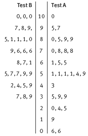
Stem-and-leaf graphs are introduced in question 1. They are particularly useful when working with 2-digit numerical data because they reduce the amount of transcribing while revealing information about the spread or shape of the distribution. When a stem-and-leaf graph is rotated 90 degrees, it is very much like a histogram.
It is easy to find the median or quartiles from a stem-and-leaf graph. First, count the total number of data items in the distribution. To find the median, count from the top or bottom (or both) until you locate the middle number. To find the quartiles, count from the top or bottom until you locate the number that is onequarter of the way from the beginning or the end of the distribution. The mode is the number that appears
most often. As always, the mean can only be found by calculation.
Question 2 asks the students to draw a bar graph, using the same data, so that they can compare the relative usefulness of the two types of graphs. See the Answers for a discussion of their comparative merits. The stem-and-leaf graph in question 3 is back-to-back in a way that is similar to the population pyramids in the previous activity.
The value of these tasks is that they demonstrate the fact that no single graph or measure can “do it all”; each reveals something different. If Ms Lewis were using only the back-to-back stem-and-leaf graph or the median or mean, she would almost certainly be pleased with her students’ progress. But a scatter plot gives
less reason for such confidence.
While other graphs typically summarise data, a scatter plot displays each individual item separately. The location and density of clusters give the “macro” picture, but the story of each individual piece of data is also present in the individual points. Scatter plots are particularly suited to bivariate data, that is, situations where we have two pieces of information about the same person, creature, or object.
In this case, one group of points represents those who did better in the first test than the second, and another represents those in the reverse situation. It turns out that exactly half of Ms Lewis’s class improved, while the other half regressed. This is explained in the Answers.
Answers to Activity
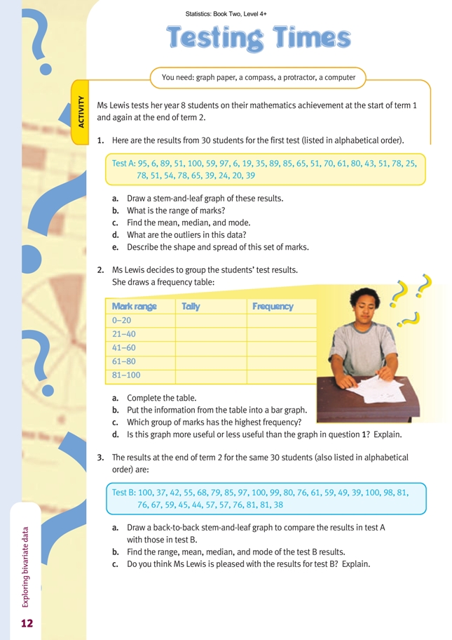
1. a.
b. 100 – 6 = 94
c. Mean = 56.8, median = 56.5, mode = 51
d. The two 6s. (These marks are 13 less than the next lowest mark.)
e. Answers will vary but could include the following points:
• the spread (range) is very great
• 2/3 of the class got 51 or better
• there are three fairly distinct groups within the class (78 and over, 51–65, and 20–39).
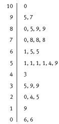
2. a.
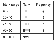
b.
c. 61–80
d. This graph is less useful because all the individual data is lost by grouping. The stem-and-leaf plot groups the data without losing any of the original information.
3. a.
b. Range: 63 (100 – 37 = 63); mean: 69.5; median: 72; mode: 76, 81, 100
c. Yes. The results indicate improvement: a much smaller range, a higher mean, a higher median, and higher modes.
4. (The labelled points on this graph are the answers to question 5a.)
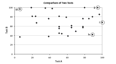
5. a. See the labelled points on the graph for question 4b.
b. They are in the area above the diagonal line that runs from (0, 0) to (100, 100). The shape is a right-angled triangle.
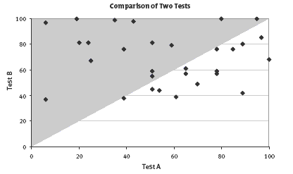
c. Exactly half (15/30) of the students got better results in the second test, so neither more nor fewer did better.
6. The scatter plot in question 4 is the most data rich. Every plotted point tells a story. None of the original data has been lost in creating the graph. It clearly compares the outcomes in the two tests, and it is the only graph that connects the scores of individual students. (The two stem-and-leaf plots keep the data intact but not the connection between an individual’s first and second scores.)