This is a level 4 statistics activity from the Figure It Out series.
A PDF of the student activity is included.

Click on the image to enlarge it. Click again to close. Download PDF (1119 KB)
create a tally chart
create a graph
interpret information from a graph
calculate percentages
This diagram shows the areas of Statistics involved in this activity.
The bottom half of the diagram represents the 5 stages of the PPDAC (Problem, Plan, Data, Analysis, Conclusion) statistics investigation cycle.
Statistical Ideas
Whose News? involves the following statistical ideas: using the PPDAC cycle*, investigative questions, multivariate data sets, tally charts, bar graphs, and pie charts, and doing a statistical investigation.
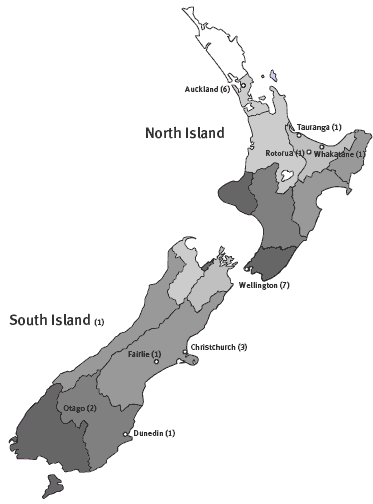
2 maps of New Zealand (see copymaster)
2008 population estimates (see copymaster)
FIO, Levels 4 -4+, Statistics in the Media, Whose News? pages 14-15
Classmates
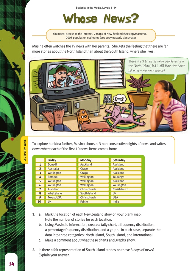
Activity One
As an introduction, you could have your students watch the news for 1 night and note the location of the first 10 items. This process could raise questions about the data collection; it is good to encourage this sort of questioning by students. The data collected could be very different at different times of the year, such as during periods of unusual weather phenomena, major sporting events, or during election time.
Question 1b involves the students in creating various charts and graphs. You may need to give your students some help with these. Examples of these are shown in the Answers.
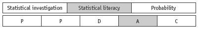
The ranking system mentioned in the answers for question 4 takes into account the importance an item may have based on its placement in the news order. It highlights the differences between North and South Island distribution perhaps more
fully than a simple tally chart does. Here is a points table based on the system of 10 for fi rst news item and 1 for the 10th. The spread for this small sample is not an even one; the students may have ideas about why this might be. (In the data gathered for the students’ book, the occurrence of snowstorms in the South Island on the Monday was a big news item.)
Activity Two
This activity provides an opportunity to work through the PPDAC cycle, with the students focusing mainly on the problem, planning, and data stages of the cycle. You will need to allow the students time to work through this.
Problem
Examples of the types of investigative question that students could pose are: “Where do news items on the 6 o’clock news on TV1 typically come from?” “Where do news items on prime-time TV in New Zealand typically come from?”
Important features of the investigative questions include specifying which news slot and which channel and that the location of the news item is of interest.
Plan
The students need to:
• make decisions about what information they are going to collect;
• decide how they will categorise the location, for example, is the news item about the South Island as a whole or is it more a specific South Island location?
• consider what is prime time (if using the second question above) and what channels should be considered (for example, only free to air or include SKY);
• decide who is collecting on which day, from which channel, in which time slot. (This part of the planning will depend on what the investigative question posed was. The data collection needs to be organised in a way that ensures there are no double-ups of data.)
At this stage, have the students consider if there is further information they could be collecting for future use, for example, information such as what the news item was about or how long it was. Collecting the additional information at the same time makes this a multivariate data set that can be used for other investigations.
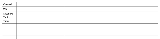
Data collection
The students may find a table such as this one useful to complete. They can adapt the headings to fit the data that they decide to collect.
Analysis
The students will draw a variety of graphs depending on the data they have selected. They should be writing “I notice …” descriptive statements about the shape of the data, the spread of the data, the middle of the data, and any appropriate statistics that may have been calculated.
Conclusion
In this part of the PPDAC cycle, the students should be answering the investigative question(s) they posed and using evidence from their analysis to support their answers.
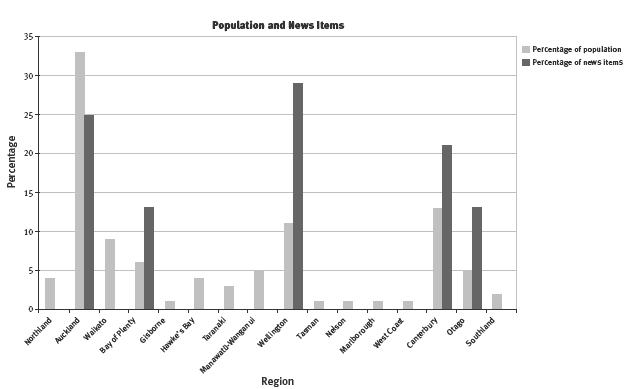
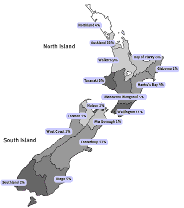
Census statistics on the population of each region and other interesting information can be found on the Statistics New Zealand website. The population fi gures in the table below were sourced from http://www.stats.govt.nz/browse_for_stats/population/estimates_and_projections.aspx, under the Subnational Population Estimates heading in the Tables section. The fi gures in the last two columns were used to draw a bar graph (shown after the table below) that compares population and news items (the South Island item was put under
Canterbury because that area has the highest population in the South Island; the percentage is of the New Zealand content).
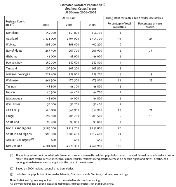
Question 2 provides a good opportunity for a discussion about when it is necessary to “clean” the data. For example, Masina labelled one news item as “South Island”. If the students do likewise, they would need to decide what to do with it later in their investigation: leave it out, choose a likely South Island region (if they know what the item is about), put it into every South Island region, or put it into the region with the largest population (as suggested earlier). Unless the region is known, assigning it to the highest population area is best; putting it into every South Island region would make most regions over-represented.
As an extension to question 3, you could ask the students if any region (Wellington in Masina’s data) stands out as having many more news items than its population would suggest and why that might be.
Extension
Students may like to investigate related representation issues in the media such as male versus female representation in the sports section of the newspaper or ethnic representation in TV advertising.
Answers to Activities
Activity one
1. a. Practical activity
b. A possible tally chart for this information is:
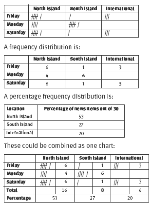
Some possible graphs, which show relative proportions but in different ways, are:
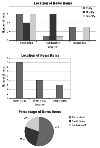
You could also show these proportions as a strip graph.
c. Comments will vary. Both the North Island and the South Island get coverage in the first 10 items on all 3 days, but there were no international items in the first 10 items on Monday. The North Island (from the percentage fi gures and graph) gets more than twice as much coverage as the South Island or international news. The South Island has only one item in the first 10 on Friday and Saturday, but has
more than the North Island on Monday (possibly weather-related).
2. Comments will vary. For the New Zealand items, there are more items for the North Island, mainly about events in Auckland and Wellington. Christchurch and
Dunedin are the only South Island cities included as a single item on these nights. A small South Island town such as Fairlie may have featured as a bad weather/
snow story.
If you take the perspective that we have two main islands, you may think that the news should be half and half. In that case, the news representation is not fair
because the North Island has twice as much coverage as the South Island. On the other hand, given that there are 3 times as many people in the North Island as in
the South Island, you could argue that there is an overrepresentation of the South Island because there are only twice as many stories for the North Island rather than 3
times as many.
3. If a major item rolled over more than 1 night, this might skew data collected on consecutive nights, especially if the story was an international one or one based in the
South Island.
4. Most of the items in the first 10 are from the North Island, but there are a number of South Island ones as well. International items are represented less in the first 10
news items. International and South Island news items are often shown later in the news programme. If you were to rank the top 10 items (for example, 10 points for the first item through to 1 point for the last), the North Island outranks the South Island on every day. However, the smallness of the sample means that it is difficult to draw any conclusion about the relative importance of north versus south in relation to the order of items.
Activity Two
1. Investigations and responses will vary.
2. The percentages that you mark on your map will vary depending on which year’s data you use. Figures for 2008 are:
3. Results will vary depending on the results of your investigation in question 1. (Note that the more data collected, the better for drawing conclusions.) For 2008, ask your teacher for the table and bar graph on pages 41–42 of the Teachers’ Notes.
4. Answers will vary. The regions that appear to be invisible might be regions that don’t contain a major city, that is, rural regions and regions with very small populations. Perhaps this is partly because most reporters live in the cities and it is easier to get stories from cities that include big business or government operations.
However, if a major news story, such as a murder or a catastrophe, happens in a small area, the reporters and film crews get there as fast as possible!
Key Competencies
Whose News? can be used to develop these key competencies:
• thinking: exploring and using patterns and relationships in data, and designing investigations
• using language, symbols, and texts: communicating fi ndings using visual representations such as graphs
• relating to others: collaborating
• participating and contributing: working in groups with everyone contributing, and sharing equipment and resources.