This is a level 3 and 4 statistics activity from the Figure It Out series.
Click on the image to enlarge it. Click again to close. Download PDF (1.1 MB)
interpret statements made about a tally chart
discuss what information the stacked bar graph bests shows
pose questions for further investigation
This diagram shows the areas of Statistics involved in this activity.
The bottom half of the diagram represents the 5 stages of the PPDAC (Problem, Plan, Data, Analysis, Conclusion) statistics investigation cycle.
FIO, Levels 3-4, Statistics Revised Edition, Change Ahead! pages 4-5
A classmate
Activity One
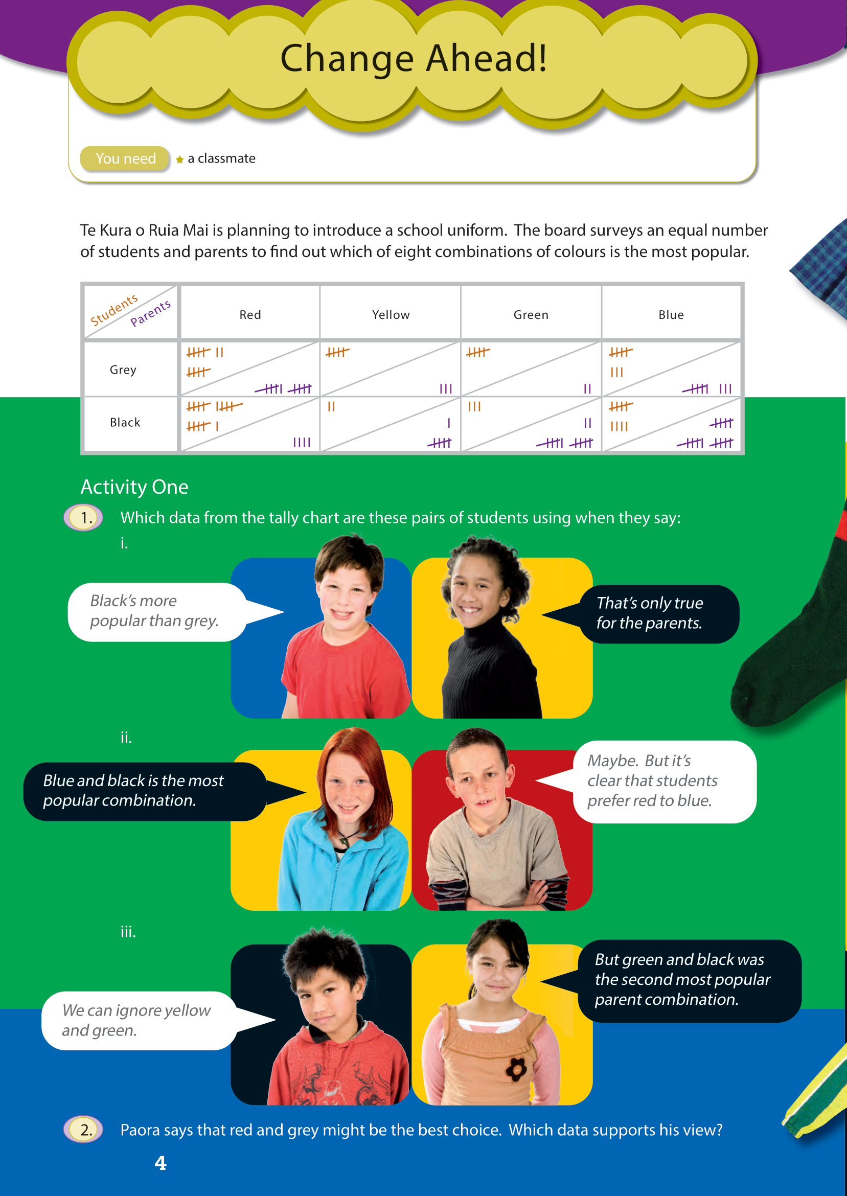
In this activity, the students interpret a tally chart. Although they will have met tally charts before, this one is likely to be new to them. Tally charts typically involve a variable (for example, favourite reading), but this one involves three: colour 1, colour 2, and parent/student. The boxes in the grid have been divided in two to cope with the third variable.
Tally charts usually have a column for totals and students may find it useful, when answering question 1, to create a table of totals, something like this:
| Red & grey | Yellow & grey | Green & grey | Blue & grey | Red & black | Yellow & black | Green & black | Blue & black | |
| Students | 12 | 5 | 5 | 8 | 16 | 2 | 3 | 9 |
| Parents | 10 | 3 | 2 | 8 | 4 | 6 | 12 | 15 |
| Total | 22 | 8 | 7 | 16 | 20 | 8 | 15 | 24 |
Paora’s view, expressed in question 2, is worth discussion. The survey does not produce a clearcut option that is favoured by students and parents alike, and Paora’s suggestion gives greater weight to student opinion than parent opinion:
- Red is the feature colour most popular with the students (28 votes) and, although red and black gets a few more votes (16) than red and grey (12), overall black and grey are equally popular (30 votes each).
- Blue (23 votes) is considerably more popular than red (14 votes) with parents, who also overwhelmingly prefer black (37 votes) to grey (23 votes).
An alternative would be to weight the decision in favour of the parents’ views and recommend blue and black. After all, they usually pay for the uniform (and virtually everything else!).
A compromise suggestion would be red and black on the grounds that students overwhelmingly prefer red to blue and parents prefer black to grey.
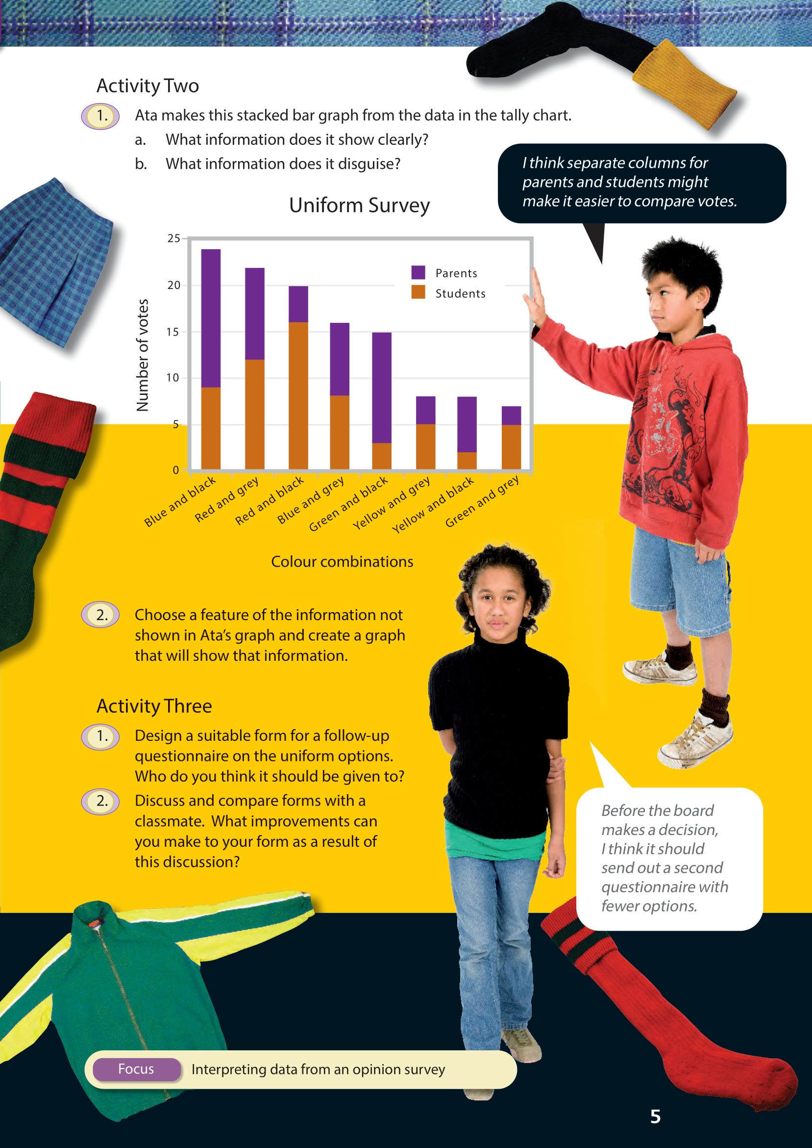
Activity Two
In question 1, the stacked bar graph highlights the total support for each colour option. Each bar of a stacked graph is like a strip graph. Although the sub-totals for parents and students can be calculated or estimated from the graph, the reader’s attention is focused on the combined totals.
For question 2, the students will probably follow Ata’s suggestion and use a double bar graph. A double bar graph will facilitate comparisons between the two groups surveyed.
Activity Three
This activity requires the students to develop their own questionnaire. To do this, they should (i) work out what information they need and (ii) work out what questions will be most likely to get them that information. The exact wording is important. Also important is how responses are to be gathered. It may be that a five-point Likert scale (see next activity) is the best way of judging the strength of people’s views. It is very difficult to ask good survey questions and provide appropriate options for response. Even professional research organisations ask ambiguous or otherwise unclear questions and may frustrate respondents by not providing options that fit them. For this reason, students should always try their questions out on several classmates before using them “in the field”.
Answers
Activity One
1. i. From the tally chart, it can be seen that:
- 67 responses favoured black; only 53 favoured grey
- students were equally divided on black and grey (30 favoured grey, 30 favoured black) but parents strongly favoured black over grey, by 37 votes to 23.
ii. In all, 24 responses favoured blue and black. (The next most popular combination was red and grey, with 22 responses.) But 28 students favoured red, a lot more than favoured blue (17).
iii. The total number of votes for yellow and green (16 and 22 respectively) were much lower than for red and blue (42 and 40 respectively). But 12 parents favoured green and black, which is only 3 fewer than the most popular parent combination of blue and black.
2. Answers will vary. Paora might argue:
- in terms of total votes (parents and students), red and grey (22) was second only to blue and black (24);
- red was a lot more popular (28) than blue (17) with students;
- it’s the students who actually wear the uniform, so their preferences need to be given some weight (although, in this case, red and black is the students’ most popular choice and parents do seem to like black, even though they prefer it to be with blue).
Activity Two
1. a. Ata’s graph clearly shows how the different colour combinations stack up in terms of overall popularity (that is, when student and parent choices are added together).
b. The graph disguises (to a certain extent) which combinations are more popular for either students or parents.
2. Graphs will vary. Here are two double bar graphs, the first arranged in order of student preference, the second in order of parent preference.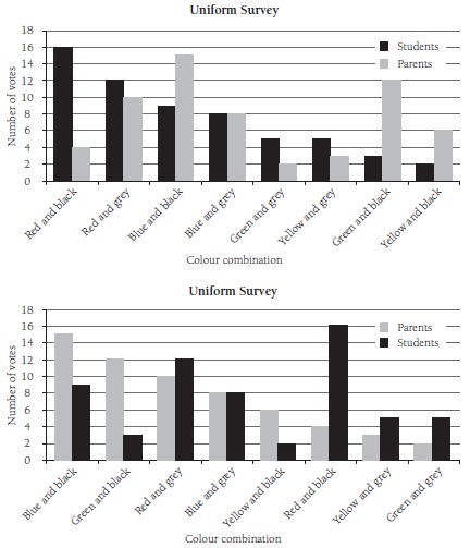
Activity Three
1. Forms will vary. The available data shows that the four colour combinations that got most votes involved either red or blue with black or grey, so it would make sense to include only these in a second survey. The focus of a second survey would be on trying to find a combination that both students and parents liked. It should be given either to equal
numbers of students and parents or to all students and parents, in which case the votes should be shown as percentages.
2. Discussion and improvements will vary.