This is a level 5 statistics activity from the Figure It Out series.
A PDF of the student activity is included.

Click on the image to enlarge it. Click again to close. Download PDF (591 KB)
find mean, median, mode of data
construct a graph
interpret data on a graph
comapre different graphs and decide which shows the data most clearly
30 centimetre ruler
FIO, Level 4+, Statistics, Book Two,Action and Reaction, pages 6-7
a computer
a classmate
In question 1, students use a ruler for an interesting purpose: to measure reaction time. In question 2a, they graph the data they have collected.
Question 2b asks students to compare the mean, median, and mode. Each of these is a measure of central tendency, that is, the way the values in a distribution tend to cluster around a middle point. The mean, median, or mode for a distribution is a single number chosen to represent the entire data set. In any given situation, one of these measures will prove more useful than the others. For a fuller treatment of the mean, see the activity Just Average (pages 14–15 of the students’ book) and the accompanying notes.
Question 3 introduces students to truncation. Sometimes outliers are valid and should be retained; sometimes they are not and should be discarded. In question 3, trial number 7 is within the bounds of what is reasonable, so it should be retained, but trial 8 is unusually low so is probably an error. In diving competitions, scored by 10 judges, the highest and lowest scores are discarded. Discuss with your students why this automatic truncation might give a better (fairer) result.
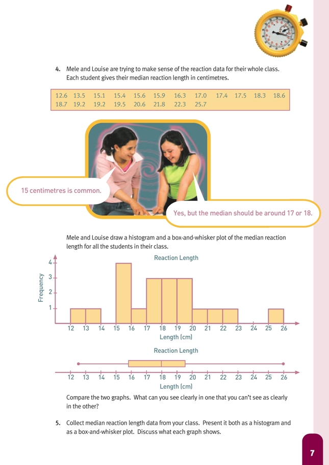
Sometimes people choose to limit the length of each of the whiskers on a box-and-whisker plot to 11/2 times the length of the box. Data values outside these limits can be represented by a cross and considered outliers.
Using this guideline in question 4, there would be no outliers at the low end of the data, but the 25.7 at the upper end would count as one.
Question 4 asks the students to compare two different graphs. Histograms have an advantage over box-and-whisker plots in that they show where the clusters and the gaps are, and every member of the data set contributes to the shape. Box-and-whisker plots, on the other hand, only identify five individual members of the data set, but because they show the median and quartiles (neither of which is obvious on a histogram), they give a very good idea of the spread of the distribution.
Histograms look similar to bar graphs, but the bars on a histogram always touch. They are used when data of the same kind (either discrete or continuous) is grouped into equal intervals. For guidance on formatting computer-generated histograms, see the introductory section of these notes (pages 18–20).
Answers to Activity
1. a.–b. Practical activity. Results will vary.
2. a. Results will vary. Reaction times will probably improve with practice.
b. Results will vary. The mean or median will be the most useful measure. The mean takes account of every individual trial; the median is unaffected by extremes.
c. Results will vary. Your conclusion needs to be supported by the mean or median (or both).
3. Trial 7 has the longest measurement recorded but it is still reasonable, so it should be retained. Trial 8 is unusually low compared with all the other measurements recorded, so it is probably an error. It could be truncated.
4. The box-and-whisker plot clearly shows the median, quartiles, and range. The histogram shows how the results were clustered and whether there were any rogue results.
5. Graphs will vary.