Time Series
In this unit students look at the components of time series. They compare sets of data using displays, use associated vocabulary and determine appropriate statistics. They interpret their results and draw conclusions. From given sets of data and other information they predict population figures.
- Plan an investigation.
- Be able to display time series data.
- Discuss the components and features of time series distributions.
- Compare features of different time series distributions.
- Report the results of a statistical investigation concisely and coherently.
The terminology associated with different time series is explored. Time series is investigated for both discrete and continuous data.
- A graphics calculator or spreadsheet would be useful here to help analyse the data
- Answers to questions
Sessions 1, 2 and 3
In these sessions, students discuss the components that go to make up time series using three examples. These components are: Long term trends, cyclical effects, seasonal effects and random variation.
1. Olympic Games Data
-
Present students with the Olympic Games data below that relates to men’s and women's performances in the 100m and high jump.
|
Year |
1928 |
1932 |
1936 |
1948 |
1952 |
1956 |
1960 |
1964 |
1968 |
|
|
Men's time (secs) |
10.8 |
10.4 |
10.3 |
10.3 |
10.79 |
10.62 |
10.32 |
10.06 |
9.95 |
|
|
Women's time (secs) |
12.2 |
11.9 |
11.5 |
11.9 |
11.65 |
11.82 |
11.18 |
11.49 |
11.08 |
|
Year |
1972 |
1976 |
1980 |
1984 |
1988 |
1992 |
1996 |
2000 |
2004 |
|
|
Men's time (secs) |
10.14 |
10.06 |
10.65 |
9.99 |
9.92 |
9.96 |
9.84 |
9.87 |
9.85 |
|
|
Women's time (secs) |
11.07 |
11.08 |
11.06 |
10.97 |
10.54 |
10.82 |
10.94 |
10.75 |
10.93 |
Olympic times for 100m
|
Year |
1948 |
1952 |
1956 |
1960 |
1964 |
1968 |
1972 |
1976 |
|
|
MH * |
1.98 |
2.04 |
2.12 |
2.16 |
2.18 |
2.24 |
2.23 |
2.25 |
|
|
WH * |
1.65 |
1.76 |
1.85 |
1.9 |
1.82 |
1.91 |
1.93 |
1.97 |
|
|
Year |
1980 |
1984 |
1988 |
1992 |
1996 |
2000 |
2004 |
2008 |
|
|
MH * |
2.23 |
2.35 |
2.38 |
2.34 |
2.39 |
2.35 |
2.36 |
|
|
|
WH * |
1.68 |
1.91 |
2.03 |
2.02 |
2.05 |
2.01 |
2.06 |
|
Olympic High Jump results
* MH = Men's height jumped (in metres)
**WH = Women's height (in metres)
-
Check students' understanding of the tables with questions like:
In what year did the men first break 10 sec for the 100m?
In what year did a woman first break the men's 1928 100m time?
Why are there no results for 1950 and 1970?
Why are there no results for 1940 and 1944?
There is a difference in the way times for the 100m are recorded between 1948 and 1952. What is the difference and why has it occurred?
In what year did women first jump higher than 2 metres?Why is it possible for someone to have jumped higher than 2.24 m in 1968?
-
Let the students display the data sets graphically.
-
Check students understanding of the effects of random fluctuations on the data.
Can we be sure that the 100m time at the next Olympics will be less than last time?
Why don't both graphs for the 100m times steadily decline?
List some possible causes of the rises and falls in the data.
Do athletes jump higher each Olympics?
Why don't both graphs for the high jump steadily increase?
List some possible causes of the rises and falls. -
Check students understanding of the long-term trends in the 100m data.
Is it likely that the 100m times for the 2048 Olympics will be less than those for the year 2004? Why?
List some of the reasons that the times for 100m races are declining.
Will they keep declining?
Is it possible to measure the 100m times more accurately? By how much?
What will be the effect of more accurate timing of races in terms of the long-term trends.
Is there a lower limit for the time the 100m can be run?
What is it? -
Check students understanding of the long-term trends in the high jump data.
Is it likely that the high jump results for the 2048 Olympics will be greater than those for 2004?
List some of the reasons why the high jump results are increasing.
Will they keep increasing?
To what level of accuracy are high jumps measured?
Why are the answers to the last two questions in some sense contradictory?
Will the high jump ever be measured to greater accuracy?
Is there an upper limit to the height athletes can jump? What is it?
It has been said that at some time in the future women and men will compete at the same level in the same events, i.e. against each other. Do the data displays support this statement? -
Both of these events are 'explosive' events in that they require short bursts of energy rather than great stamina. Students can compare men and women's performances at events in which stamina plays a greater part such long distance running events.
2. Life Expectancy
-
Present students with the following Life Expectancy data.
Year
1890
1895
1900
1905
1910
1915
1920
1925
1930
1935
1940
MLE#
54.4
55.3
57.4
58.1
59.2
61.0
62.8
64.0
65.0
65.5
WLE##
57.3
58.1
60.0
60.6
61.8
63.5
65.4
66.6
67.9
68.4
|
1945 |
1950 |
1955 |
1960 |
1965 |
1970 |
1975 |
1980 |
1985 |
1990 |
1995 |
|
67.2 |
68.2 |
68.4 |
68.2 |
68.6 |
69.0 |
70.4 |
71.1 |
72.9 |
74.3 |
|
|
71.3 |
73.0 |
73.8 |
74.3 |
74.6 |
75.4 |
76.4 |
77.1 |
78.7 |
79.6 |
Statistics New Zealand
# MLE = Men's life expectancy
##WLE = Women's life expectancy
-
Check students' understanding of the tables with questions like:
In 1900 to what age did women expect to live?
Was there any year in which life expectancy decreased?
Why do you think there is no data for the years 1940 and 1945?
Comparing just the years 1890 and 1990, has the difference between the life expectancies of men and women decreased or increased?
In what years was the difference between the life expectancy of men and women six years?
At what rate was the life expectancy of women increasing between 1890 and 1900? Between 1985 and 1995? -
Let the students display the data sets graphically.
Women in 1900 had more children than today and it was common for quite a number of them to die at a young age. Why?List some reasons why men and women's life expectancy is increasing.
Give a mathematical description of the trends in life expectancy shown by the data display.
Does the display suggest an upper limit for life expectancy?
Why can the current trend not continue?
How would you expect the life expectancy graphs to look when they are compiled in the year 3000?
3. Predator-Prey
-
Present students with the Predator-Prey data that shows population numbers for predator and prey species A and B in an ecosystem over a period of 16 years.
|
Time (years) |
0 |
1 |
2 |
3 |
4 |
5 |
6 |
7 |
8 |
|
|
No. Species '00 |
10 |
22 |
34 |
36 |
25 |
12 |
8 |
17 |
30 |
|
|
No. Species '00 |
200 |
310 |
323 |
228 |
111 |
77 |
154 |
273 |
329 |
|
Time (years) |
9 |
10 |
11 |
12 |
13 |
14 |
15 |
16 |
|
|
|
No. Species '00 |
36 |
30 |
17 |
9 |
13 |
25 |
35 |
33 |
|
|
|
No. Species '00 |
271 |
153 |
80 |
117 |
229 |
317 |
301 |
198 |
|
Modelled Data
-
Let the students display the data in the form of line graphs on the same axes.
Check students' understanding with questions like:
How many of species B were there at the beginning of the study?
In what year did the numbers of species A decrease from 36 to 25?
Approximately how many years do the peak population figures for species A lag behind those of species B?
Given that either species A predates species B or vice versa, which of the two is the predator? Why?
With unlimited food and no predators what would happen to population numbers of a species?
What other factors could cause a drop in a species' population numbers?
What would the effect of unlimited predation be on a species? How would this effect prey status?
Over what period, approximately, do population numbers cycle? -
Students brainstorm for other time series that cycle and list them.
Sessions 4 and 5
In these sessions students, working in groups, are presented with population data sets, a model population graph and other information. From this material only, they predict the World’s population in 2025 and 2050, justifying their arguments.
-
Present students with the World Population data below.
Table 1: World population through history.
|
Year |
0 |
200 |
400 |
600 |
800 |
1000 |
1200 |
1400 |
1600 |
1800 |
2000 |
|
Pop (109) |
0.2 |
0.21 |
0.22 |
0.24 |
0.26 |
0.275 |
0.33 |
0.39 |
0.52 |
0.9 |
6.09 |
Table 2: World population since 1950.
|
Year |
Population |
AAGR^ % |
AAPC^^ |
|
1950 |
2,555,360,972 |
1.47 |
37,785,986 |
|
1955 |
2,779,968,031 |
1.89 |
52,959,308 |
|
1960 |
3,039,669,330 |
1.33 |
40,792,172 |
|
1965 |
3,346,224,081 |
2.08 |
70,238,858 |
|
1970 |
3,708,067,105 |
2.07 |
77,587,001 |
|
1975 |
4,087,351,095 |
1.74 |
71,804,569 |
|
1980 |
4,454,389,519 |
1.68 |
75,430,353 |
|
1985 |
4,853,252,663 |
1.71 |
83,561,368 |
|
1990 |
5,284,679,123 |
1.58 |
84,130,498 |
|
1995 |
5,696,263,461 |
1.38 |
79,253,622 |
|
2000 |
6,085,478,778 |
1.21 |
74,220,528 |
|
2005* |
6,450,219,806 |
1.12 |
72,540,568 |
* Estimated figures
^ AAGR = Average annual growth rate (%)
^^AAPC = Average annual population change
Other possibly useful information is the number of years it has taken to add one one billion (a thousand million) people to the World’s population.
|
|
Date Achieved |
Years Required |
|
First billion |
1800 |
All of human history |
|
Second |
1930 |
130 |
|
Third |
1960 |
30 |
|
Fourth |
1974 |
14 |
|
Fifth |
1987 |
13 |
|
Sixth |
1998 |
11 |
|
Seventh |
2009* |
11 |
* estimated figure
-
Check students' understanding with questions like:
What was the world population in the year 600 CE?
What was the world population in the year 2000 CE?
In approximately what year did the World's population exceed 1,000,000,000?
What do you notice about the average annual population growth rate from 1965? -
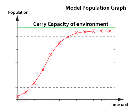
Discuss the mathematical relationships and quantities shown in the display entitled Model Population Graph. It shows how populations increase in numbers to the carrying capacity of their environment. It is a simplified model of population growth.
-
Also present students with the following information:
Most of the World's population increase occurs in the less developed countries. For example, it is estimated that between mid 2004 and 2050 India's population will increase by approximately 50% from 1,087 million to 1,628 million, whilst that of Australia will increase by only 31% from 20.125 million to 26.314 million. -
Give students time to present their prediction of the human population in 2025 and 2050. It is important that they should incorporate mathematical reasoning when they justify their predictions.